GroupBox
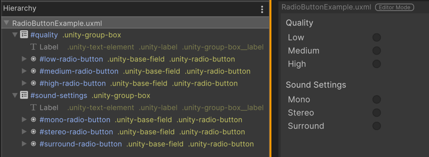
A GroupBox is a container element for a logical group of multiple buttons (including radio buttons) or toggles. You can use a combination of GroupBox and RadioButton if you want to have multiple groups of options in the same panel.

If you want to treat your group of radio buttons as a single field, use RadioButtonGroup. In most cases, it’s better to use RadioButtonGroup because you must register every single radio button when you use the GroupBox and RadioButton combo. However, use the combo if you want to add additional visual elementsA node of a visual tree that instantiates or derives from the C# VisualElement class. You can style the look, define the behaviour, and display it on screen as part of the UI. More info
See in Glossary in the group.

Create a GroupBox with C# script
The following C# code snippets create a GroupBox and add three radio buttons to it so that they’re logically grouped.
var group = new GroupBox("Group Example");
// Must register change events on each radio button.
var choice1 = new RadioButton("First Choice");
choice1.RegisterValueChangedCallback(v => Debug.Log("Choice 1 is : " + v.newValue));
var choice2 = new RadioButton("Second Choice");
choice2.RegisterValueChangedCallback(v => Debug.Log("Choice 2 is : " + v.newValue));
var choice3 = new RadioButton("Third Choice");
choice3.RegisterValueChangedCallback(v => Debug.Log("Choice 3 is : " + v.newValue));
group.Add(choice1);
group.Add(choice2);
group.Add(choice3);
rootVisualElement.Add(group);
C# class and namespace
C# class: GroupBox
Namespace: UnityEngine.UIElements
Base class: BindableElement
Member UXML attributes
This element has the following member attributes:
| Name | Type | Description |
|---|---|---|
text |
string |
The title text of the box. |
Inherited UXML attributes
This element inherits the following attributes from its base class:
| Name | Type | Description |
|---|---|---|
binding-path |
string |
Path of the target property to be bound. |
focusable |
boolean |
True if the element can be focused. |
tabindex |
int |
An integer used to sort focusables in the focus ring. Must be greater than or equal to zero. |
This element also inherits the following attributes from VisualElement:
| Name | Type | Description |
|---|---|---|
content-container |
string |
Child elements are added to it, usually this is the same as the element itself. |
data-source |
Object |
Assigns a data source to this VisualElement which overrides any inherited data source. This data source is inherited by all children. |
data-source-path |
string |
Path from the data source to the value. |
data-source-type |
System.Type |
The possible type of data source assignable to this VisualElement. This information is only used by the UI Builder as a hint to provide some completion to the data source path field when the effective data source cannot be specified at design time. |
language-direction |
UIElements.LanguageDirection |
Indicates the directionality of the element’s text. The value will propagate to the element’s children. Setting the languageDirection to RTL adds basic support for right-to-left (RTL) by reversing the text and handling linebreaking and word wrapping appropriately. However, it does not provide comprehensive RTL support, as this would require text shaping, which includes the reordering of characters, and OpenType font feature support. Comprehensive RTL support is planned for future updates, which will involve additional APIs to handle language, script, and font feature specifications. To enhance the RTL functionality of this property, users can explore available third-party plugins in the Unity Asset Store and make use of ITextElementExperimentalFeatures.renderedText
|
name |
string |
The name of this VisualElement. Use this property to write USS selectors that target a specific element. The standard practice is to give an element a unique name. |
picking-mode |
UIElements.PickingMode |
Determines if this element can be pick during mouseEvents or IPanel.Pick queries. |
style |
string |
Sets the VisualElement style values. |
tooltip |
string |
Text to display inside an information box after the user hovers the element for a small amount of time. This is only supported in the Editor UI. |
usage-hints |
UIElements.UsageHints |
A combination of hint values that specify high-level intended usage patterns for the VisualElement. This property can only be set when the VisualElement is not yet part of a Panel. Once part of a Panel, this property becomes effectively read-only, and attempts to change it will throw an exception. The specification of proper UsageHints drives the system to make better decisions on how to process or accelerate certain operations based on the anticipated usage pattern. Note that those hints do not affect behavioral or visual results, but only affect the overall performance of the panel and the elements within. It’s advised to always consider specifying the proper UsageHints, but keep in mind that some UsageHints might be internally ignored under certain conditions (e.g. due to hardware limitations on the target platform). |
view-data-key |
string |
Used for view data persistence, such as tree expanded states, scroll position, or zoom level. This key is used to save and load the view data from the view data store. If you don’t set this key, the persistence is disabled for the associated VisualElement. For more information, refer to View data persistence. |
USS classes
The following table lists all the C# public property names and their related USS selector.
| C# property | USS selector | Description |
|---|---|---|
ussClassName |
.unity-group-box |
USS class name for GroupBox elements. Unity adds this USS class to every instance of the GroupBox element. Any styling applied to this class affects every GroupBox located beside, or below the stylesheet in the visual tree. |
labelUssClassName |
.unity-group-box__label |
USS class name for Labels in GroupBox elements. Unity adds this USS class to the Label sub-element of the GroupBox if the GroupBox has a Label. |
disabledUssClassName |
.unity-disabled |
USS class name of local disabled elements. |
You can also use the Matching Selectors section in the Inspector or the UI Toolkit Debugger to see which USS selectors affect the components of the VisualElement at every level of its hierarchy.