Description
Common GUIStyles used for EditorGUI controls.
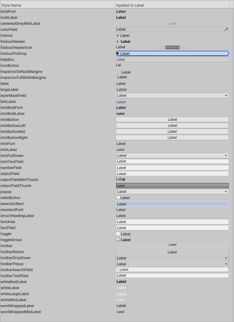
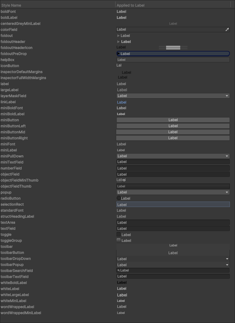
The screenshots below illustrate each style in both light and dark modes:
Static Properties
| Property | Description |
|---|---|
| boldFont | Bold font. |
| boldLabel | Style for bold label. |
| centeredGreyMiniLabel | Style for label with small font which is centered and grey. |
| colorField | Style used for headings for Color fields. |
| foldout | Style used for headings for EditorGUI.Foldout. |
| foldoutHeader | Style used for headings for EditorGUILayout.BeginFoldoutHeaderGroup. |
| foldoutHeaderIcon | Style used for icon for EditorGUILayout.BeginFoldoutHeaderGroup. |
| foldoutPreDrop | Style used for headings for EditorGUI.Foldout. |
| helpBox | Style used for background box for EditorGUI.HelpBox. |
| iconButton | Style used for a standalone icon button. |
| inspectorDefaultMargins | Wrap content in a vertical group with this style to get the default margins used in the Inspector. |
| inspectorFullWidthMargins | Wrap content in a vertical group with this style to get full width margins in the Inspector. |
| label | Style used for the labelled on all EditorGUI overloads that take a prefix label. |
| largeLabel | Style for label with large font. |
| layerMaskField | Style used for headings for Layer masks. |
| linkLabel | Style used for links. |
| miniBoldFont | Mini Bold font. |
| miniBoldLabel | Style for mini bold label. |
| miniButton | Style used for a standalone small button. |
| miniButtonLeft | Style used for the leftmost button in a horizontal button group. |
| miniButtonMid | Style used for the middle buttons in a horizontal group. |
| miniButtonRight | Style used for the rightmost button in a horizontal group. |
| miniFont | Mini font. |
| miniLabel | Style for label with small font. |
| miniPullDown | Style used for the drop-down controls. |
| miniTextField | Smaller text field. |
| numberField | Style used for field editors for numbers. |
| objectField | Style used for headings for object fields. |
| objectFieldMiniThumb | Style used for object fields that have a thumbnail (e.g Textures). |
| objectFieldThumb | Style used for headings for the Select button in object fields. |
| popup | Style used for EditorGUI.Popup, EditorGUI.EnumPopup,. |
| radioButton | Style used for a radio button. |
| selectionRect | Style used to draw a marquee selection rect in the SceneView. |
| standardFont | Standard font. |
| textArea | Style used for EditorGUI.TextArea. |
| textField | Style used for EditorGUI.TextField. |
| toggle | Style used for headings for EditorGUI.Toggle. |
| toggleGroup | Style used for headings for EditorGUILayout.BeginToggleGroup. |
| toolbar | Toolbar background from top of windows. |
| toolbarButton | Style for Button and Toggles in toolbars. |
| toolbarDropDown | Toolbar Dropdown. |
| toolbarPopup | Toolbar Popup. |
| toolbarSearchField | Toolbar search field. |
| toolbarTextField | Toolbar text field. |
| whiteBoldLabel | Style for white bold label. |
| whiteLabel | Style for white label. |
| whiteLargeLabel | Style for white large label. |
| whiteMiniLabel | Style for white mini label. |
| wordWrappedLabel | Style for word wrapped label. |
| wordWrappedMiniLabel | Style for word wrapped mini label. |