USS common properties
This page introduces the common USS properties, their syntax and accepted values, and differences from CSS. For a complete list of USS properties, refer to USS properties reference.
All
The all property resets all properties to their default value. This property doesn’t apply to the custom USS properties.
all: initial
Box model
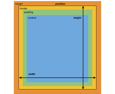
Dimensions
width: <length> | auto
height: <length> | auto
min-width: <length> | auto
min-height: <length> | auto
max-width: <length> | none
max-height: <length> | none
aspect-ratio: <ratio> | auto
The width and height specify the size of the element. If width isn’t specified, the width is based on the width of the element’s contents. If height isn’t specified, the height is based on the height of the element’s contents.
Aspect ratio is the ratio of the element’s width to its height. You can specify the aspect ratioThe relationship of an image’s proportional dimensions, such as its width and height.
See in Glossary as a floating-point number (for example, 1.777778 for 16/9) or set it to auto to maintain the original aspect ratio.
When you set other sizing properties on an element, such as width, height, min-width, or max-height, the aspect-ratio property works together with these properties. For example, if you set height: 200px on an image and apply an aspect ratio of 3/4, the image’s width becomes 150px to maintain the ratio. If you explicitly set both width and height, those values override the aspect ratio.
To ensure your element maintains the ratio regardless of the content inside, you can set overflow to hidden.
Note: Elements sized using aspect ratio might appear differently on mobile portrait device sizes because the device screen width might not match the ratio’s proportional height. The recommended best practice is to adjust the ratio values or other sizing settings on breakpoints to achieve the desired layout. For example, set a widescreen aspect ratio on an image for larger breakpoints and a square aspect ratio on the same image for mobile breakpoints.
Aspect ratio is equivalent to the aspect-ratio CSS property. For more information, refer to MDN documentation.
Margins
margin-left: <length> | auto;
margin-top: <length> | auto
margin-right: <length> | auto
margin-bottom: <length> | auto
/* Shorthand */
margin: [<length> | auto]{1,4}
Borders
border-left-width: <length>
border-top-width: <length>
border-right-width: <length>
border-bottom-width: <length>
/* Shorthand */
border-width: <length>{1,4}
Padding
padding-left: <length>
padding-top: <length>
padding-right: <length>
padding-bottom: <length>
/* Shorthand */
padding: <length>{1,4}
Differences from CSS
The alternative box model that USS uses is different from the standard CSS box model. In the standard CSS box model, width and height define the size of the content box. An element’s rendered size is the sum of its padding, border-width, and width / height values.
Unity’s model is equivalent to setting the CSS box-sizing property to border-box. Refer to the MDN documentation for details.
Flex layout
UI Toolkit includes a layout engine that positions visual elementsA node of a visual tree that instantiates or derives from the C# VisualElement class. You can style the look, define the behaviour, and display it on screen as part of the UI. More info
See in Glossary based on layout and styling properties. The layout engine implements a subset of Flexbox, an HTML/CSS layout system.
By default, all items are vertically placed in their container.
/* Items */
flex-grow: <number>
flex-shrink: <number>
flex-basis: <length> | auto
flex: none | [ <'flex-grow'> <'flex-shrink'>? || <'flex-basis'> ]
align-self: auto | flex-start | flex-end | center | stretch

/* Containers */
flex-direction: row | row-reverse | column | column-reverse
flex-wrap: nowrap | wrap | wrap-reverse
align-content: flex-start | flex-end | center | stretch

/* The default value is `stretch`.
`auto` sets `align-items` to `flex-end`. */
align-items: auto | flex-start | flex-end | center | stretch

justify-content: flex-start | flex-end | center | space-between | space-around
Positioning
/* The default value is `relative` which positions the element based on its parent.
If sets to `absolute`, the element leaves its parent layout and values are specified based on the parent bounds.*/
position: absolute | relative

/* The distance from the parent edge or the original position of the element. */
left: <length> | auto
top: <length> | auto
right: <length> | auto
bottom: <length> | auto
Background
background-color: <color>
background-image: <resource> | <url> | none
-unity-background-scale-mode: stretch-to-fill | scale-and-crop | scale-to-fit
-unity-background-image-tint-color: <color>
For more information about setting background images, refer to Set background images.
Slicing
When assigning a background image, you draw it with respect to a simplified 9-slice specification:
-unity-slice-left: <integer>
-unity-slice-top: <integer>
-unity-slice-right: <integer>
-unity-slice-bottom: <integer>
-unity-slice-scale: <length>
-unity-slice-type: sliced | tiled
Note: For spritesA 2D graphic objects. If you are used to working in 3D, Sprites are essentially just standard textures but there are special techniques for combining and managing sprite textures for efficiency and convenience during development. More info
See in Glossary, Unity adjusts the -unity-slice-scale by the sprite’s pixels-per-unit value in relation to the panel’s reference sprite pixels per unit value, which is by default 100. For example, if the sprite’s pixels-per-unit is 16, the scale is adjusted by 16/100 = 0.16. Therefore, if you set the scale to 2px, the final scale is 2px * 0.16px = 0.32px. For texture and vector images, Unity doesn’t make additional adjustments to the slice scale value you set.
For more information about 9-slice, refer to 9-Slice images with UI Toolkit.
Border color
border-left-color: <color>
border-top-color: <color>
border-right-color: <color>
border-bottom-color: <color>
/* Shorthand */
border-color: <color>{1,4}
Border radius
border-top-left-radius: <length>
border-top-right-radius: <length>
border-bottom-left-radius: <length>
border-bottom-right-radius: <length>
/* Shorthand */
border-radius: <length>{1,4}
Differences from CSS
Border radius properties work almost the same in USS and CSS. For detailed information about border-radius, refer to the MDN documentation.
However, the following are the main differences:
- Unity doesn’t support the second-radius shorthand (
border-radius: (first radius values) / (second radius values);) used to create elliptical corners. - Unity reduces border radius values to half of the element’s size in pixelsThe smallest unit in a computer image. Pixel size depends on your screen resolution. Pixel lighting is calculated at every screen pixel. More info
See in Glossary. For example, for a 100px x 100px element, anyborder-radiusvalue greater than 50px is reduced to 50px. If you use percentage (%) values for border-radius properties, Unity first resolves the percentage to pixels and then reduces theborder-radiusvalue to half of the resolved pixel value. If you have different radius values for two or more corners, Unity reduces any values greater than half of the element’s size to half of the element’s size. - If the element’s width and height aren’t equal, or if clamping occurs on one axis, the border radius might be uneven, resulting in elliptical corner rounding.
Appearance
overflow: hidden | visible
-unity-overflow-clip-box: padding-box | content-box
-unity-paragraph-spacing: <length>
visibility: visible | hidden
display: flex | none
The -unity-overflow-clip-box defines the clipping rectangle for the element content. The default is padding-box, the rectangle outside the padding area (the green rectangle in the box model image above); content-box represents the value inside the padding area (the blue rectangle in the box model image above).
The display default value is flex. Set display to none to remove the element from the UI. Set the visibility to hidden to hide the element, but the element still occupies space in the layout.
The overflow property controls the clipping of an element’s content. The default value is visible, which means the element’s content isn’t clipped to the element’s bounds. If you set overflow to hidden, the element’s content is clipped to the element’s bounds. You can use overflow to make a masking effect.
Differences from CSS
The USS display property supports only a small subset of the CSS display property’s available keyword values. The USS version supports keywords that work with the Yoga layout engine.
- For more information about Yoga, refer to Flexible Layouts with Yoga.
- For more information about the CSS
displayproperty, refer to the MDN documentation.
Text properties
Text properties set the color, font, font size, and Unity-specific properties for font resource, font style, alignment, word wrap, and clipping.
color: <color>
-unity-font: <resource> | <url>
-unity-font-definition: <resource> | <url>
font-size: <number>
-unity-font-style: normal | italic | bold | bold-and-italic
-unity-text-align: upper-left | middle-left | lower-left | upper-center | middle-center | lower-center | upper-right | middle-right | lower-right
-unity-text-overflow-position: start | middle | end
white-space: normal | nowrap | pre | pre-wrap

-unity-text-outline-width: <length>
-unity-text-outline-color: <color>
/* Shorthand */
-unity-text-outline: <length> | <color>

-unity-text-generator: standard | advanced
-unity-text-auto-size: none | best-fit <min-font-size> <max-font-size>

/* The text overflow mode. */
/* clip: Trims any text that extends beyond the boudaries of its container. */
/* ellipsis: Truncates any text that extends beyong the boudaries of its container with an ellipsis. */
text-overflow: clip | ellipsis

text-shadow: <x-offset> <y-offset> <blur-radius> <color>;

letter-spacing: <length>
word-spacing: <length>
-unity-paragraph-spacing: <length>
Note: When you set up the font in UI Builder, the Font control in the InspectorA Unity window that displays information about the currently selected GameObject, asset or project settings, allowing you to inspect and edit the values. More info
See in Glossary sets -unity-font, and the Font Asset control sets -unity-font-definition. Because -unity-font-definition takes precedence over -unity-font, to use a font from the Font list, select None from Font Asset. Otherwise, the font you selected doesn’t take effect.
For more information about text shadow and text outline, refer to Text effects.
For more information about auto sizing, refer to Auto sizing text elements.
Cursor
The cursor property specifies the mouse cursor to be displayed when the mouse pointer is over an element.
cursor: [ [ <resource> | <url> ] [ <integer> <integer>]? , ] [ arrow | text | resize-vertical | resize-horizontal | link | slide-arrow | resize-up-right | resize-up-left | move-arrow | rotate-arrow | scale-arrow | arrow-plus | arrow-minus | pan | orbit | zoom | fps | split-resize-up-down | split-resize-left-right ]
Note: Cursor keywords are only available in the Editor UI. Cursor keywords don’t work in runtime UI. In runtime UI, you must use a texture for custom cursors.
Differences from CSS
In CSS, you can specify multiple optional custom cursors and a mandatory keyword in a single cursor style declaration. When you specify multiple cursors, they form a fallback chain. If the browser can’t load the first custom cursor, it tries each of the others in sequence until one of them loads or there are no more custom cursors to try. If the browser can’t load any custom cursors, it uses the keyword.
In USS, custom cursors and keywords are mutually exclusive. A cursor style declaration can only have one custom cursor or one keyword.
For detailed information about the CSS cursor property, refer to the MDN documentation.
Opacity
opacity: <number>
Differences from CSS
USS opacity is similar to CSS opacity. The opacity of parent elements affects the perceived opacity of child elements. The perceivability is different between USS opacity and CSS opacity.
In the following USS example, the blue square is a child of the red square. The red square has an opacity of 0.5.
.red {
    background-color: red;
    opacity: 0.5;
}

.blue {
    background-color: blue;
    left: 20px;
    top: 20px;
}
Although the blue square doesn’t have an opacity value, it has a perceived opacity of 0.5 from the red square. You can see the red square through the blue square.

In CSS, if you apply the same styles, both the red and blue squares are 50% transparent. However, you can’t see the red square through the blue square, unless you also set the opacity of blue to be less than 1.

Material
-unity-material: <resource> | <url> | none
The -unity-material property assigns a custom material to the element. For more information, refer to Get started with UI Shader Graph.
Note: This property is automatically inherited by descendant elements, meaning child elements use the same material but they can override it.