USS 公共属性
本页面介绍常见的 USS 属性、其语法和接受值以及与 CSS 的差异。有关 USS 属性的完整列表,请参阅 USS 属性参考。
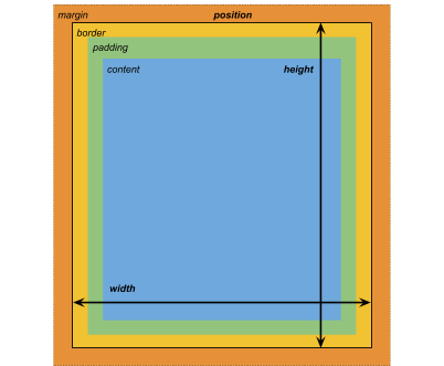
框形模型
维度
width: <length> | auto
height: <length> | auto
min-width: <length> | auto
min-height: <length> | auto
max-width: <length> | none
max-height: <length> | none
width 和 height 指定元素的大小。如果未指定 width,则宽度基于元素内容的宽度。如果未指定 height,则高度基于元素内容的高度。
边距
margin-left: <length> | auto;
margin-top: <length> | auto
margin-right: <length> | auto
margin-bottom: <length> | auto
/* Shorthand */
margin: [<length> | auto]{1,4}
边框
border-left-width: <length>
border-top-width: <length>
border-right-width: <length>
border-bottom-width: <length>
/* Shorthand */
border-width: <length>{1,4}
填充
padding-left: <length>
padding-top: <length>
padding-right: <length>
padding-bottom: <length>
/* Shorthand */
padding: <length>{1,4}
与 CSS 的区别
USS 使用的替代框形模型不同于标准的 CSS 框形模型。在标准的 CSS 框形模型中,width 和 height 定义了内容框的大小。元素的渲染大小是其 padding、border-width 和 width/height 值的总和。
Unity 的模型相当于将 CSS 的 box-sizing 属性设置为 border-box。有关详细信息,请参阅 MDN 文档。
灵活布局
UI 工具包包括一个布局引擎,可根据布局和样式属性定位视觉元素。该布局引擎实现一个名为 Flexbox 的 HTML/CSS 布局系统的子集。
默认情况下,所有项都垂直放置在其容器中。
/* Items */
flex-grow: <number>
flex-shrink: <number>
flex-basis: <length> | auto
flex: none | [ <'flex-grow'> <'flex-shrink'>? || <'flex-basis'> ]
align-self: auto | flex-start | flex-end | center | stretch

/* Containers */
flex-direction: row | row-reverse | column | column-reverse
flex-wrap: nowrap | wrap | wrap-reverse
align-content: flex-start | flex-end | center | stretch

/* The default value is `stretch`.
`auto` sets `align-items` to `flex-end`. */
align-items: auto | flex-start | flex-end | center | stretch

justify-content: flex-start | flex-end | center | space-between | space-around
定位
/* The default value is `relative` which positions the element based on its parent.
If sets to `absolute`, the element leaves its parent layout and values are specified based on the parent bounds.*/
position: absolute | relative

/* The distance from the parent edge or the original position of the element. */
left: <length> | auto
top: <length> | auto
right: <length> | auto
bottom: <length> | auto
Background
background-color: <color>
background-image: <resource> | <url> | none
-unity-background-scale-mode: stretch-to-fill | scale-and-crop | scale-to-fit
-unity-background-image-tint-color: <color>
有关设置背景图像的更多信息,请参阅设置背景图像。
切片
分配背景图像时,根据简化的九宫格规范来绘制该图像:
-unity-slice-left: <integer>
-unity-slice-top: <integer>
-unity-slice-right: <integer>
-unity-slice-bottom: <integer>
-unity-slice-scale: <length>
注意:对于精灵,Unity 会根据精灵相对于面板 reference sprite pixels per unit value 的 pixels-per-unit 值(默认为 100)来调整 -unity-slice-scale。例如,如果精灵的 pixels-per-unit 为 16,则按 16/100 = 0.16 调整缩放。因此,如果将比例设置为 2px,则最终比例为 2px * 0.16px = 0.32px。对于纹理和矢量图像,Unity 不会对您设置的宫格缩放值进行额外调整。
有关九宫格的更多信息,请参阅带 UI 工具包的九宫格图像。
Border color(边框颜色)
border-color: <color>
Border radius(边框半径)
border-top-left-radius: <length>
border-top-right-radius: <length>
border-bottom-left-radius: <length>
border-bottom-right-radius: <length>
/* Shorthand */
border-radius: <length>{1,4}
与 CSS 的区别
边界半径属性在 USS 和 CSS 中几乎相同。有关 border-radius 的详细信息,请参阅 MDN 文档。
但是,有两个主要区别:
- Unity 不支持用于创建椭圆角的第二半径简写 (
border-radius: (first radius values) / (second radius values);)。 - Unity 将边框半径值减小到元素大小的一半(以像素为单位)。例如,对于 100px x 100px 的元素,任何大于 50px 的
border-radius值都会被减少为 50px。如果您对边框半径属性使用百分比 (%) 值,Unity 首先将百分比解析为像素,然后将border-radius值减少为解析像素值的一半。如果两个或多个角的半径值不同,Unity 会将任何大于元素大小一半的值减少为元素大小的一半。
外观
overflow: hidden | visible
-unity-overflow-clip-box: padding-box | content-box
-unity-paragraph-spacing: <length>
visibility: visible | hidden
display: flex | none
-unity-overflow-clip-box 定义元素内容的裁剪矩形。默认值为 padding-box,表示位于填充区域外部的矩形(上文的框形模型图像中的绿色矩形);content-box 表示位于填充区域内的值(上文的框形模型图像中的蓝色矩形)。
display 的默认值为 flex。将 display 设置为 none 可从__ UI__(即用户界面,User Interface)让用户能够与您的应用程序进行交互。Unity 目前支持三种 UI 系统。更多信息
See in Glossary 中删除该元素。将 visibility 设置为 hidden 将隐藏该元素,但是该元素仍会占用布局中的空间。
overflow 属性控制元素内容的裁剪。默认值为 visible,这意味着元素的内容不会裁剪到元素的边界。如果将 overflow 设置为 hidden,元素的内容将被裁剪到元素的边界。您可以使用 overflow 创建遮罩效果。
与 CSS 的区别
USS display 属性只支持 CSS display 属性可用关键字值的一小部分。USS 版本支持与 Yoga 布局引擎配合使用的关键词。
- 有关 Yoga 的更多信息,请参阅使用 Yoga 实现灵活布局。
- 有关 CSS
display属性的更多信息,请参阅 MDN 文档。
文本属性
文本属性用于设置颜色、字体、字体大小以及 Unity 特有属性(字体资源、字形、对齐、自动换行和剪切)。
color: <color>
-unity-font: <resource> | <url>
-unity-font-definition: <resource> | <url>
font-size: <number>
-unity-font-style: normal | italic | bold | bold-and-italic
-unity-text-align: upper-left | middle-left | lower-left | upper-center | middle-center | lower-center | upper-right | middle-right | lower-right
-unity-text-overflow-position: start | middle | end
white-space: normal | nowrap

-unity-text-outline-width: <length>
-unity-text-outline-color: <color>
/* Shorthand */
-unity-text-outline: <length> | <color>

-unity-text-generator: standard | advanced

/* The text overflow mode. */
/* clip: Trims any text that extends beyond the boudaries of its container. */
/* ellipsis: Truncates any text that extends beyong the boudaries of its container with an ellipsis. */
text-overflow: clip | ellipsis

text-shadow-offset-x: <length>
text-shadow-offset-y: <length>
text-shadow-color: <color>
text-shadow-blur-radius: <length>
/* Shorthand */
text-shadow: <x-offset> <y-offset> <blur-radius> <color>;

letter-spacing: <length>
word-spacing: <length>
-unity-paragraph-spacing: <length>
注意:在 UI Builder 中设置字体时,检视面板中的 Font 控件会设置 -unity-font,而 Font Asset 控件会设置 -unity-font-definition。由于 -unity-font-definition 优先于 -unity-font,因此要使用 Font 列表中的字体,请从 Font Asset 中选择 None。否则,您选择的字体不会生效。
有关文本阴影和文本轮廓的更多信息,请参阅文本效果。
光标
cursor 属性指定当鼠标指针悬停在元素上时显示的鼠标光标。
cursor: [ [ <resource> | <url> ] [ <integer> <integer>]? , ] [ arrow | text | resize-vertical | resize-horizontal | link | slide-arrow | resize-up-right | resize-up-left | move-arrow | rotate-arrow | scale-arrow | arrow-plus | arrow-minus | pan | orbit | zoom | fps | split-resize-up-down | split-resize-left-right ]
注意:光标关键字仅在 Editor UI 中可用。光标关键字在运行时 UI 中无效。在运行时 UI 中,必须为自定义光标使用纹理。
与 CSS 的区别
在 CSS 中,您可以在单个 cursor 样式声明中指定多个可选的自定义光标和一个强制关键字。当您指定多个光标时,它们会形成一个回退链。如果浏览器无法加载第一个自定义光标,它会依次尝试其他每个光标,直到能加载其中一个或没有更多自定义光标可供尝试。如果浏览器无法加载任何自定义光标,则它使用关键字。
在 USS 中,自定义光标和关键字是互斥的。一个 cursor 样式声明只能有一个自定义光标或一个关键字。
有关 CSS cursor 属性的详细信息,请参阅 MDN 文档。
Opacity(不透明度)
opacity: <number>
与 CSS 的区别
USS 不透明度类似于 CSS 不透明度。父元素的不透明度会影响子元素的感知不透明度。USS 不透明度和 CSS 不透明度之间的可感知性不同。
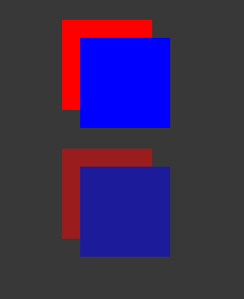
在以下 USS 示例中,蓝色方块是红色方块的子项。红色方块的 opacity 为 0.5。
.red {
    background-color: red;
    opacity: 0.5;
}

.blue {
    background-color: blue;
    left: 20px;
    top: 20px;
}
虽然蓝色方块没有不透明度值,但它具有与红色方块的不透明度 0.5。您可以通过蓝色方块查看红色方块。
在 CSS 中,如果应用相同的样式,则红色和蓝色方块的透明度均为 50%。但是,除非还将蓝色的 opacity 设置为小于 1,否则无法通过蓝色方块查看红色方块。