Introduction to UI Toolkit
You can use UI Toolkit to develop custom UI and extensions for the Unity Editor, and runtime UI for games and applications.
Web-inspired design
UI Toolkit is designed for optimal performance and adaptability across platforms and it is inspired by standard web technologies. If you have experience developing web pages or applications, the core concepts of UI Toolkit might be familiar to you. UI Toolkit provides powerful tools and workflows that leverage your existing knowledge of markup languages and style sheets.
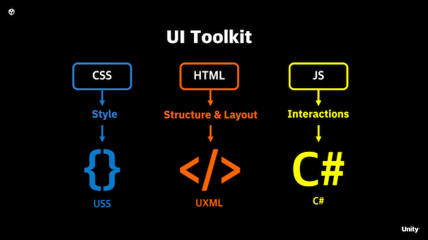
With UI Toolkit, you can separate the structure, style, and behavior of your UI, similar to how you might with HTML, CSS, and JavaScript:
UXML
UXML is a markup language inspired by HTML and XML that defines UI structure and reusable templates. While you can build UI in C#, using UXML is recommended.
USS
USS are style sheets that apply visual styles and layout rules to UI. Similar to CSS, USS supports a subset of standard CSS properties. While you can define styles in C#, using USS is recommended.
Retained mode architecture
UI Toolkit operates in a retained mode architecture, which means the UI builds a hierarchical structure and maintains it in memory. The framework handles rendering and updates to the UI based on the state of that tree. Here’s what retained mode means in detail:
Declarative structure
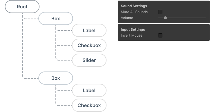
UI components are defined and managed as objects or nodes within a visual treeAn object graph, made of lightweight nodes, that holds all the elements in a window or panel. It defines every UI you build with the UI Toolkit.
See in Glossary. Visual tree is an object graph made of lightweight nodes that holds all the elements in a window or panel. It defines every UI built with UI Toolkit. You declare the UI structure once, UI Toolkit takes care of rendering and updates based on the changes to the tree.
State persistence
The UI elements in retained mode persist in memory after creation. You can modify their properties, and UI Toolkit reflects changes in the next rendering cycle. For example, if you have a button, you don’t need to redraw it manually. Updating its properties, such as position or appearance, is enough. The system handles the rest.
Event handling
Events such as clicks, drags, or key presses are routed automatically to the appropriate visual elements in the tree. You attach handlers to UI elements, UI Toolkit propagates events appropriately.
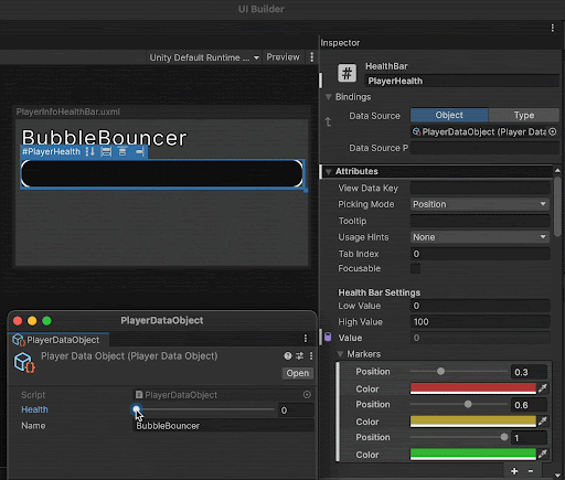
Data binding
UI Toolkit supports a data binding system that allows you to link properties of UI elements to data sources. This means that when the data changes, the UI updates automatically, and vice versa. This is similar to how frameworks like React or Angular handle data binding in web development.
Layout engine
UI Toolkit uses a layout engine based on the CSS Flexbox model. This lets you to define how UI elements are positioned and sized within their parent containers. The layout engine automatically calculates the size and position of elements based on their properties, making it easier to create responsive designs.
Use flex properties for efficient space distribution, easy reordering, and absolute positioning of elements. The layout engine also supports alignment, justification, wrapping, and much more.
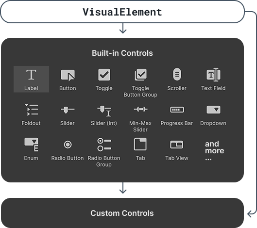
Library of UI controls
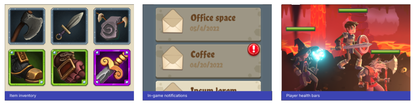
UI Toolkit provides a rich library of standard UI controls that you can use to build your interfaces, such as buttons, toggles, and list and tree views. You can use them as is, customize them, or create your own controls.
Text and fonts
UI Toolkit supports a text system that allows you to work with fonts, styles, and text elements. You can use system fonts or import custom fonts, and apply styles such as bold, italic, or underline. The text system is designed to work seamlessly with the layout engine, ensuring that text flows correctly within your UI.
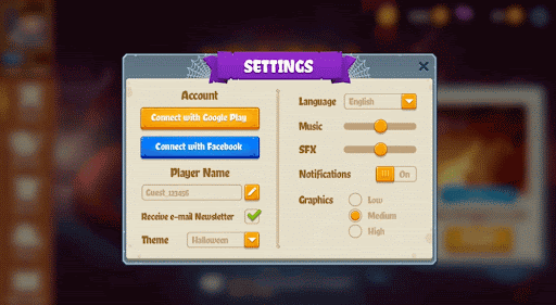
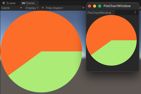
Support for Editor and runtime UI
UI Toolkit lets you create a UI that works seamlessly in both Editor and runtime UI. The same UI elements, styling, and layout system apply across both scenarios, reducing duplication and ensuring consistency. Whether you’re building in-game menus, heads-up displays (HUDs), or custom Editor tools, UI Toolkit provides the capability to adapt your UI for different contexts.
UI tools and resources
UI Toolkit provides a set of tools and resources to help you design, develop, and debug your UI.
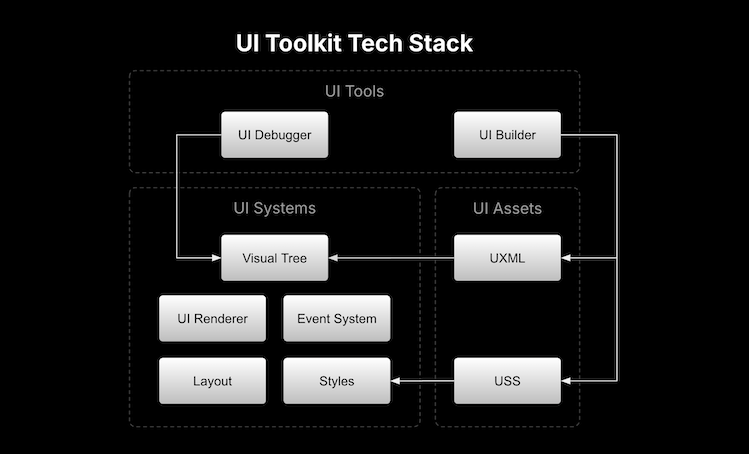
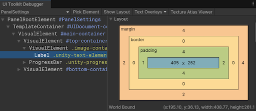
UI Debugger
UI Debugger is a diagnostic tool that resembles a web browser’s debugging view. Use it to explore a hierarchy of elements and get information about their underlying UXML structure and USS styles.
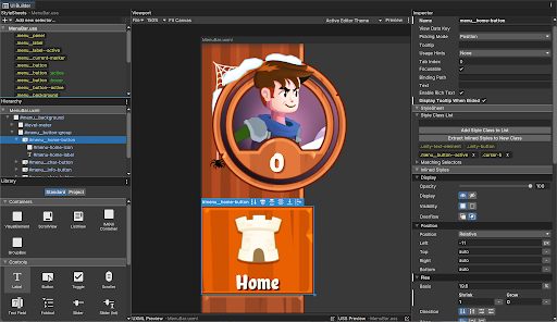
UI Builder
UI Builder is a visual authoring tool that lets you create and edit UXML and USS files. You can design your UI visually, drag and drop elements, and customize styles without writing code. The UI Builder interface allows artists and designers to edit and visualize the UI as it’s being built.
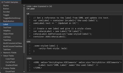
UI samples
A library of code samples for UI controls that you can view in the Editor under Window > UI Toolkit > Samples.
Roles and responsibilities
In a studio, UI Toolkit can be used across different disciplines, with each role contributing to specific parts of the process.
UX/UI Designers
UX/UI designers are responsible for the overall look and feel of the UI. They create wireframes, mockups, and prototypes to define the user experience.
Designers use UI Builder to visually design the UI and create UXML and USS files for structure and styling.
Developers
Developers implement the behavior of the UI and integrate it with game or editor logic. They work closely with designers to ensure that the UI meets the design specifications and functions correctly.
Developers use C# to create custom functionality, handle user interactions, and bind data. They also use UI Toolkit’s API to interact with the UI controls created by designers and to develop custom UI controls that designers can use and customize in their designs.
Technical Artists
Technical artists often act as a bridge between designers and developers. They ensure that the visual assets are optimized for performance and integrate well with the UI.
Technical artists assist in creating USS styles and troubleshooting issues that arise during development.
QA/Testing
QA/testers test the UI to ensure it functions correctly and meets design specifications.
Testers use the UI Debugger to inspect the UI hierarchy and verify interactions.