static function VerticalSlider (value : float, leftValue : float, rightValue : float, params options : GUILayoutOption[]) : float
static function VerticalSlider (value : float, leftValue : float, rightValue : float, slider : GUIStyle, thumb : GUIStyle, params options : GUILayoutOption[]) : float
Parameters
| Name | Description |
|---|---|
| value | The value the slider shows. This determines the position of the draggable thumb. |
| topValue | The value at the top end of the slider. |
| bottomValue | The value at the bottom end of the slider. |
| slider | The GUIStyle to use for displaying the dragging area. If left out, the horizontalSlider style from the current GUISkin is used. |
| thumb | The GUIStyle to use for displaying draggable thumb. If left out, the horizontalSliderThumb style from the current GUISkin is used. |
| options |
An optional list of layout options that specify extra layouting properties. Any values passed in here will override settings defined by the style. See Also: GUILayout.Width, GUILayout.Height, GUILayout.MinWidth, GUILayout.MaxWidth, GUILayout.MinHeight, GUILayout.MaxHeight, GUILayout.ExpandWidth, GUILayout.ExpandHeight |
Returns
float - The value that has been set by the user.
Description
A vertical slider the user can drag to change a value between a min and a max.

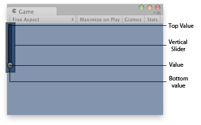
Vertical slider in the Game View.
JavaScript
// Draws a vertical slider control that goes from  10 (top) to 0 (bottom)
var vSliderValue : float = 0.0;

function OnGUI () {
    vSliderValue = GUILayout.VerticalSlider (vSliderValue, 10.0, 0.0);
}
using UnityEngine;
using System.Collections;

public class example : MonoBehaviour {
    public float vSliderValue = 0.0F;
    void OnGUI() {
        vSliderValue = GUILayout.VerticalSlider(vSliderValue, 10.0F, 0.0F);
    }
}
import UnityEngine
import System.Collections

class example(MonoBehaviour):

    public vSliderValue as single = 0.0F

    def OnGUI():
        vSliderValue = GUILayout.VerticalSlider(vSliderValue, 10.0F, 0.0F)