static function Button (image : Texture, params options : GUILayoutOption[]) : boolean
static function Button (text : String, params options : GUILayoutOption[]) : boolean
static function Button (content : GUIContent, params options : GUILayoutOption[]) : boolean
static function Button (image : Texture, style : GUIStyle, params options : GUILayoutOption[]) : boolean
static function Button (text : String, style : GUIStyle, params options : GUILayoutOption[]) : boolean
static function Button (content : GUIContent, style : GUIStyle, params options : GUILayoutOption[]) : boolean
Parameters
| Name | Description |
|---|---|
| text | Text to display on the button. |
| image | Texture to display on the button. |
| content | Text, image and tooltip for this button. |
| style | The style to use. If left out, the button style from the current GUISkin is used. |
| options |
An optional list of layout options that specify extra layouting properties. Any values passed in here will override settings defined by the style. See Also: GUILayout.Width, GUILayout.Height, GUILayout.MinWidth, GUILayout.MaxWidth, GUILayout.MinHeight, GUILayout.MaxHeight, GUILayout.ExpandWidth, GUILayout.ExpandHeight |
Returns
boolean - /true/ when the users clicks the button
Description
Make a single press button. The user clicks them and something happens immediately.
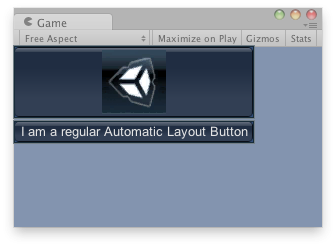
Buttons in the Game View.
JavaScript
// Draws a button with an image and a button with text
var tex : Texture;
function OnGUI() {
    if(!tex) {
        Debug.LogError("No texture found, please assign a texture on the inspector");
    }

    if(GUILayout.Button (tex)) {
        Debug.Log("Clicked the image");
    }
    if(GUILayout.Button ("I am a regular Automatic Layout Button")) {
        Debug.Log("Clicked Button");
    }
}
using UnityEngine;
using System.Collections;

public class example : MonoBehaviour {
    public Texture tex;
    void OnGUI() {
        if (!tex)
            Debug.LogError("No texture found, please assign a texture on the inspector");

        if (GUILayout.Button(tex))
            Debug.Log("Clicked the image");

        if (GUILayout.Button("I am a regular Automatic Layout Button"))
            Debug.Log("Clicked Button");

    }
}
import UnityEngine
import System.Collections

class example(MonoBehaviour):

    public tex as Texture

    def OnGUI():
        if not tex:
            Debug.LogError('No texture found, please assign a texture on the inspector')
        if GUILayout.Button(tex):
            Debug.Log('Clicked the image')
        if GUILayout.Button('I am a regular Automatic Layout Button'):
            Debug.Log('Clicked Button')