Vector API を使用して放射状の進捗インジケーターを作成
バージョン: 2023.2 以降
この例では、カスタムコントロールを作成し、Vector API を使用してビジュアル要素にビジュアルコンテンツを描画する方法について説明します。
例の概要
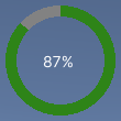
この例では、プログレスバーの代わりに進行状況を表示するカスタムコントロールを作成します。進捗インジケーターは、パーセントを表示するラベルの周囲に、部分的に塗りつぶされた輪で進捗値を表示します。0 から 100 の間の値で表示され、その値に対応して輪がどの程度塗りつぶされるかが決定されます。
この例で作成する完成したファイルは、こちらの GitHub リポジトリにあります。
必要な要件
このガイドは、Unity エディター、UI Toolkit、および C# スクリプトに精通している開発者を対象としています。始める前に、以下の点を理解しておいてください。
放射状の進捗コントロールとそのカスタムメッシュの作成
ビジュアル要素 RadialProgress を定義する C# スクリプトと、カスタムメッシュを定義する C# スクリプトを作成します。USS ファイルでビジュアル要素のスタイルを設定します。
- 任意のテンプレートで Unity プロジェクトを作成します。
- ファイルを保存するための
radial-progressという名前のフォルダーを作成します。 -
radial-progressフォルダーに、以下の内容の C# スクリプトを作成しRadialProgress.csと命名します。
using Unity.Collections;
using UnityEngine;
using UnityEngine.UIElements;

namespace MyGameUILibrary
{

    // An element that displays progress inside a partially filled circle
    [UxmlElement]
    public partial class RadialProgress : VisualElement
    {

        // These are USS class names for the control overall and the label.
        public static readonly string ussClassName = "radial-progress";
        public static readonly string ussLabelClassName = "radial-progress__label";

        // These objects allow C# code to access custom USS properties.
        static CustomStyleProperty<Color> s_TrackColor = new CustomStyleProperty<Color>("--track-color");
        static CustomStyleProperty<Color> s_ProgressColor = new CustomStyleProperty<Color>("--progress-color");

        Color m_TrackColor = Color.gray;
        Color m_ProgressColor = Color.red;

        // This is the label that displays the percentage.
        Label m_Label;

        // This is the number that the Label displays as a percentage.
        float m_Progress;

        // A value between 0 and 100
        [UxmlAttribute]
        public float progress
        {
            // The progress property is exposed in C#.
            get => m_Progress;
            set
            {
                // Whenever the progress property changes, MarkDirtyRepaint() is named. This causes a call to the
                // generateVisualContents callback.
                m_Progress = value;
                m_Label.text = Mathf.Clamp(Mathf.Round(value), 0, 100) + "%";
                MarkDirtyRepaint();
            }
        }

        // This default constructor is RadialProgress's only constructor.
        public RadialProgress()
        {
            // Create a Label, add a USS class name, and add it to this visual tree.
            m_Label = new Label();
            m_Label.AddToClassList(ussLabelClassName);
            Add(m_Label);

            // Add the USS class name for the overall control.
            AddToClassList(ussClassName);

            // Register a callback after custom style resolution.
            RegisterCallback<CustomStyleResolvedEvent>(evt => CustomStylesResolved(evt));

            // Register a callback to generate the visual content of the control.
            generateVisualContent += GenerateVisualContent;

            progress = 0.0f;
        }

        static void CustomStylesResolved(CustomStyleResolvedEvent evt)
        {
            RadialProgress element = (RadialProgress)evt.currentTarget;
            element.UpdateCustomStyles();
        }

        // After the custom colors are resolved, this method uses them to color the meshes and (if necessary) repaint
        // the control.
        void UpdateCustomStyles()
        {
            bool repaint = false;
            if (customStyle.TryGetValue(s_ProgressColor, out m_ProgressColor))
                repaint = true;

            if (customStyle.TryGetValue(s_TrackColor, out m_TrackColor))
                repaint = true;

            if (repaint)
                MarkDirtyRepaint();
        }

        void GenerateVisualContent(MeshGenerationContext context)
        {
            float width = contentRect.width;
            float height = contentRect.height;

            var painter = context.painter2D;
            painter.lineWidth = 10.0f;
            painter.lineCap = LineCap.Butt;

            // Draw the track
            painter.strokeColor = m_TrackColor;
            painter.BeginPath();
            painter.Arc(new Vector2(width * 0.5f, height * 0.5f), width * 0.5f, 0.0f, 360.0f);
            painter.Stroke();

            // Draw the progress
            painter.strokeColor = m_ProgressColor;
            painter.BeginPath();
            painter.Arc(new Vector2(width * 0.5f, height * 0.5f), width * 0.5f, -90.0f, 360.0f * (progress / 100.0f) - 90.0f);
            painter.Stroke();
        }
    }
}
カスタムコントロールのスタイル設定
以下のコンテンツで RadialProgress.uss という名前の USS ファイルを作成します。
.radial-progress {
        min-width: 26px;
        min-height: 20px;
        --track-color: rgb(130, 130, 130);
        --progress-color: rgb(46, 132, 24);
        --percentage-color: white;
        margin-left: 5px;
        margin-right: 5px;
        margin-top: 5px;
        margin-bottom: 5px;
        flex-direction: row;
        justify-content: center;
        width: 100px;
        height: 100px;
    }

    .radial-progress__label {
        -unity-text-align: middle-left;
        color: var(--percentage-color);
    }
UI Document でのカスタムコントロールの使用
UI Builder を使用してコントロールを追加し、USS スタイルシートを適用します。コントロールをさまざまな Progress 値でテストします。
-
RadialProgressExample.uxmlという名前の UI Document を作成します。 -
RadialProgressExample.uxmlをダブルクリックして UI Builder で開きます。 - Library ウィンドウで、Project > Custom Controls > MyUILibrary の順に選択します。
- RadialProgress を Hierarchy ウィンドウにドラッグします。
- UI Builder の StyleSheets セクションで、既存の USS として
RadialProgress.ussを追加します。 - Hierarchy ウィンドウで、RadialProgress を選択します。
- Inspector ウィンドウで、Name ボックスに
radial-progressと入力します。 - Inspector ウィンドウで、Progress ボックスに異なる値を入力します。Viewport 内のパーセンテージが変更され、緑色のプログレスリングのサイズが変更されます。
動的値で進捗を更新するロジックの作成
デモ用に、C# MonoBehaviour スクリプトを作成し、コントロールの Progress プロパティを動的値で更新します。radial-progress フォルダーに、以下の内容の C# MonoBehaviour を RadialProgressComponent.cs という名前で作成します。
using MyUILibrary;
using UnityEngine;
using UnityEngine.UIElements;

[RequireComponent(typeof(UIDocument))]
public class RadialProgressComponent : MonoBehaviour
{
    RadialProgress m_RadialProgress;

    void Start()
    {
        var root = GetComponent<UIDocument>().rootVisualElement;

       m_RadialProgress = new RadialProgress() {
            style = {
                position = Position.Absolute,
                left = 20, top = 20, width = 200, height = 200
            }
        };

        root.Add(m_RadialProgress);
    }

    void Update()
    {
        m_RadialProgress.progress = ((Mathf.Sin(Time.time) + 1.0f) / 2.0f) * 60.0f + 10.0f;
    }
}
ランタイムでの進捗インジケーターのテスト
- Unity で、GameObject > UI Toolkit > UI Document の順に選択します。
- Hierarchy ウィンドウで、UIDocument を選択します。
- UIDocument ゲームオブジェクトのコンポーネントとして RadialProgressComponent.cs を追加します。
- 再生モードに切り替えます。進捗インジケーターがシーンに表示され、プログレスリングと値が動的に変化します。