使用矢量 API 创建径向进度指示器
版本:2023.2+
此示例演示了如何创建自定义控件和使用矢量 API 将视觉内容绘制到视觉元素上。
示例概述
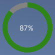
此示例创建一个显示进度的自定义控件,作为加载栏的替代项。进度指示器在显示百分比的标签周围以部分填充的圆环显示进度值。它支持 0 到 100 之间的值,用于确定环的填充量。
可以在此 GitHub 代码仓库中找到此示例创建的完整文件。
先决条件
本指南适用于熟悉 Unity 编辑器、UI 工具包和 C# 脚本的开发者。在开始之前,请熟悉以下内容:
创建径向进度控件及其自定义网格
创建一个 C# 脚本来定义 RadialProgress 视觉元素,并创建一个 C# 脚本来定义自定义网格。使用 USS 文件设置视觉元素的样式。
- 使用任何模板创建 Unity 项目。
- 创建名为
radial-progress的文件夹来存储文件。 - 在
radial-progress文件夹中,创建一个名为RadialProgress.cs的 C# 脚本,其中包含以下内容:
using Unity.Collections;
using UnityEngine;
using UnityEngine.UIElements;

namespace MyGameUILibrary
{

    // An element that displays progress inside a partially filled circle
    [UxmlElement]
    public partial class RadialProgress : VisualElement
    {

        // These are USS class names for the control overall and the label.
        public static readonly string ussClassName = "radial-progress";
        public static readonly string ussLabelClassName = "radial-progress__label";

        // These objects allow C# code to access custom USS properties.
        static CustomStyleProperty<Color> s_TrackColor = new CustomStyleProperty<Color>("--track-color");
        static CustomStyleProperty<Color> s_ProgressColor = new CustomStyleProperty<Color>("--progress-color");

        Color m_TrackColor = Color.gray;
        Color m_ProgressColor = Color.red;

        // This is the label that displays the percentage.
        Label m_Label;

        // This is the number that the Label displays as a percentage.
        float m_Progress;

        // A value between 0 and 100
        [UxmlAttribute]
        public float progress
        {
            // The progress property is exposed in C#.
            get => m_Progress;
            set
            {
                // Whenever the progress property changes, MarkDirtyRepaint() is named. This causes a call to the
                // generateVisualContents callback.
                m_Progress = value;
                m_Label.text = Mathf.Clamp(Mathf.Round(value), 0, 100) + "%";
                MarkDirtyRepaint();
            }
        }

        // This default constructor is RadialProgress's only constructor.
        public RadialProgress()
        {
            // Create a Label, add a USS class name, and add it to this visual tree.
            m_Label = new Label();
            m_Label.AddToClassList(ussLabelClassName);
            Add(m_Label);

            // Add the USS class name for the overall control.
            AddToClassList(ussClassName);

            // Register a callback after custom style resolution.
            RegisterCallback<CustomStyleResolvedEvent>(evt => CustomStylesResolved(evt));

            // Register a callback to generate the visual content of the control.
            generateVisualContent += GenerateVisualContent;

            progress = 0.0f;
        }

        static void CustomStylesResolved(CustomStyleResolvedEvent evt)
        {
            RadialProgress element = (RadialProgress)evt.currentTarget;
            element.UpdateCustomStyles();
        }

        // After the custom colors are resolved, this method uses them to color the meshes and (if necessary) repaint
        // the control.
        void UpdateCustomStyles()
        {
            bool repaint = false;
            if (customStyle.TryGetValue(s_ProgressColor, out m_ProgressColor))
                repaint = true;

            if (customStyle.TryGetValue(s_TrackColor, out m_TrackColor))
                repaint = true;

            if (repaint)
                MarkDirtyRepaint();
        }

        void GenerateVisualContent(MeshGenerationContext context)
        {
            float width = contentRect.width;
            float height = contentRect.height;

            var painter = context.painter2D;
            painter.lineWidth = 10.0f;
            painter.lineCap = LineCap.Butt;

            // Draw the track
            painter.strokeColor = m_TrackColor;
            painter.BeginPath();
            painter.Arc(new Vector2(width * 0.5f, height * 0.5f), width * 0.5f, 0.0f, 360.0f);
            painter.Stroke();

            // Draw the progress
            painter.strokeColor = m_ProgressColor;
            painter.BeginPath();
            painter.Arc(new Vector2(width * 0.5f, height * 0.5f), width * 0.5f, -90.0f, 360.0f * (progress / 100.0f) - 90.0f);
            painter.Stroke();
        }
    }
}
设置自定义控件的样式
创建名为 RadialProgress.uss 的 USS 文件,其中包含以下内容:
.radial-progress {
        min-width: 26px;
        min-height: 20px;
        --track-color: rgb(130, 130, 130);
        --progress-color: rgb(46, 132, 24);
        --percentage-color: white;
        margin-left: 5px;
        margin-right: 5px;
        margin-top: 5px;
        margin-bottom: 5px;
        flex-direction: row;
        justify-content: center;
        width: 100px;
        height: 100px;
    }

    .radial-progress__label {
        -unity-text-align: middle-left;
        color: var(--percentage-color);
    }
在 UI 文档中使用自定义控件并进行测试
使用__ UI__(即用户界面,User Interface)让用户能够与您的应用程序进行交互。Unity 目前支持三种 UI 系统。更多信息
See in Glossary Builder 添加控件,并应用 USS 样式表。使用不同的 Progress 值测试控件。
- 创建名为
RadialProgressExample.uxml的 UI 文档。 - 双击
RadialProgressExample.uxml可在 UI Builder 中将其打开。 - 在库 (Library) 窗口中,选择项目 (Project) > 自定义控件 (Custom Controls) > MyUILibrary。
- 将 RadialProgress 拖动到层级视图 (Hierarchy) 窗口。
- 在 UI Builder 的样式表 (StyleSheets) 部分中,添加
RadialProgress.uss作为现有 USS。 - 在层级视图 (Hierarchy) 窗口中,选择 RadialProgress。
- 在检视面板 (Inspector) 窗口中,在名称 (Name) 框中输入
radial-progress。 - 在检视面板 (Inspector) 窗口中,在进度 (Progress) 框中输入不同的值。视口 (Viewport) 中的百分比会发生变化,绿色进度环会调整大小。
创建用动态值更新进度的逻辑
创建一个 C# MonoBehaviour 脚本,通过动态值更新控件的 Progress 属性,以用于演示。在 radial-progress 文件夹中,创建一个名为 RadialProgressComponent.cs 的 C# MonoBehaviour,其中包含以下内容:
using MyUILibrary;
using UnityEngine;
using UnityEngine.UIElements;

[RequireComponent(typeof(UIDocument))]
public class RadialProgressComponent : MonoBehaviour
{
    RadialProgress m_RadialProgress;

    void Start()
    {
        var root = GetComponent<UIDocument>().rootVisualElement;

       m_RadialProgress = new RadialProgress() {
            style = {
                position = Position.Absolute,
                left = 20, top = 20, width = 200, height = 200
            }
        };

        root.Add(m_RadialProgress);
    }

    void Update()
    {
        m_RadialProgress.progress = ((Mathf.Sin(Time.time) + 1.0f) / 2.0f) * 60.0f + 10.0f;
    }
}
在运行时测试进度指示器
- 在 Unity 中,选择游戏对象 (GameObject) > UI 工具包 (UI Toolkit) > UI 文档 (UI Document)。
- 在层级视图 (Hierarchy) 窗口中选择 UIDocument。
- 将 RadialProgressComponent.cs 添加为 UIDocument 游戏对象的组件。
- 进入运行模式。进度指示器将显示在场景中,且进度环和值会动态变化。