UI Builder
Table of Contents
UI Builder enables you to create, visualize, and modify UXML and USS files in a visual interface that’s integrated into the main Editor. Let’s look at the key features of__ UI__(即用户界面,User Interface)让用户能够与您的应用程序进行交互。Unity 目前支持三种 UI 系统。更多信息
See in Glossary Builder:
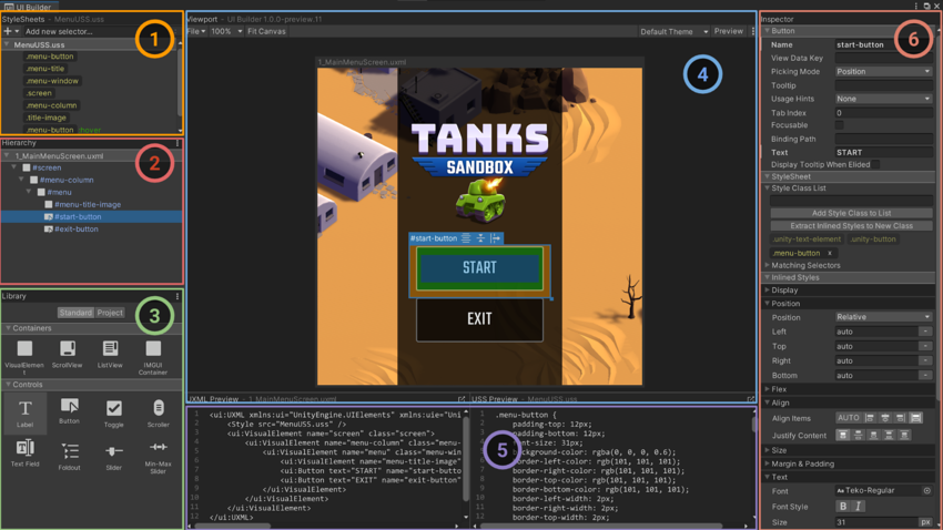
- StyleSheets: This is where you manage layout and styling formatting rules (also known as USS selectors) to share styles across UXML Documents and UI elements.
- Hierarchy: Similar to the Scene view, it displays the hierarchy of visual elements in your UXML document.
- Library: This contains predefined or custom controls ready to be added to your hierarchy, like buttons, labels, and sliders. From here you can also add other UXML (templates) into your current UXML.
- Viewport: This shows how your interface looks; you can edit elements directly in the Canvas using gizmos.
- Code Previews: This shows the code that the UI Builder is creating behind the scenes for both the UI Document (UXML) and the StyleSheets (USS). You may have to resize the window in order to see it properly.
- Inspector: Use it to change the attributes and style properties of the selected element or USS selector.
💡 Tip: Saving UI assets
In UI Builder, save your changes from the Viewport menu (File > Save). This saves all open UXML and USS files.
Unlike Unity UI, the game can run in the Editor while you actively make changes in UI Toolkit. Look for the asterisk * next to the file name in the UI Builder’s Canvas header; this indicates unsaved changes.
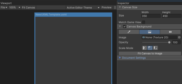
Canvas background
Enabling the Canvas background can help you visualize your element styling over a color or background image. Select the UXML file in the Hierarchy pane and then choose a Canvas background that approximates the final UI interface to judge style changes in context.
The Canvas background provides a few different options:
Background Color: Represents a specific shade or hue of the game environment
Image: For choosing a sprite or texture as the background (useful for replicating mockup screens or reference art)
Camera: Displays the current gameplay in the background, enabling you to see the UI in context of the actual game
Viewport settings
To navigate the work area, adjust the zoom level (between 25%–500%), or choose the Fit Canvas option which automatically adjusts the zoom according to the current screen real estate.
Use Preview to visualize the UI without accidentally editing the selected elements. When active, the Viewport can also show styles applied for specific mouse events (e.g., hovering, focusing).
💡 Tip: Match Game view and themes
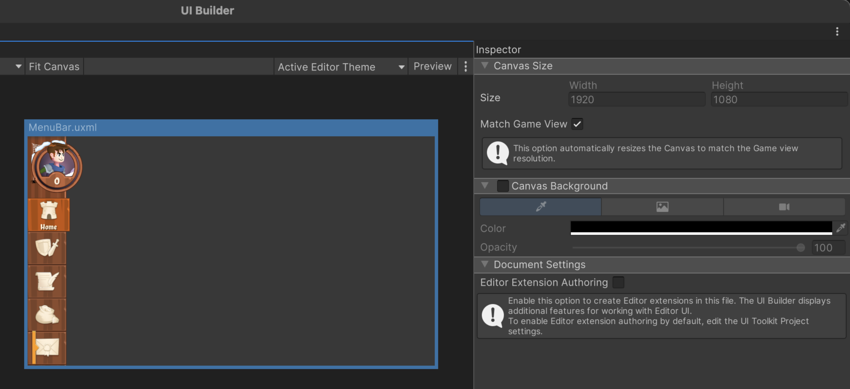
To approximate a runtime UI, select the currently loaded UI Document (UXML) in the Hierarchy and check Match Game View. This sizes the Viewport to your project Reference Resolution. Remember that modifying this parameter does not affect the UI files themselves, only the visualization. From UI Builder you can also previsualize different themes used in your project, a feature that’s covered later in the guide.