Get started with in-scene UI authoring
This example shows how to create UI with in-scene UI authoring. It follows the same workflow as Get started with UI Builder, but uses in-scene UI authoring instead.
Prerequisites
Before you start, familiarize yourself with the following:
- Introduction to visual elements and visual tree
- Introduction to UXML
- Introduction to USS
- UI authoring interface
Example overview
This example creates the same character selection screen as Get started with UI Builder, using in-scene UI authoring instead.
Create the root element
Create a root visual element that covers the entire screen. Set your root element to have a background color and center all child elements in the middle of the screen.
To create the root element:
Create a project in Unity with any template.
Create a Panel Renderer and a UXML Document named as
MainView.uxml. For instructions, refer to Create a Panel Renderer and a UXML Document.In the Hierarchy window, select the arrow icon (>) next to
MainView.uxmlto enter the UI Staging mode.-
In the UI Staging mode, right-click anywhere in the Hierarchy window, and select UI Toolkit > Standard Elements > Visual Element to add a visual Element as the root element.
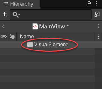
Create new elements with in-scene UI authoring Select the element from the Hierarchy panel.
-
In the Inspector panel, make sure Flex > Grow is
1. This sets theflex-growproperty to1, making it cover the entire screen.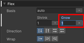
Set the Flex property -
To center all child elements, set both Align Items and Justify Content to
Center.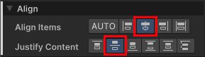
Center children -
Set Background > Color to
#732526.Note: By default, the Alpha value for colors is
0, making them fully transparent. To make color opaque, set the Alpha value to255.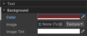
Root element background color
Create the parent container
Create a new visual element underneath the root element. This element becomes the parent container for the left and right sections of the UI.
To create the parent container:
Right-click the visual element you just created in the Hierarchy window. Select Standard Elements > Visual Element to add a child visual element.
Select the element from the Hierarchy panel.
In the Inspector panel, set Flex > Direction to
row.Set Flex > Grow to
0.-
Set Size > Height to
350pixels.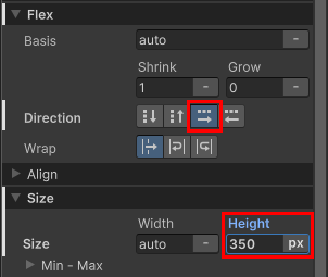
Center container properties
Create the character names list container
Add a list view as the child element of the container to hold the character names.
To create the character names list container:
Select the visual element you just created and select Standard Elements > UI Library.
Under Containers, drag List View to the container visual element in the Hierarchy window.
Select the element from the Hierarchy window.
-
In the Inspector window, set its name to
CharacterList.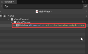
Background container with the empty element inside Set Size > Width to
230pixels.-
Set Spacing > Margin > Right to
6pixels.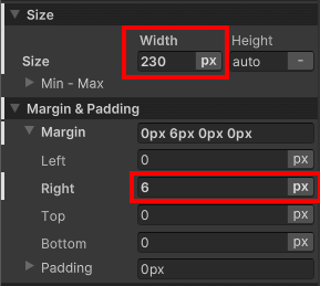
Size and Margin foldouts for the character list Set Background > Color to
#6E3925.Set Border > Color to
#311A11.Set Border > Width to
4pixels.-
Set Border > Radius to
15pixels.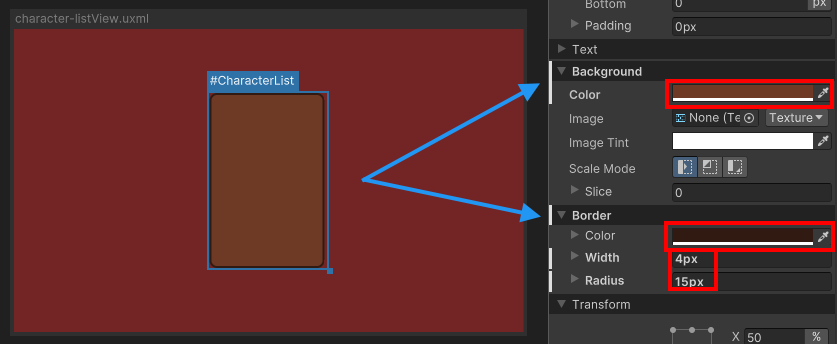
Styled character list
Create the character details container
Add a new visual element under the same parent as the #CharacterList to hold the character details container. The purpose is that when the user selects a character from the list on the left, it displays the character’s portrait, name, and class.
To create the character details container:
Right-click the parent container visual element in the Hierarchy window. Select Standard Elements > Visual Element.
Select the element from the Hierarchy panel.
In the Inspector panel, set Align > Align Items to
flex-end.-
Set Align > Justify Content to
space-between.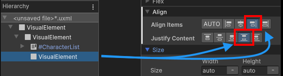
Justify content property Add another VisualElement as the child of the right container.
Select the element from the Hierarchy panel.
Set Flex > Grow to
0.Set Size > Width to
276pixels.In the Align section, set both Align Items and Justify Content to
Center.-
Set Spacing > Padding to
8pixels.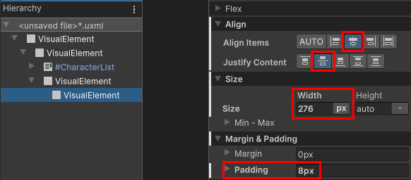
Properties of the character details container Set Background > Color to
#AA5939.
Create a USS class for the border style
The character details container uses the same border styles as the character names list container. Create a USS class to apply to both containers.
To create a USS class for the border style:
- Select Window > UI Toolkit > Style Sheets to open the Style Sheets window.
- In the Style Sheets panel, select + > Create New USS.
- Name it
MainView.ussand select Save. - Click in the Add new selector… field and enter
.border. A.borderselector appears in the Style Sheets panel. - In the Style Sheets panel, select
.border. - In the Inspector panel, set Border > Color to
#311A11. - Set Border > Width to
4pixels. - Set Border > Radius to
15pixels. - Drag
.borderfrom the Style Sheets panel to the character details container VisualElement. - Drag
.borderfrom the Style Sheets panel to #CharacterList. - Select #CharacterList.
- In the Inspector panel, right-click Border and select Unset to remove the inline style you set earlier.
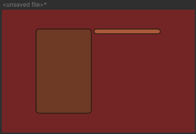
Your UI layout now looks like the following:
Create the character portrait background
Add the individual UI controls to the character details container. The first step is to add the character portrait background.
To create the character portrait background:
Add a visual element to the child of the character details container.
Select the element from the Hierarchy panel.
In the Size section, set both Width and Height to
120pixels.Set Spacing > Padding to
4pixels.Set Background > Color to
#FF8554.Set Border > Color to
#311A11.Set Border > Width to
2pixels.-
Set Border > Radius to
13pixels.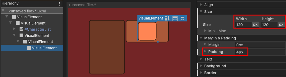
Background frame for the character portrait
Create labels
Add two label controls to the character details container to display the selected character’s name and class.
To create labels:
Right-click the parent of the visual element you just created in the Hierarchy window and select Standard Elements > Label.
Set its name to
CharacterName.Create another Label from the character details container in the Hierarchy window.
-
Set its name to
CharacterClass.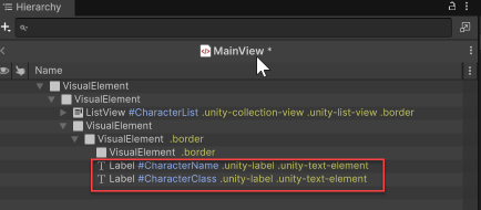
Add labels for name and class Select the
#CharacterNameelement.Set Text > Font Style to
B.Set Text > Size to
18pixels.Select File > Save to save the changes to
MainView.uxml.
Extract inline styles
In the in-scene UI authoring, you can create elements and use inline styles only to experiment while the number of elements is still small. As you build a more complex UI, it’s easier to manage styles using style sheets. You can extract inline styles to a style sheet in in-scene UI authoring.
To extract inline styles to a style sheet:
Select the root visual element.
In the Inspector panel, in the Style Class List field, enter
.backgroundas the class name.-
Select Extract Inlined Styles to New Class. This creates a
.backgroundclass selector with the inline styles you set for the root element and updates the UI Document (UXML) for the root visual element to use the class selector instead of the inline styles.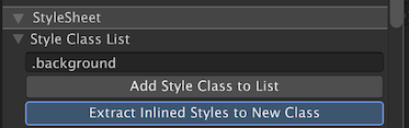
Extract inline styles to a new class Select File > Save.
If you want to continue to work on the Create a list view runtime UI example, you can repeat the steps to extract styles for all the other elements, and follow the instructions to create the example.