スライドトグルカスタムコントロールの作成
バージョン: 2023.2 以降
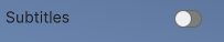
この例では、“スイッチのような” トグルを作成する方法を説明します。
例の概要
この例では、ユーザーがマウス、キーボード、ゲームパッド、およびその他のデバイスで反転できるトグルというカスタムコントロールを作成します。トグルが何を表しているかを示すラベルが付いています。
この例で作成する完成したファイルは、こちらの GitHub リポジトリにあります。
必要な要件
このガイドは、Unity エディター、UI Toolkit、および C# スクリプトに精通している開発者を対象としています。始める前に、以下の点を理解しておいてください。
スライドトグルクラスの作成
C# スクリプトでスライドトグルのクラスを作成します。
- 3D テンプレートを使用して Unity プロジェクトを作成します。この例では、3D テンプレートの方が高い視覚効果を得られます。ただし、任意のテンプレートを使用できます。
- ファイルを保存するための
slide-toggleという名前のフォルダーを作成します。 -
slide-toggleフォルダーにSlideToggle.csという名前の C# スクリプトを作成します。 - テキストエディターで
SlideToggle.csを開き、そのコンテンツを以下のコードに置き換えます。
using UnityEngine;
using UnityEngine.UIElements;

namespace MyUILibrary
{
    // Derives from BaseField<bool> base class. Represents a container for its input part.
    [UxmlElement]
    public partial class SlideToggle : BaseField<bool>
    {
        // In the spirit of the BEM standard, the SlideToggle has its own block class and two element classes. It also
        // has a class that represents the enabled state of the toggle.
        public static readonly new string ussClassName = "slide-toggle";
        public static readonly new string inputUssClassName = "slide-toggle__input";
        public static readonly string inputKnobUssClassName = "slide-toggle__input-knob";
        public static readonly string inputCheckedUssClassName = "slide-toggle__input--checked";

        VisualElement m_Input;
        VisualElement m_Knob;

        // Custom controls need a default constructor. This default constructor calls the other constructor in this
        // class.
        public SlideToggle() : this(null) { }

        // This constructor allows users to set the contents of the label.
        public SlideToggle(string label) : base(label, null)
        {
            // Style the control overall.
            AddToClassList(ussClassName);

            // Get the BaseField's visual input element and use it as the background of the slide.
            m_Input = this.Q(className: BaseField<bool>.inputUssClassName);
            m_Input.AddToClassList(inputUssClassName);

            // Create a "knob" child element for the background to represent the actual slide of the toggle.
            m_Knob = new();
            m_Knob.AddToClassList(inputKnobUssClassName);
            m_Input.Add(m_Knob);

            // There are three main ways to activate or deactivate the SlideToggle. All three event handlers use the
            // static function pattern described in the Custom control best practices.

            // ClickEvent fires when a sequence of pointer down and pointer up actions occurs.
            RegisterCallback<ClickEvent>(evt => OnClick(evt));
            // KeydownEvent fires when the field has focus and a user presses a key.
            RegisterCallback<KeyDownEvent>(evt => OnKeydownEvent(evt));
            // NavigationSubmitEvent detects input from keyboards, gamepads, or other devices at runtime.
            RegisterCallback<NavigationSubmitEvent>(evt => OnSubmit(evt));
        }

        static void OnClick(ClickEvent evt)
        {
            var slideToggle = evt.currentTarget as SlideToggle;
            slideToggle.ToggleValue();

            evt.StopPropagation();
        }

        static void OnSubmit(NavigationSubmitEvent evt)
        {
            var slideToggle = evt.currentTarget as SlideToggle;
            slideToggle.ToggleValue();

            evt.StopPropagation();
        }

        static void OnKeydownEvent(KeyDownEvent evt)
        {
            var slideToggle = evt.currentTarget as SlideToggle;

            // NavigationSubmitEvent event already covers keydown events at runtime, so this method shouldn't handle
            // them.
            if (slideToggle.panel?.contextType == ContextType.Player)
                return;

            // Toggle the value only when the user presses Enter, Return, or Space.
            if (evt.keyCode == KeyCode.KeypadEnter || evt.keyCode == KeyCode.Return || evt.keyCode == KeyCode.Space)
            {
                slideToggle.ToggleValue();
                evt.StopPropagation();
            }
        }

        // All three callbacks call this method.
        void ToggleValue()
        {
            value = !value;
        }

        // Because ToggleValue() sets the value property, the BaseField class dispatches a ChangeEvent. This results in a
        // call to SetValueWithoutNotify(). This example uses it to style the toggle based on whether it's currently
        // enabled.
        public override void SetValueWithoutNotify(bool newValue)
        {
            base.SetValueWithoutNotify(newValue);

            //This line of code styles the input element to look enabled or disabled.
            m_Input.EnableInClassList(inputCheckedUssClassName, newValue);
        }
    }
}
スライドトグルのスタイル設定
USS ファイルを使用してスライドトグルのスタイルを設定します。
-
slide-toggleフォルダーに、SlideToggle.ussという名前の USS ファイルを作成します。 - テキストエディターで
SlideToggle.ussを開き、そのコンテンツを以下のコードに置き換えます。
.slide-toggle__input {
    background-color: var(--unity-colors-slider_groove-background);
    max-width: 25px;
    border-top-left-radius: 8px;
    border-bottom-left-radius: 8px;
    border-top-right-radius: 8px;
    border-bottom-right-radius: 8px;
    overflow: visible;
    border-left-width: 1px;
    border-right-width: 1px;
    border-top-width: 1px;
    border-bottom-width: 1px;
    border-right-color: var(--unity-colors-slider_thumb-border);
    border-top-color: var(--unity-colors-slider_thumb-border);
    border-bottom-color: var(--unity-colors-slider_thumb-border);
    max-height: 16px;
    margin-top: 10px;
    border-left-color: var(--unity-colors-slider_thumb-border);
    transition-property: background-color;
    transition-duration: 0.5s;
}

.slide-toggle__input-knob {
    height: 16px;
    width: 16px;
    background-color: var(--unity-colors-slider_thumb-background);
    position: absolute;
    border-top-left-radius: 25px;
    border-bottom-left-radius: 25px;
    border-top-right-radius: 25px;
    border-bottom-right-radius: 25px;
    top: -1px;
    transition-property: translate, background-color;
    transition-duration: 0.5s, 0.5s;
    translate: -1px 0;
    border-left-width: 1px;
    border-right-width: 1px;
    border-top-width: 1px;
    border-bottom-width: 1px;
    border-left-color: var(--unity-colors-slider_thumb-border);
    border-right-color: var(--unity-colors-slider_thumb-border);
    border-top-color: var(--unity-colors-slider_thumb-border);
    border-bottom-color: var(--unity-colors-slider_thumb-border);
}

.slide-toggle__input--checked {
    background-color: rgb(0, 156, 10);
}

.slide-toggle__input--checked > .slide-toggle__input-knob {
    translate: 8px 0;
}

.slide-toggle:focus .slide-toggle__input-knob {
    border-left-width: 1px;
    border-right-width: 1px;
    border-top-width: 1px;
    border-bottom-width: 1px;
    border-left-color: var(--unity-colors-input_field-border-focus);
    border-right-color: var(--unity-colors-input_field-border-focus);
    border-top-color: var(--unity-colors-input_field-border-focus);
    border-bottom-color: var(--unity-colors-input_field-border-focus);
}
UI Builder を使って UXML ファイルへスライドトグルを追加する
-
slide-toggleフォルダーに、SlideToggleUsage.uxmlという名前の UI Document ファイルを作成します。 - UI Builder で
SlideToggleUsage.uxmlを開きます。 - UI Builder で、Library > Project > MyUILibrary を選択します。
- SlideToggle を Hierarchy ウィンドウにドラッグします。
- Inspector で、Label フィールドにトグルのラベルテキストを入力します。
-
StyleSheets セクションに、既存の USS として
SlideToggle.ussを追加します。 - UI Builder を保存して終了します。
スライドトグルのテスト
- サンプルシーンで、UI Document ゲームオブジェクトを作成します。
- UI Document を選択し、
SlideToggleUsage.uxmlを Inspector の Source Asset フィールドにドラッグします。 - 再生モードに切り替えます。トグルをクリックする、Enter キーを押す、Return キーを押す、または Space キーを押すと、トグルを前後に切り替えることができます。