Controls
IMGUI Control Types
There are a number of different IMGUI Controls that you can create. This section lists all of the available display and interactive Controls. There are other IMGUI functions that affect layout of Controls, which are described in the Layout section of the Guide.
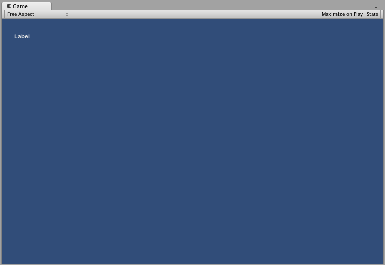
Label
The Label is non-interactive. It is for display only. It cannot be clicked or otherwise moved. It is best for displaying information only.
/* GUI.Label example */

using UnityEngine;
using System.Collections;

public class GUITest : MonoBehaviour
{

    void OnGUI ()
    {
        GUI.Label (new Rect (25, 25, 100, 30), "Label");
    }

}
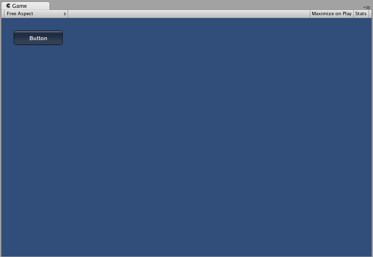
Button
The Button is a typical interactive button. It will respond a single time when clicked, no matter how long the mouse remains depressed. The response occurs as soon as the mouse button is released.
Basic Usage
In UnityGUI, Buttons will return true when they are clicked. To execute some code when a Button is clicked, you wrap the the GUI.Button function in an if statement. Inside the if statement is the code that will be executed when the Button is clicked.
/* GUI.Button example */

using UnityEngine;
using System.Collections;

public class GUITest : MonoBehaviour
{

    void OnGUI ()
    {
        if (GUI.Button (new Rect (25, 25, 100, 30), "Button"))
        {
            // This code is executed when the Button is clicked
        }
    }

}
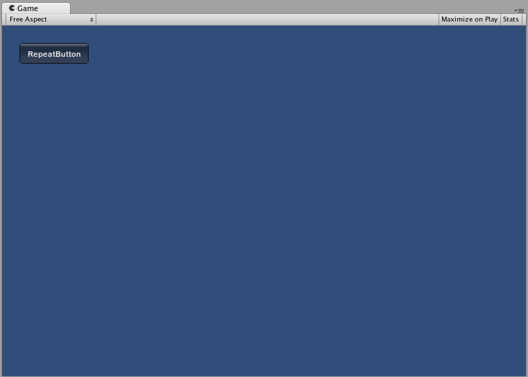
RepeatButton
RepeatButton is a variation of the regular Button. The difference is, RepeatButton will respond every frame that the mouse button remains depressed. This allows you to create click-and-hold functionality.
Basic Usage
In UnityGUI, RepeatButtons will return true for every frame that they are clicked. To execute some code while the Button is being clicked, you wrap the the GUI.RepeatButton function in an if statement. Inside the if statement is the code that will be executed while the RepeatButton remains clicked.
/* GUI.RepeatButton example */

using UnityEngine;
using System.Collections;

public class GUITest : MonoBehaviour
{

    void OnGUI ()
    {
        if (GUI.RepeatButton (new Rect (25, 25, 100, 30), "RepeatButton"))
        {
            // This code is executed every frame that the RepeatButton remains clicked
        }
    }

}
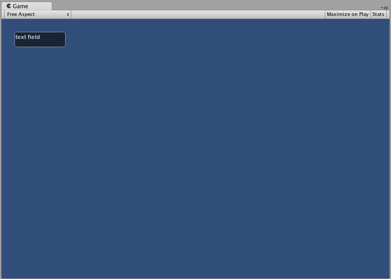
TextField
The TextField Control is an interactive, editable single-line field containing a text string.
Basic Usage
The TextField will always display a string. You must provide the string to be displayed in the TextField. When edits are made to the string, the TextField function will return the edited string.
/* GUI.TextField example */

using UnityEngine;
using System.Collections;

public class GUITest : MonoBehaviour
{

    private string textFieldString = "text field";

    void OnGUI ()
    {
        textFieldString = GUI.TextField (new Rect (25, 25, 100, 30), textFieldString);
    }

}
TextArea
The TextArea Control is an interactive, editable multi-line area containing a text string.
Basic Usage
The TextArea will always display a string. You must provide the string to be displayed in the TextArea. When edits are made to the string, the TextArea function will return the edited string.
/* GUI.TextArea example */

using UnityEngine;
using System.Collections;

public class GUITest : MonoBehaviour
{

    private string textAreaString = "text area";

    void OnGUI ()
    {
        textAreaString = GUI.TextArea (new Rect (25, 25, 100, 30), textAreaString);
    }

}

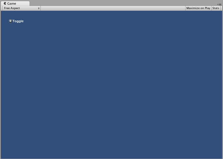
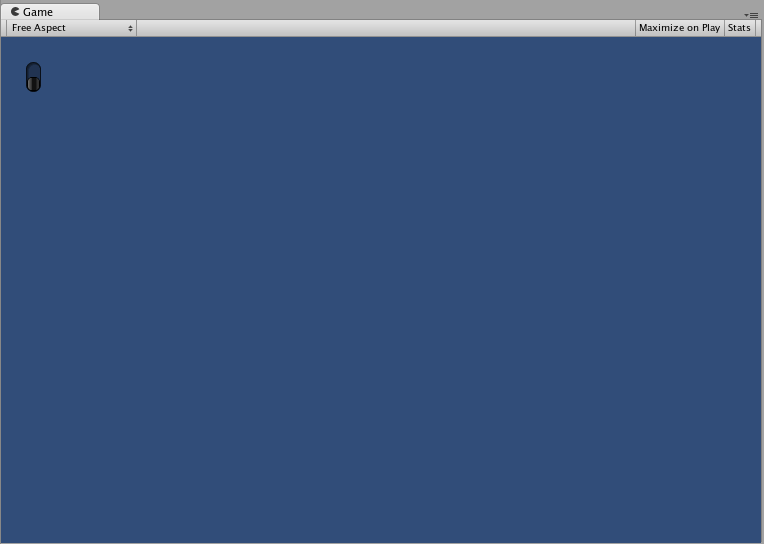
Toggle
The ToggleA checkbox that allows the user to switch an option on or off. More info
See in Glossary Control creates a checkbox with a persistent on/off state. The user can change the state by clicking on it.
Basic Usage
The Toggle on/off state is represented by a true/false boolean. You must provide the boolean as a parameter to make the Toggle represent the actual state. The Toggle function will return a new boolean value if it is clicked. In order to capture this interactivity, you must assign the boolean to accept the return value of the Toggle function.
/* GUI.Toggle example */

using UnityEngine;
using System.Collections;

public class GUITest : MonoBehaviour
{
    private bool toggleBool = true;

    void OnGUI ()
    {
        toggleBool = GUI.Toggle (new Rect (25, 25, 100, 30), toggleBool, "Toggle");
    }
}
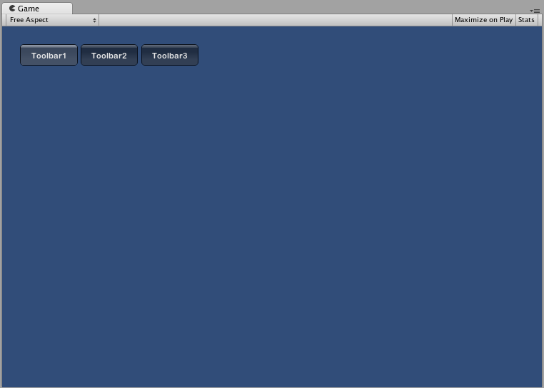
Toolbar
The ToolbarA row of buttons and basic controls at the top of the Unity Editor that allows you to interact with the Editor in various ways (e.g. scaling, translation). More info
See in Glossary Control is essentially a row of Buttons. Only one of the Buttons on the Toolbar can be active at a time, and it will remain active until a different Button is clicked. This behavior emulates the behavior of a typical Toolbar. You can define an arbitrary number of Buttons on the Toolbar.
Basic Usage
The active Button in the Toolbar is tracked through an integer. You must provide the integer as an argument in the function. To make the Toolbar interactive, you must assign the integer to the return value of the function. The number of elements in the content array that you provide will determine the number of Buttons that are shown in the Toolbar.
/* GUI.Toolbar example */

using UnityEngine;
using System.Collections;

public class GUITest : MonoBehaviour
{

    private int toolbarInt = 0;
    private string[] toolbarStrings = {"Toolbar1", "Toolbar2", "Toolbar3"};

    void OnGUI ()
    {
        toolbarInt = GUI.Toolbar (new Rect (25, 25, 250, 30), toolbarInt, toolbarStrings);
    }

}
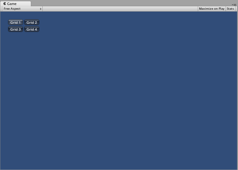
SelectionGrid
The SelectionGrid Control is a multi-row Toolbar. You can determine the number of columns and rows in the grid. Only one Button can be active at time.
Basic Usage
The active Button in the SelectionGrid is tracked through an integer. You must provide the integer as an argument in the function. To make the SelectionGrid interactive, you must assign the integer to the return value of the function. The number of elements in the content array that you provide will determine the number of Buttons that are shown in the SelectionGrid. You also can dictate the number of columns through the function arguments.
/* GUI.SelectionGrid example */

using UnityEngine;
using System.Collections;

public class GUITest : MonoBehaviour
{

    private int selectionGridInt = 0;
    private string[] selectionStrings = {"Grid 1", "Grid 2", "Grid 3", "Grid 4"};

    void OnGUI ()
    {
        selectionGridInt = GUI.SelectionGrid (new Rect (25, 25, 300, 60), selectionGridInt, selectionStrings, 2);

    }

}
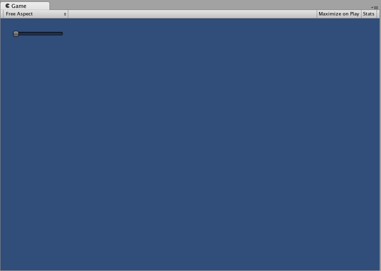
HorizontalSlider
The HorizontalSlider Control is a typical horizontal sliding knob that can be dragged to change a value between predetermined min and max values.
Basic Usage
The position of the Slider knob is stored as a float. To display the position of the knob, you provide that float as one of the arguments in the function. There are two additional values that determine the minimum and maximum values. If you want the slider knob to be adjustable, assign the slider value float to be the return value of the Slider function.
/* Horizontal Slider example */

using UnityEngine;
using System.Collections;

public class GUITest : MonoBehaviour
{

    private float hSliderValue = 0.0f;

    void OnGUI ()
    {
        hSliderValue = GUI.HorizontalSlider (new Rect (25, 25, 100, 30), hSliderValue, 0.0f, 10.0f);
    }

}
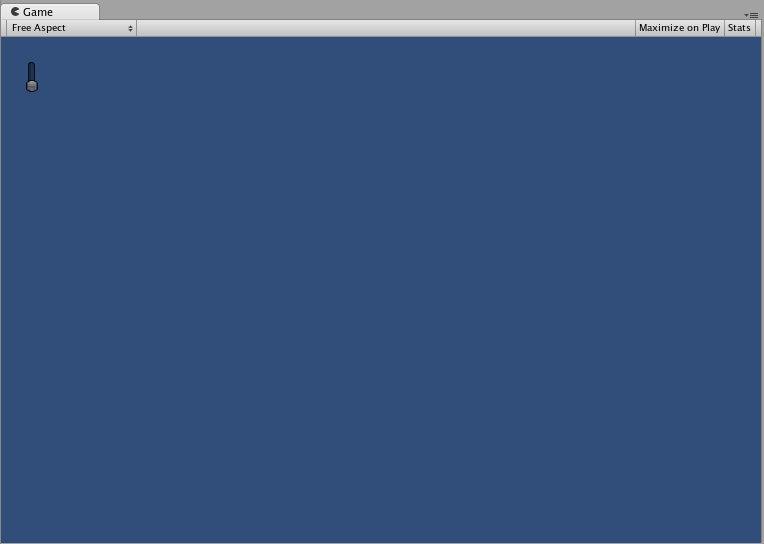
VerticalSlider
The VerticalSlider Control is a typical vertical sliding knob that can be dragged to change a value between predetermined min and max values.
Basic Usage
The position of the Slider knob is stored as a float. To display the position of the knob, you provide that float as one of the arguments in the function. There are two additional values that determine the minimum and maximum values. If you want the slider knob to be adjustable, assign the slider value float to be the return value of the Slider function.
/* Vertical Slider example */

using UnityEngine;
using System.Collections;

public class GUITest : MonoBehaviour
{

    private float vSliderValue = 0.0f;

    void OnGUI ()
    {
        vSliderValue = GUI.VerticalSlider (new Rect (25, 25, 100, 30), vSliderValue, 10.0f, 0.0f);
    }

}
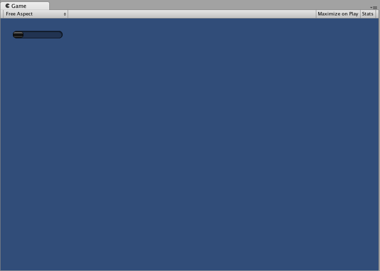
HorizontalScrollbar
The HorizontalScrollbar Control is similar to a Slider Control, but visually similar to Scrolling elements for web browsers or word processors. This control is used to navigate the ScrollViewA UI Control which displays a large set of Controls in a viewable area that you can see by using a scrollbar. More info
See in Glossary Control.
Basic Usage
Horizontal Scrollbars are implemented identically to Horizontal Sliders with one exception: There is an additional argument which controls the width of the Scrollbar knob itself.
/* Horizontal Scrollbar example */

using UnityEngine;
using System.Collections;

public class GUITest : MonoBehaviour
{
    private float hScrollbarValue;

    void OnGUI ()
    {
        hScrollbarValue = GUI.HorizontalScrollbar (new Rect (25, 25, 100, 30), hScrollbarValue, 1.0f, 0.0f, 10.0f);
    }

}
VerticalScrollbar
The VerticalScrollbar Control is similar to a Slider Control, but visually similar to Scrolling elements for web browsers or word processors. This control is used to navigate the ScrollView Control.
Basic Usage
Vertical Scrollbars are implemented identically to Vertical Sliders with one exception: There is an additional argument which controls the height of the Scrollbar knob itself.
/* Vertical Scrollbar example */

using UnityEngine;
using System.Collections;

public class GUITest : MonoBehaviour
{

    private float vScrollbarValue;

    void OnGUI ()
    {
        vScrollbarValue = GUI. VerticalScrollbar (new Rect (25, 25, 100, 30), vScrollbarValue, 1.0f, 10.0f, 0.0f);
    }
}
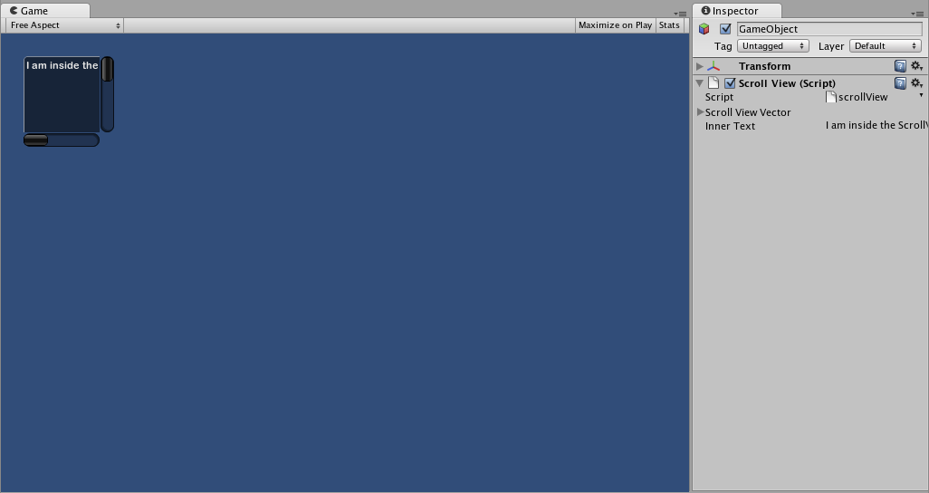
ScrollView
ScrollViews are Controls that display a viewable area of a much larger set of Controls.
Basic Usage
ScrollViews require two Rects as arguments. The first Rect defines the location and size of the viewable ScrollView area on the screen. The second Rect defines the size of the space contained inside the viewable area. If the space inside the viewable area is larger than the viewable area, Scrollbars will appear as appropriate. You must also assign and provide a 2D Vector which stores the position of the viewable area that is displayed.
/* ScrollView example */

using UnityEngine;
using System.Collections;

public class GUITest : MonoBehaviour
{

    private Vector2 scrollViewVector = Vector2.zero;
    private string innerText = "I am inside the ScrollView";

    void OnGUI ()
    {
        // Begin the ScrollView
        scrollViewVector = GUI.BeginScrollView (new Rect (25, 25, 100, 100), scrollViewVector, new Rect (0, 0, 400, 400));

        // Put something inside the ScrollView
        innerText = GUI.TextArea (new Rect (0, 0, 400, 400), innerText);

        // End the ScrollView
        GUI.EndScrollView();
    }

}
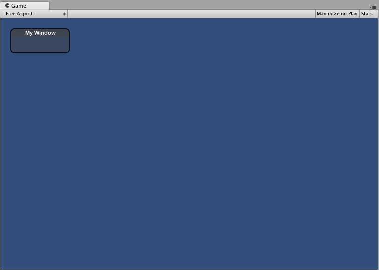
Window
Windows are drag-able containers of Controls. They can receive and lose focus when clicked. Because of this, they are implemented slightly differently from the other Controls. Each Window has an id number, and its contents are declared inside a separate function that is called when the Window has focus.
Basic Usage
Windows are the only Control that require an additional function to work properly. You must provide an id number and a function name to be executed for the Window. Inside the Window function, you create your actual behaviors or contained Controls.
/* Window example */

using UnityEngine;
using System.Collections;

public class GUITest : MonoBehaviour
{

    private Rect windowRect = new Rect (20, 20, 120, 50);

    void OnGUI ()
    {
        windowRect = GUI.Window (0, windowRect, WindowFunction, "My Window");
    }

    void WindowFunction (int windowID)
    {
        // Draw any Controls inside the window here
    }

}
GUI.changed
To detect if the user did any action in the GUI (clicked a button, dragged a slider, etc), read the GUI.changed value from your script. This gets set to true when the user has done something, making it easy to validate the user input.
A common scenario would be for a Toolbar, where you want to change a specific value based on which Button in the Toolbar was clicked. You don’t want to assign the value in every call to OnGUI(), only when one of the Buttons has been clicked.
/* GUI.changed example */

using UnityEngine;
using System.Collections;

public class GUITest : MonoBehaviour
{

    private int selectedToolbar = 0;
    private string[] toolbarStrings = {"One", "Two"};

    void OnGUI ()
    {
        // Determine which button is active, whether it was clicked this frame or not
        selectedToolbar = GUI.Toolbar (new Rect (50, 10, Screen.width - 100, 30), selectedToolbar, toolbarStrings);

        // If the user clicked a new Toolbar button this frame, we'll process their input
        if (GUI.changed)
        {
            Debug.Log("The toolbar was clicked");

            if (0 == selectedToolbar)
            {
                Debug.Log("First button was clicked");
            }
            else
            {
                Debug.Log("Second button was clicked");
            }
        }
    }

}
GUI.changed will return true if any GUI Control placed before it was manipulated by the user.