IMGUI の拡張
自分のニーズに合わせて IMGUI を活用し、拡張する方法は多くあります。コントロールは、組み合わせたり作成することが可能で、ユーザー入力の処理方法を制御する多くの GUI 機能があります。
複合コントロール
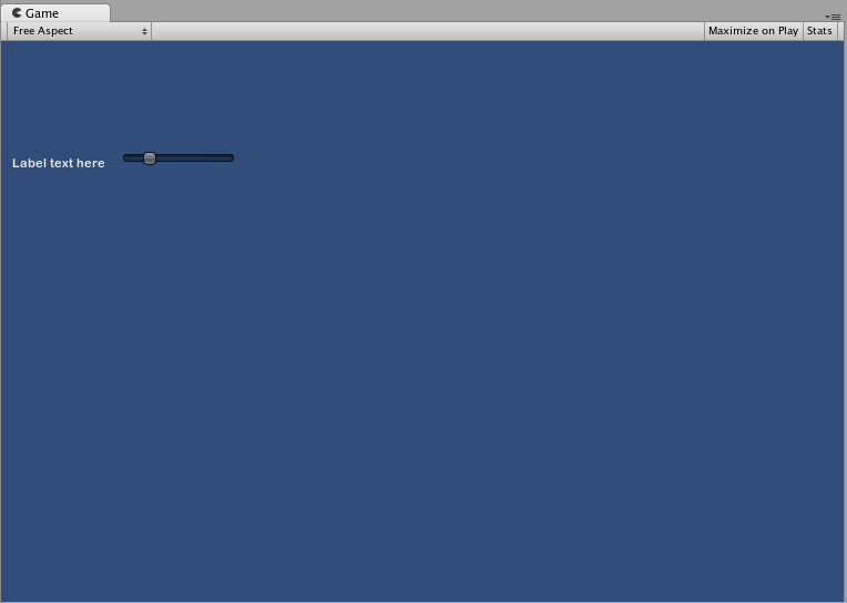
GUI では、2 種類のコントロールが常に一緒に表示される場合があります。例えば、複数の水平スライダーがあるキャラクター作成画面を作成する場合などです。これらのスライダーはすべて、プレイヤーが調整内容を認識できるように、識別するためのラベルが必要です。この場合、GUI.Label() へのすべての呼び出しを GUI.HorizontalSlider() への呼び出しと提携するか、ラベルとスライダーの両方を含む__複合コントロール__を作成できます。
// Label and Slider Compound Control

using UnityEngine;
using System.Collections;

public class GUITest : MonoBehaviour {

    private float mySlider = 1.0f;

    void OnGUI () {
        mySlider = LabelSlider (new Rect (10, 100, 100, 20), mySlider, 5.0f, "Label text here");
    }

    float LabelSlider (Rect screenRect, float sliderValue, float sliderMaxValue, string labelText) {
        GUI.Label (screenRect, labelText);

        // <- Push the Slider to the end of the Label
        screenRect.x += screenRect.width;

        sliderValue = GUI.HorizontalSlider (screenRect, sliderValue, 0.0f, sliderMaxValue);
        return sliderValue;
    }

}
この例では、LabelSlider() を呼び出し、正しい引数を渡すと、水平スライダーとペアになったラベルが作成されます。複合コンポーネントを作成する際、インタラクティブなものにするには、必ず関数の最後で正しい値を返すようにしてください。
静的な複合コントロール
Static 関数を使用することで、独自の内蔵型複合コントロールの集合全体を作成できます。このようにすると、関数を使用したい同じスクリプトで関数を宣言する必要はありません。
// This script is called CompoundControls
using UnityEngine;
using System.Collections;

public class CompoundControls : MonoBehaviour {

    public static float LabelSlider (Rect screenRect, float sliderValue, float sliderMaxValue, string labelText) {
        GUI.Label (screenRect, labelText);

        // <- Push the Slider to the end of the Label
        screenRect.x += screenRect.width;

        sliderValue = GUI.HorizontalSlider (screenRect, sliderValue, 0.0f, sliderMaxValue);
        return sliderValue;
    }

}
CompoundControls と呼ばれるスクリプトに上記の例を保存することで、ただ CompoundControls.LabelSlider() を入力し、引数を渡すことで、他のスクリプトから LabelSlider() 関数を呼び出すことができます。
複雑な複合コントロール
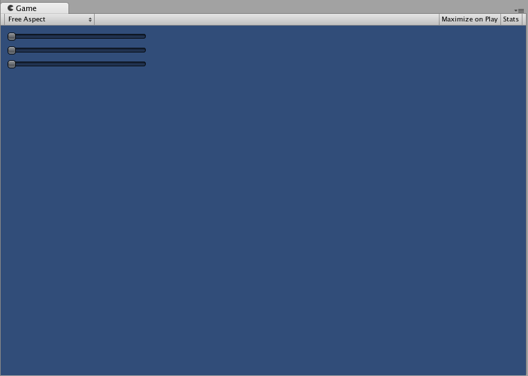
よりクリエイティブな複合コントロールの作成も可能です。思い通りに配置したり、グループ化することができます。以下の例では、再利用可能な RGB スライダーを作成します。
// RGB Slider Compound Control

using UnityEngine;
using System.Collections;

public class GUITest : MonoBehaviour {

    public Color myColor;

    void OnGUI () {
        myColor = RGBSlider (new Rect (10,10,200,10), myColor);
    }

    Color RGBSlider (Rect screenRect, Color rgb) {
        rgb.r = GUI.HorizontalSlider (screenRect, rgb.r, 0.0f, 1.0f);

        // <- Move the next control down a bit to avoid overlapping
        screenRect.y += 20;
        rgb.g = GUI.HorizontalSlider (screenRect, rgb.g, 0.0f, 1.0f);

        // <- Move the next control down a bit to avoid overlapping
        screenRect.y += 20;

        rgb.b = GUI.HorizontalSlider (screenRect, rgb.b, 0.0f, 1.0f);
        return rgb;
    }
}
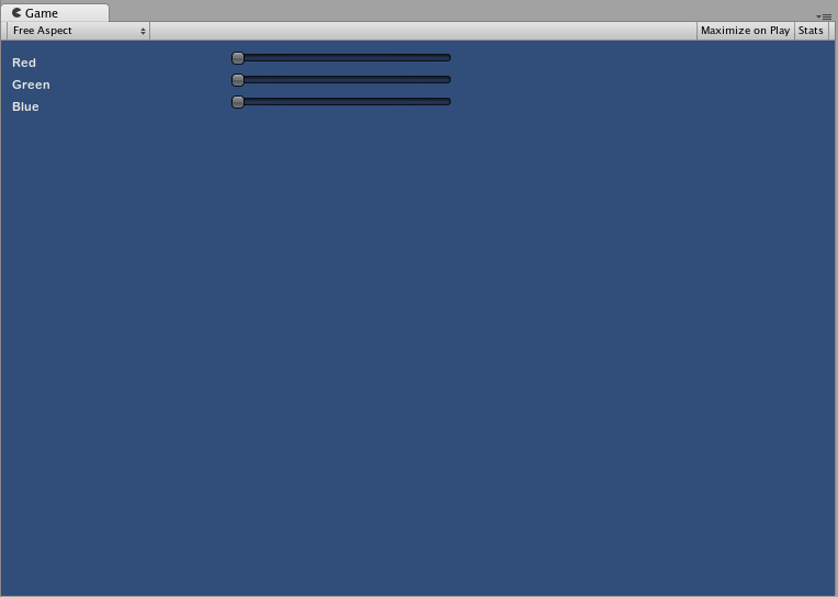
今度は、複合コントロール内で他の複合コントロールを使用できることを示すため、複合コントロールを上下に並べて作成します。これを行うため、上のような RGB スライダーを新規作成しますが、LabelSlider を使用します。こうすると、ラベルによってどのスライダーがどの色に対応しているかを常に知ることができます。
// RGB Label Slider Compound Control

using UnityEngine;
using System.Collections;

public class GUITest : MonoBehaviour {

    public Color myColor;

    void OnGUI () {
        myColor = RGBSlider (new Rect (10,10,200,30), myColor);
    }

    Color RGBSlider (Rect screenRect, Color rgb) {
        rgb.r = CompoundControls.LabelSlider (screenRect, rgb.r, 1.0f, "Red");

        // <- Move the next control down a bit to avoid overlapping
        screenRect.y += 20;
        rgb.g = CompoundControls.LabelSlider (screenRect, rgb.g, 1.0f, "Green");

        // <- Move the next control down a bit to avoid overlapping
        screenRect.y += 20;

        rgb.b = CompoundControls.LabelSlider (screenRect, rgb.b, 1.0f, "Blue");

        return rgb;
    }

}