USS サポートプロパティー
ここでは、サポートされている USS プロパティーとその値について説明します。
USS データ型
USS データ型は、USS プロパティーが受け入れる値とキーワードを定義します。
- <length>: Represents a distance value.
- <number>: Represents either an integer or a number with a fractional component.
- <integer>: Represents a whole number.
- <color>: Represents a color. A color can be defined with a
#hexadecimalcode,rgb(), orrgba(). Color keywords such asblueortransparentare not supported. - <resource>: Represents an asset in a Resources folder.
- <url>: Represents an asset specified by a path. It can be expressed as either a relative path or an absolute path.
USS 構文
UIElement のスタイルプロパティーは、W3C CSS ドキュメントと同じ文法構文を使用します。
- キーワードの値はそのまま表記します。例えば
auto、baseline - 基本的なデータ型は山括弧の間 (
<と>) に表記します。例えば <length>、<color> - Non-terminals that share the same name as a property appear between angle brackets and single straight quotes (
<'and'>). For example, <‘width’>.
プロパティー値に複数のコンポーネントがある場合は以下の通りです。
- 複数の並列の単語は、すべてが指定の順序で発生します。
- A bar (
|) separates two or more alternatives: exactly one must occur. - A double bar (
||) separates two or more options: one or more must occur, in any order. - 2 重アンパサンド (
&&) は、2 つ以上のコンポーネントを区切ります。これらのコンポーネントは任意の順序で発生します。 - 大括弧 (
[]) はグループ化を意味します。
すべての型、キーワード、または山括弧 <> で囲まれたグループの後にモディファイアが記述される場合があります。
- アスタリスク (
*) は、前に記述された型、単語、またはグループが 0 回以上発生することを示します。 - プラス (
+) は、前に記述された型、単語、またはグループが 1 回以上発生することを示します。 - 疑問符 (
?) は、前に記述された型、単語、またはグループが必須でないことを示します。 - 中括弧 (
{A,B}) の数字は、前に記述された型、単語、またはグループが少なくともA回、最大でB回発生することを示します。
継承プロパティー
継承プロパティーに値が指定されていない場合、 要素は親要素から値を取得します。例えば、継承プロパティーを使用して、すべての要素のフォントを設定します。
:root {
    -unity-font: resource("Font/consola.ttf");
}
その結果、以下のプロパティーが継承されます。
- color
- font-size
- -unity-font
- -unity-font-style
- -unity-text-align
- visibility
- whitespace
ボックスモデル
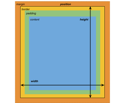
寸法
- width: <length> | auto
- height: <length> | auto
- min-width: <length> | auto
- min-height: <length> | auto
- max-width: <length> | none
- max-height: <length> | none
width と height は要素のサイズを指定します。width が指定されない場合、幅は要素の内容の幅にもとづいて決定されます。height が指定されない場合、高さは要素のコンテンツの高さに基づきます。
マージン
- margin-left: <length> | auto;
- margin-top: <length> | auto
- margin-right: <length> | auto
- margin-bottom: <length> | auto
簡略表記
- margin: [<length> | auto]{1,4}
margin 簡易表記オプションは以下のように適用されます。
- 1 length: Applied to all 4 margins.
- 2 lengths: The first is applied to
margin-topandmargin-bottom. The second is applied tomargin-leftandmargin-right. - 3 lengths: The first is applied to
margin-top. The second is applied tomargin-leftandmargin-right. The third is applied tomargin-bottom. - 4 lengths: The lengths are applied in this order :
margin-top,margin-right,margin-bottom,margin-left
境界線
- border-left-width: <length>
- border-top-width: <length>
- border-right-width: <length>
- border-bottom-width: <length>
簡略表記
- border-width: <length>{1,4}
border-width 簡易表記オプションは以下のように適用されます。
- 1 length: Applied to all 4 border widths.
- 2 lengths: The first is applied to
border-top-widthandborder-bottom-width. The second is applied toborder-left-widthandborder-right-width. - 3 lengths: The first is applied to
border-top-width. The second is applied toborder-left-widthandborder-right-width. The third is applied toborder-bottom-width. - 4 lengths: The lengths are applied in this order:
border-top-width,border-right-width,border-bottom-width,border-left-width
パディング
- padding-left: <length>
- padding-top: <length>
- padding-right: <length>
- padding-bottom: <length>
簡略表記
- padding: <length>{1,4}
padding 省略オプションは以下のように適用されます。
- 1 length: Applied to all 4 padding.
- 2 lengths: The first is applied to
padding-topandpadding-bottom. The second is applied topadding-leftandpadding-right. - 3 lengths: The first is applied to
padding-top. The second is applied topadding-leftandpadding-right. The third is applied topadding-bottom. - 4 lengths: The lengths are applied in this order:
padding-top,padding-right,padding-bottom,padding-left
フレックスレイアウト
このセクションでは、視覚要素を配置するためのプロパティーを列挙します。UIElement には レイアウトエンジン が含まれ、レイアウトやスタイリングのプロパティーに基づいて視覚要素を配置します。レイアウトエンジンは、HTML/CSS レイアウトシステムの 1 つである Flexbox のサブセットを実装しています。
デフォルトでは、すべてのアイテムは垂直にコンテナに配置されます。
アイテム
- flex-grow: <number>
- flex-shrink: <number>
- flex-basis: <length> | auto
- flex: none | [ <‘flex-grow’> <‘flex-shrink’>? || <‘flex-basis’> ]
- align-self: auto | flex-start | flex-end | center | stretch
コンテナ
- flex-direction: row | row-reverse | column | column-reverse
- flex-wrap: nowrap | wrap | wrap-reverse
- align-content: flex-start | flex-end | center | stretch
- align-items: flex-start | flex-end | center | stretch
- justify-content: flex-start | flex-end | center | space-between | space-around
相対位置と絶対位置
位置指定
- position: absolute | relative
このプロパティーは、デフォルトで relative に設定されています。これは、親に基づいて要素を配置します。このプロパティーが absolute に設定されている場合、要素は親のレイアウトを離れ、親の領域に基づいて値が指定されます。
位置
- left: <length> | auto
- top: <length> | auto
- right: <length> | auto
- bottom: <length> | auto
親のエッジまたは、要素の元の位置からの距離。
描画プロパティー
描画プロパティーは、視覚要素の背景、境界線、外観を設定します。
背景
- background-color: <color>
- background-image: <resource> | <url> | none
- -unity-background-scale-mode: stretch-to-fill | scale-and-crop | scale-to-fit
- -unity-background-image-tint-color: <color>
スライス
背景画像を割り当てるとき、それは簡略化された 9 スライス仕様に基づいて描画されます。
- -unity-slice-left: <integer>
- -unity-slice-top: <integer>
- -unity-slice-right: <integer>
- -unity-slice-bottom: <integer>
境界線
- border-color: <color>
- border-top-left-radius: <length>
- border-top-right-radius: <length>
- border-bottom-left-radius: <length>
- border-bottom-right-radius: <length>
簡略表記
- border-radius: <length>{1,4}
border-radius 簡易表記オプションは以下のように適用されます。
- 1 length: Applied to all 4 border-radius properties.
- 2 lengths: The first is applied to
border-top-left-radiusandborder-bottom-right-radius. The second is applied toborder-bottom-left-radiusandborder-top-right-radius - 3 lengths: The first is applied to
border-top-left-radius. The second is applied toborder-bottom-left-radiusandborder-top-right-radius. The third is applied toborder-bottom-right-radius. - 4 lengths: The lengths are applied in this order:
border-top-left-radius,border-top-right-radius,border-bottom-right-radius,border-bottom-left-radius
外観
- overflow: hidden | visible
- opacity: <number>
- visibility: visible | hidden
- display: flex | none
The display default value is flex. Setting display to none removes the element.
テキストプロパティー
テキストプロパティーは、フォント、フォントサイズ、フォントリソースの Unity 特有のプロパティー、フォントスタイル、整列、ワードラップ、クリッピングを設定します。
- color: <color>
- -unity-font: <resource> | <url>
- font-size: <number>
- -unity-font-style: normal | italic | bold | bold-and-italic
- -unity-text-align: upper-left | middle-left | lower-left | upper-center | middle-center | lower-center | upper-right | middle-right | lower-right
- white-space: normal | nowrap
カーソルプロパティー
cursor のデフォルトテクスチャタイプを使用して、カーソルのカスタムテクスチャをインポートします。
cursor: [ [ <resource> | <url> ][ <integer> <integer>]? , ][ arrow | text | resize-vertical | resize-horizontal | link | slide-arrow | resize-up-right | resize-up-left | move-arrow | rotate-arrow | scale-arrow | arrow-plus | arrow-minus | pan | orbit | zoom | fps | split-resize-up-down | split-resize-left-right ]
- 2018–11–16 限られた 編集レビュー で修正されたページ