Gizmos introduction
Gizmos are graphics associated with GameObjects in the scene. Some gizmos are only drawn when the GameObject is selected, while other gizmos are drawn by the Unity Editor regardless of which GameObjects are selected. They are usually wireframes, drawn with code rather than bitmap graphics, and can be interactive.
The Camera gizmo and Light direction gizmo are both examples of built-in gizmos. You can also create your own Gizmos using script. Refer to Introduction to the camera view for more information about the camera.
Some gizmos are passive graphical overlays, shown for reference (such as the Light direction gizmo, which shows the direction of the light). Other gizmos are interactive, such as the audio sourceA component which plays back an Audio Clip in the scene to an audio listener or through an audio mixer. More info
See in Glossary spherical range gizmo, which you can click and drag to adjust the maximum range of the audio source.
The Move, Scale, Rotate and Transform tools are also interactive gizmos. Refer to Positioning GameObjects to learn more about these tools.
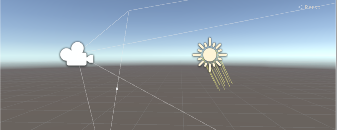
Refer to the OnDrawGizmos method for further information about implementing custom Gizmos in your scripts.
Icons
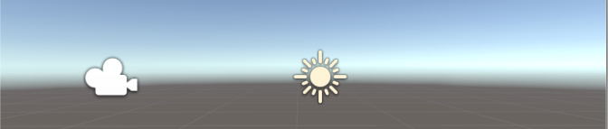
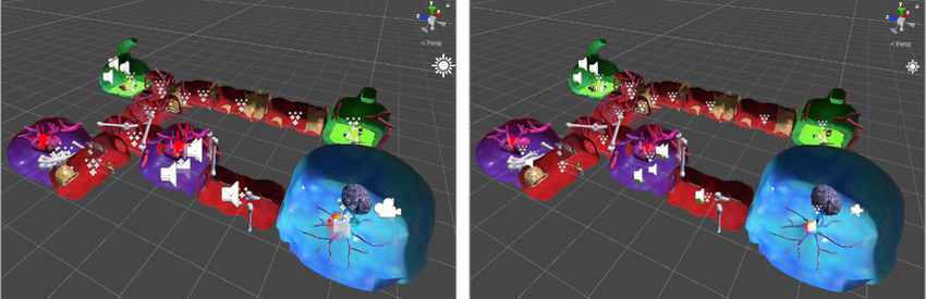
You can display icons in the Game view or Scene view as flat, billboard-style overlays. These help indicate a GameObject’s position while you work on your game. The Camera icon and Light icon are examples of built-in icons. You can also assign custom icons to GameObjects or individual scripts. For more information, refer to Assigning Icons.
Selection wireframes
Unity provides visual feedback when you select GameObjects in the Scene view through selection outlines and wireframes. These visual indicators help you identify selected objects and understand their hierarchy relationships at a glance.
Selection Outline
When Selection Outline is enabled, an outline appears around selected GameObjects and their child GameObjects. By default, Unity outlines selected GameObjects in orange, and child GameObjects in blue. You can change these colors in the Unity Preferences window.
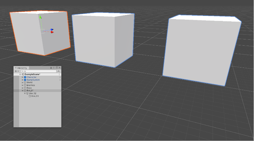
When you select a GameObject, Unity outlines all its child GameObjects (and their child GameObjects), but doesn’t outline parent GameObjects (or their parent GameObjects).
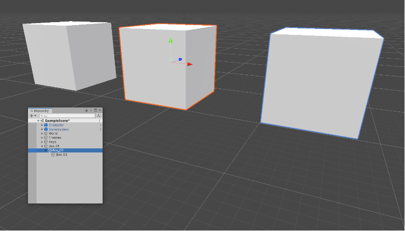
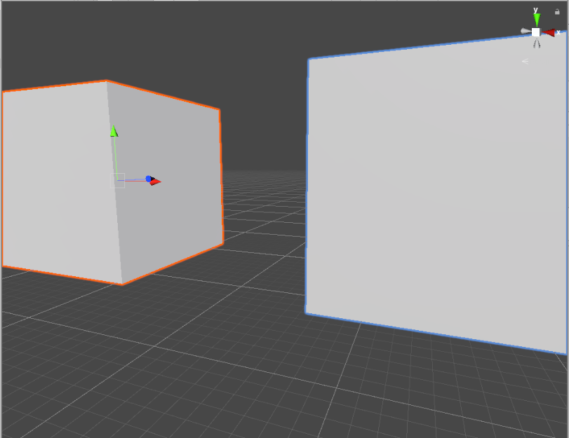
If selected GameObjects extend beyond the edges of the Scene view, the selection outline runs along the edge of the window:
Selection Wire
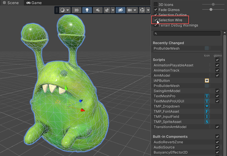
When Selection Wire is enabled, then when you select a GameObject in the Scene view or Hierarchy window, the wireframe Mesh for that GameObject is made visible in the Scene view:
Selection colors
You can set custom colors for selection wireframes.
- Go to Unity > Settings (macOS) or Edit > Preferences (Windows) to open the Preferences window.
- On the colors tab, change one or more of the following colors:
- Selected Children Outline: outline color for selected GameObjects’ children.
- Selected Outline: outline color for selected GameObjects.
- Wireframe Selected: outline color for selected GameObjects’ wireframes.
Built-in components, scripts, and recently changed items
Use the list in the Gizmos menu to control the visibility of icons and gizmos for various components. The list is divided into sections:
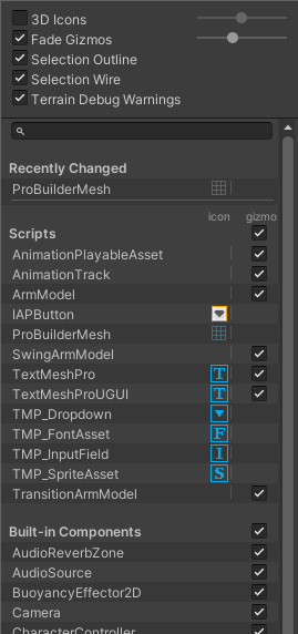
Recently Changed
The Recently Changed section controls the visibility of the icons and gizmos for items that you’ve modified recently. It appears the first time you change one or more items. Unity updates the list after subsequent changes.
Scripts
The Scripts section controls the visibility of the icons and gizmos for scripts that:
Have an icon assigned to them (see documentation on Assigning Icons).
Implement the OnDrawGizmos function.
Implement the OnDrawGizmosSelected function.
This section appears when your Scene contains one or more scripts that meet the above criteria.
Built-in Components
The Built-in Components section controls the visibility of the icons and gizmos for all component types that have an icon or gizmo.
Built-in component types that do not have an icon or gizmo shown in the Scene view (for example, Rigidbody) are not listed here.
Toggling icon visibility
The icon column shows or hides the icons for each component type. Full-color icons are displayed in the main Scene view window, faded icons are not.
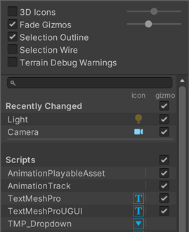
To toggle an icon’s visibility in the Scene view, click any icon in the icon column.
Note: If an item in the list has a gizmo but no icon, the icon column for that item is empty.
Changing script icons
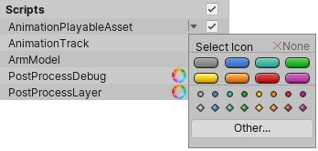
Scripts with custom icons show a small drop-down menu arrow in the icon column. To change a custom icon, click the arrow to open the Select Icon menu.
Toggling gizmo visibility
To control whether the Editor draws gizmo graphics for a particular component type (for example, a Collider’s wireframe gizmo or a Camera’s view frustum gizmo) or script, use the checkboxes in the Gizmo column.
When a checkbox is checked, the Editor draws gizmos for that component type.
When a checkbox is cleared, the Editor does not draw gizmos for that component type.
Note: If an item in the list has an icon but no gizmo, the Gizmo column for that item is empty.
To toggle gizmo visibility for an entire section (all Built-in Components, all Scripts, and so on), use the checkboxes next to the section names.
The Built-in Components checkbox toggles gizmo visibility for every type of component listed in that section
When the checkbox is toggled on, gizmo visibility is toggled on for one or more item types in the section.