Introduction to UI Shader Graph
You can create shaders with Shader Graph to do the following:
- Custom button effects: add glow, blur, or interactive color changes to buttons.
- Text rendering: create crisp, scalable text with outlines.
- Animated UI elements: use shaders to animate gradients or textures.
- Color processing: apply effects like grayscale, sepia, or color correction to images in the UI.
Important: UI Shader Graph is designed to create shaders that render UI mesh elements directly. You can’t use it to create custom filters, which are post-processing shaders that apply effects to render targets containing subtrees of visual elements. These are fundamentally different rendering approaches and you can’t interchange them.
UI-specific rendering
When you create a shader for UI elements and open it in the Shader Graph editor, it typically includes a Fragment node and a Vertex node.
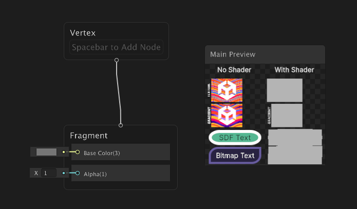
The Fragment node has inputs for Base Color and Alpha, which define the color and transparency of the shader.
The Main Preview window shows the result of the shader. It provides immediate visual feedback on how your custom shaders affect UI elements, and allows you to compare the before and after states.
The No Shader section shows example graphs without any shader applied. This serves as a baseline to compare against the shader effects. It includes:
- An example texture graph
- An example gradient graph
- A graph with solid color background and border with SDF text in it. Signed Distance Fields (SDF) fonts are commonly used for crisp, scalable text that looks good at various sizes and they are rendered without high-resolution texture atlases.
- A graph with solid color background and border with Bitmap text in it. Bitmap fonts are pixel-based fonts that are rendered using a texture atlas.
The With Shader section shows the same example graphs as the No Shader section, but with the shader applied. This lets you compare the original appearance to the result after your shader modifications. As you adjust your shader, the preview updates in real time, so you can immediately check how your changes affect each UI element.
Single shader for multiple render types
A UI Toolkit mesh can contain triangles that correspond to various render types (text, solid colors, textures, gradients). Unlike conventional systems that use separate shaders for each render type, UI Toolkit manages all render types within a single shader for optimal CPU performance.
To accommodate multiple render types, UI Shader Graph provides specialized nodes that lets you branch your shader logic based on the current render type.
Render Type Branch node
The key tool is the Render Type Branch node, which allows you to define different behaviors for solid colors, textures, SDF and Bitmap text, and gradients within one shader.
When you add a Render Type Branch node, it includes all input ports for each render type with default values. Each input port of the Render Type Branch node corresponds to a specific render type. You can connect different nodes to each port to define how each render type is processed, and then connect the outputs of the Render Type Branch node to the inputs of the Fragment node to define the final appearance of the shader.
The following graph shows a simple example of assigning a different color to each render type using the Render Type Branch node:
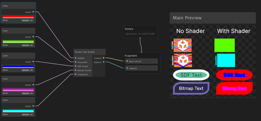
In this example, each render type gets a solid color: red for solid color, so the background and the border of the buttons appear red. Likewise, the SDF text appears blue while the Bitmap text appears purple; texture appears green while the vector image appears lake blue.
The following table summarizes each render type, what it applies to, and how it appears in the Main Preview window.
| Render type | Applies to | Appearance in Main Preview |
|---|---|---|
| Solid | Solid color backgrounds and borders of UI elements | Background and border of the SDF and Bitmap graphs |
| Texture | Texture graphics | Texture graph |
| SDF Text | Text rendering using Signed Distance Fields (SDF) fonts | SDF text in SDF graphs |
| Bitmap Text | Text rendering using Bitmap fonts | Bitmap text in Bitmap graphs |
| Gradient | Vector graphics | Gradient graph |
Tips: If you want the Render Type Branch node to be added automatically when you create a new shader, you can use one of the UI Shader Graph templates from Create > Shader Graph > From Template > UI.
Render Type node
The Render Type node outputs the current render type being processed by the shader. This allows you to implement conditional logic based on the render type. For example, you can use the output of the Render Type node with comparison or branch nodes to apply specific effects only to certain render types.
Default nodes for each render type
Although you can use any node in your custom shaders, UI Shader Graph provides default nodes for each render type. Each default node represents the default implementation for its branch type. You can use them as starting points and combine them with other nodes to create desired visual effects.
The following graph connects the default nodes to each port of the Render Type Branch node:
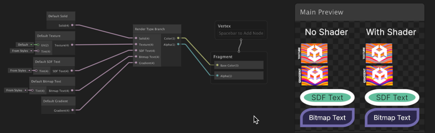
Note: If an input of the Render Type Branch node isn’t connected, the node automatically uses the default value for that input.
For best performance, leave an input disconnected if you want it to use its default value, rather than connecting it to outputs of nodes such as the Default Solid node or Default Texture node. The node handles branching more efficiently when you disconnect inputs, which optimizes for all render types.
Customize render types
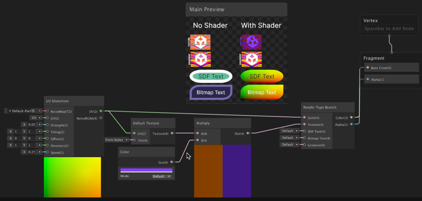
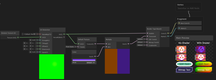
To customize the appearance of each render type, modify the output from the default nodes before connecting them to the Render Type Branch node. For example, you can add a color multiplication node between the Default Solid node and the Render Type Branch node to tint all solid color elements. You can also chain additional nodes to blend colors, apply effects, or animate properties.
The following graph uses a UV Distortion node to create a subtle animated warp effect, applies a purple tint to textures, while leaving SDF Text, Bitmap Text, and Gradients to display their default appearance:
UI-specific input nodes
UI Shader Graph includes several nodes specifically for UI elements, providing information about the current UI element they render:
- Element Texture UV: Texture coordinates for sampling the assigned texture.
- Element Layout UV: UV coordinates within the element’s layout rectangle.
- Element Texture Size: Size of the assigned texture.
The following graph uses the Element Texture UV node to ensure UV distortion applies specifically to the UI element’s texture.
Sample Element Texture node
The Sample Element Texture node allows you to sample a texture at specific UV coordinates. You can use this node to do multiple samples of the texture assigned to the element, such as for creating complex visual effects or manipulating the texture in various ways.
Note: The texture assigned to the element is the texture that the UI element currently uses. It might be the font texture, an element background image, the source image assigned to an Image element, or a texture provided through MeshGenerationContext.DrawMesh in custom rendering code.
The following graph uses the Sample Element Texture node to create a texture-based effect:
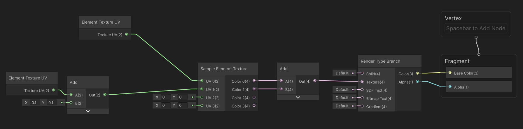
This shader graph samples an element’s texture twice: once normally and once with its UVs offset by (0.1, 0.1). The two sampled colors are then combined together to create a ghosting and doubling effect of the texture: