Styling
Table of Contents
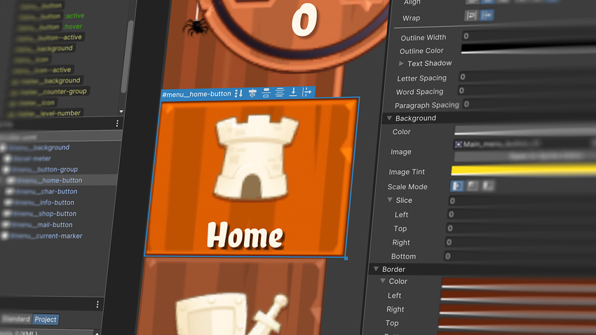
Once you’ve mocked up some wireframe layouts with visual elementsA node of a visual tree that instantiates or derives from the C# VisualElement class. You can style the look, define the behaviour, and display it on screen as part of the UI. More info
See in Glossary, you can begin styling them or saving the formatting properties into reusable styles. Styling is where UI Toolkit exhibits its full power.
Adding style to visual elements is preferably done via Unity style sheet (USS) files (Assets > Create > UI Toolkit > StyleSheet). They are the Unity equivalent to web CSS files, and use a similar rule-based format. They also add flexibility to the design process making it easy to reuse and styles consistent across the project at scale.
USS files define the size, color, font, spacing, borders, or location of elements.
USS selectors
If you haven’t created a USS file yet, all the styling changes you make will be embedded directly in the UXML asset as inline styles. While these inline styles affect the appearance of the specific visual element they are attached to, they cannot be reused across your project.
For example, if your project has hundreds of buttons, updating the style of each individual button would be time-consuming and inefficient. Instead, you can define a selector in a USS. USS selectors make it possible for style sheets in UI Builder to share and apply styles across many elements in UXML assets.
Convert existing inline styles to selectors
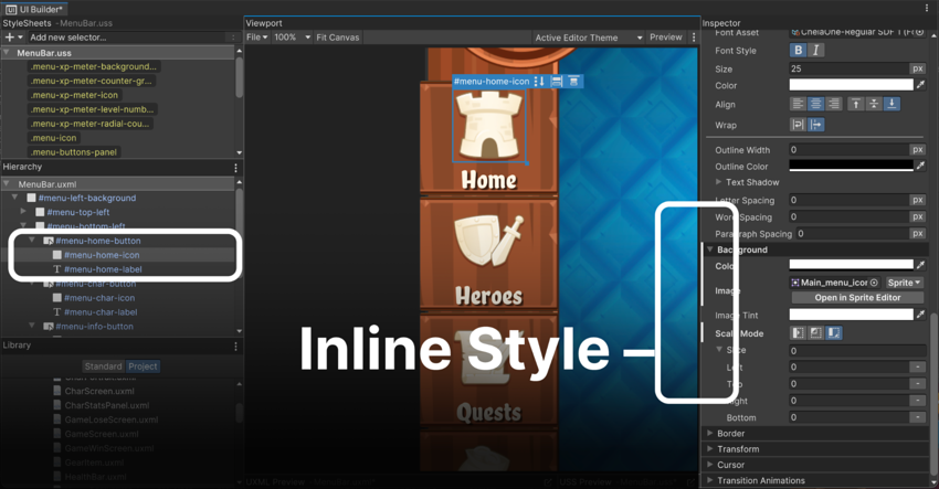
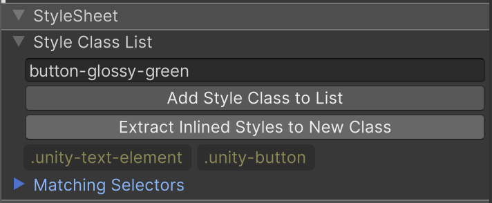
Use the Add Style Class to List button to type and convert all the inline styles of an element to a selector (starting with “.” in yellow). This selector now centralizes the styling properties, allowing you to apply consistent styles to other buttons (or other elements) throughout the project. Any updates made to the selector will automatically reflect on all associated elements, making the process scalable and maintainable.
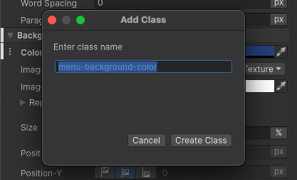
To extract specific inline styles to a new selector, click on the vertical ellipsis (⋮) next to the property, and select Extract Inlined Style to Selector / Add Class, which turns that property into a selector.
Create new selectors
Selectors query the visual treeAn object graph, made of lightweight nodes, that holds all the elements in a window or panel. It defines every UI you build with the UI Toolkit.
See in Glossary for any elements that match a given search criteria. UI Toolkit then applies style changes to all matching elements. You can add a new selector by clicking on the field Add new selector… in the top left side of UI Builder:
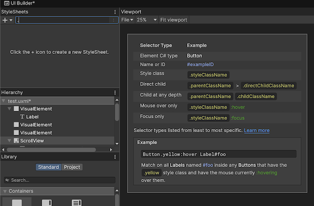
USS selectors can match visual elements by:
Element C# type: These selectors work by Type (Button, Label, ListView, etc.) The selector matches the available default Type names in the Library panel. They don’t have any special characters in front of the name. Class selectors appear in white. For example, Button will apply the style to all the elements of the type Button
-
Name or ID: These selectors can apply styling to all the elements of the same name. Name selectors have a preceding hash “#” symbol and appear in blue. For example, #title would apply the style to all the elements in the Hierarchy with the name title.
- Note: UXML name attributes (unlike HTML IDs) don’t need to be unique because UI Toolkit supports UXML templates and reusable components, allowing multiple elements to share the same name and style.
Style class: A Style Class selector is a reusable style that can be applied to any visual element by adding the corresponding class name to the element’s Class List property. Style Class selectors have a preceding dot
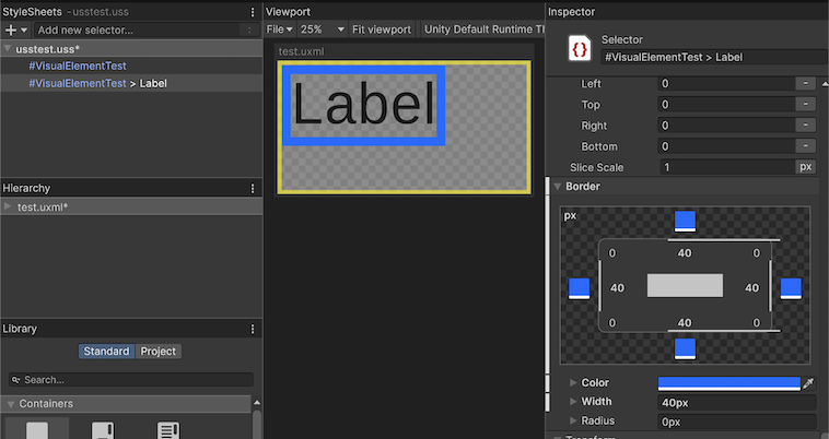
.character and appear in yellow. For example, .smallFont could be used to apply a specific style to any element by adding smallFont to its Class List.Direct child: If you add a > after the matching criteria, only the direct child elements matching the second criteria after the symbol > will be affected. For example, the selector #title > Label, would apply the style to any Label type inside the elements of the name
#title. Any Label outside that parent or deeper in the hierarchy won’t be affected.-
Child at any depth: This is the same as the previous selector, but in this case the second matching criteria will apply to any child regardless of its depth in the parent hierarchy.
-
Note: Avoid overly broad selectors when possible (especially those ending in * or targeting generic Unity classes like
.unity-button). Deep child selectors can potentially slow down performance if they evaluate a large portion of the visual tree.
-
Note: Avoid overly broad selectors when possible (especially those ending in * or targeting generic Unity classes like
-
Pseudo-class: Pseudo-classes allow you to define distinct styles for visual elements when they change state, such as when the mouse hovers over them or when they are focused. Pseudo-classes are denoted by a colon
:and modify existing selectors.- For example, the selector Button
:focuswould apply specific styles to all Button elements when they are focused. This makes pseudo-classes useful for adding visual feedback, such as hover effects or focus indicators. Additionally, combining pseudo-classes with USS animations enables you to introduce smooth motion and dynamic transitions, enhancing the user experience. - You can read about the pseudo-classes available here.
- For example, the selector Button
If a visual element matches multiple selectors, the selector with the highest specificity takes precedence.
The specificity hierarchy in USS is as follows:
Inline Styles: Styles applied directly to an element (e.g., in UXML or through code) take the highest precedence and override all USS selectors.
ID selectors (#id): These are the most specific USS selectors and apply to elements with a unique name property.
Class selectors (.className): These apply to elements with the corresponding class added to their Class List.
C# Type selectors (e.g., Button, Label): These apply to all elements of the specified type.
For example, if an element has both an inline style and matches a #title ID selector, the inline style will override the ID selector. Similarly, if the element matches both a Class selector and a Type selector, the Class selector will take precedence.
In the case of a tie, where several selectors are trying to override the same property and all have the same level of specificity, the tie breaker will be the order in the USS style sheet, selectors lower in the list will take precedence.
You can learn more about selector precedence in the documentation.
💡 Tip: Additional information on Hierarchy
Click the vertical ellipsis (⋮) in the Hierarchy header to further visualize the UI elements.

In the Hierarchy pane, additional information appears next to the element Type. The #options-bar Name selector and .options-bar Style Class selector appear when checked.
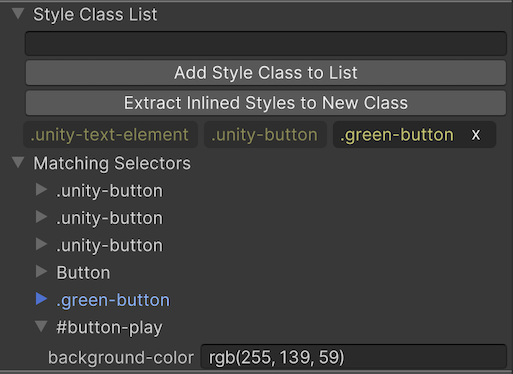
You might notice that some selectors begin with the .unity- prefix. These are default styles that apply to all elements. Any defined selectors will override these values.
Selectors assigned to elements
In the InspectorA Unity window that displays information about the currently selected GameObject, asset or project settings, allowing you to inspect and edit the values. More info
See in Glossary, you can visualize the matching selectors of a selected element in the Hierarchy. The selector at the bottom of the list has precedence. Unfold the details to see which style parameters are changing.
Edit selectors
When modifying a Style selector, be sure to select the Style Class in the Style Sheet panel – not the visual element from the Hierarchy. Otherwise, you will change the inline style for a specific element and not the Style Class itself.
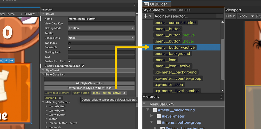
You can double-click a Style Class in the Inspector to deselect an element and select the Style selector instead.
Just like when you were modifying parameters as inline styles directly in the UXML, you can edit parameters in the selectors, by selecting them in the StyleSheets pane, and modifying with overrides. The changes will also show as bold with a white line next to them. To unset a value you can do it from the vertical ellipsis (⋮) menu next to the property.
With numerous formatting options available, you can modify the basic appearance of elements and fonts. UI Toolkit offers advanced styling that can reduce the need for custom-made spritesA 2D graphic objects. If you are used to working in 3D, Sprites are essentially just standard textures but there are special techniques for combining and managing sprite textures for efficiency and convenience during development. More info
See in Glossary.
UI Builder can facilitate adding outlines, rounded corners, image adjustments, and border colors to your elements. Styling can also include bevel effects and the ability to change the cursor image.

Override styles
Rules were meant to be broken. Whenever you define a style class for UI elements, there will always be exceptions.
For example, if you have hundreds of Button elements, but each one has a different icon you don’t need to create a new selector for each one. This would defeat the purpose (convenience) of making styles reusable.
In lieu of this, you’d apply the same style to all of the buttons and then override the specific parts of each one that are unique (e.g., each Button element could override the Background > Image to use its own icon). These Overrides are the Inline style properties.
💡 Tip: Inline styles take precedence over selectors
Inline styles always take precedence over selectors. So if you’re unsure as to why a style is not updating when a selector is applied, it could be helpful to check the element to see if there are any Overrides.
USS variables
You can create USS variables to save time manually setting up the same values in different properties. When you update a USS variable, all of the USS properties that use that variable update. In Unity 6.1 these variables can also be set up from the UI Builder Editor.
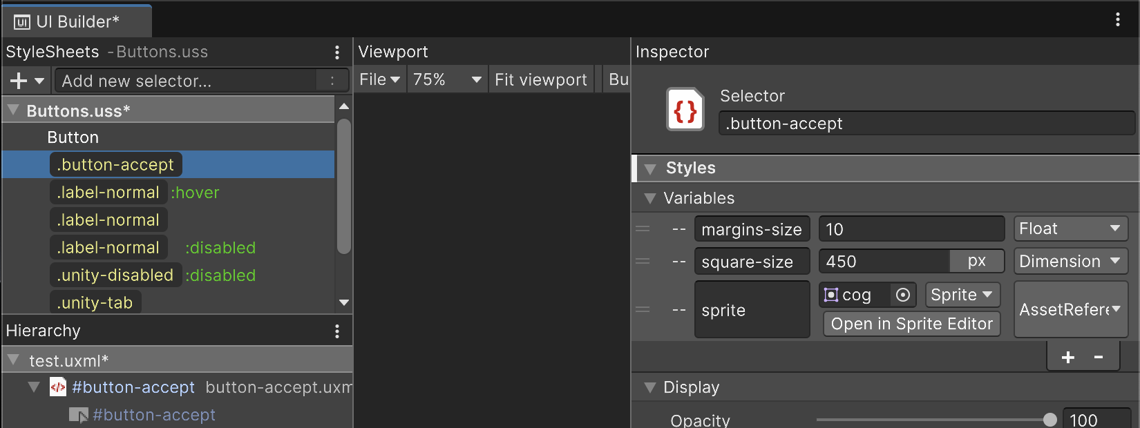
You can create variables of the type: float, color, string, asset reference (for background images), dimensions (like pixels, degrees, percentage, etc) and enums. Variables have a selector level scope; you can’t use variables present in other selectors, but selectors themselves can be applied to as many elements as needed.
USS transitions animations

USS transitions animations
Adding transitions to your menu screens can significantly enhance visual polish and user experience. UI Toolkit makes this relatively easy with the Transition Animations property in the Inspector.
You can configure the Property, Duration, Easing, and Delay to set up the animation. Once configured, the transition is automatically applied when the relevant styles change during runtime.
Think of the transition between pseudo-classes of a Button – the :hover pseudo-class over the .green-button Class selector. Each style has its own size and color.
To define a transition in the mouse hover state, the .green-button:hover selector has Transition Animations, located at the bottom of the Inspector. The result is a Button that animates with your pointer movements.
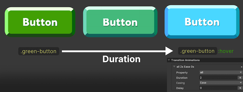
The Transition Animation interpolates between styles with the following options:
Property: This determines what to interpolate. The default setting is all, but you can select a specific property in the drop-down list. In the above example, :hover state is only modifying the Color and Transform properties. See this complete list of animatable properties.
Duration: This is the length of the transition, expressed in either seconds or milliseconds. For it to be visible, Duration must be set higher than 0.
Easing Function: An easing function determines how an animation progresses over time, allowing you to simulate natural motion, such as acceleration, deceleration, or elasticity. By using an easing function, the animation transitionsAllows a state machine to switch or blend from one animation state to another. Transitions define how long a blend between states should take, and the conditions that activate them. More info
See in Glossary appear smoother and more organic compared to a basic linear interpolation, which moves at a constant speed.
Use the following cheat sheet to help you visualize the available functions (visualization courtesy of https://easings.net/):

Delay: Defined in seconds or milliseconds, this specifies how long to wait before starting the transition.
-
Add Transition: Each property of the new state can be animated individually, with different durations, delays, and easing effects.
- Click the Add Transition button to chain another transition animation. This makes it possible to trigger several overlapping transitions at once, making them more natural and less mechanical.
💡 Tip: Transition events
Callbacks for transition events can be added to the visual elements being animated. They serve to support more advanced workflows, such as sequencing or looping.
Here are some common transition events with explanations for when they are sent:
— TransitionRunEvent: Sent when a transition is created — TransitionStartEvent: Sent when a transition’s delay phase ends and the transition begins — TransitionEndEvent: Sent when a transition ends — TransitionCancelEvent: Sent when a transition is canceled
Learn more about USS transitions in this documentation.
For visual elements, animations don’t require additional code because pseudo-classes (:active, :inactive, :hover, etc.) can have their own selectors. Whenever a pseudo-class triggers a style change, any defined transitions will automatically animate the change. For example: A button can grow or shrink when hovered (:hover), clicked (:active), or elements can fade out or become invisible based on user interaction or other events.
Pseudo-classes are predefined and you can’t make your own.
Swap styles on demand
For any other events in your game you can also change styling in code using methods from the UI Element APIs.
For example, for changing to a different styling based on a character rarity, you can use the RemoveFromClassList and AddToClassList methods.
if (character.rarity == RarityType.Legendary)
{
  visualElement.RemoveFromClassList("common");
  visualElement.AddToClassList("legendary");
}
You can additionally trigger the pseudo-class :active or :inactive which is based on the enabled state of the visual element, to have USS transitions when changing state. This way, they can represent the before and after states.

💡 Tip: Overriding Unity default selectors
More complex visual elements, for example, a Tab view, are made of a parent element with children that are predefined by the system. They behave in a particular way when you add content to these elements and the styles used appear to be disabled and Unity-made. You can override any of these default selectors by double-clicking on the selector in use and make a copy to edit in your style sheet or USS.
Themes
If you want to make a seasonal version of the UI or offer different color styles, Theme Style Sheets (TSS) can simplify this process. Create a TSS via Create > UI Toolkit > TSS theme file.
TSS files are Asset files that operate like regular USS files. They provide a starting point for defining your own custom theme, made of USS selectors as well as Property and Variable settings.
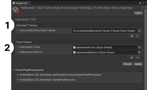
Inherited themes mean that if there are style sheets with selectors missing in the new theme, compared to the original one, then the latter’s styling will be applied. This makes customization easier. For example, you could create a new theme that only modifies fonts, while leaving the rest of the UI (such as colors, padding, or borders) styled according to the original theme. This approach is useful for scenarios like implementing light/dark mode, per-character UI customization, or creating game-specific event themes.
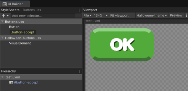
A workflow to create new themes based on existing ones could be:
Create a new TSS, and add the theme to inherit from and the new USS file to be used by this new TSS.
In UI Builder > StyleSheets, click Add Existing USS and select the one that the new theme will use.
Copy the selector that the new theme will override.
Paste it in the USS that the new theme uses, then right-click and choose Set as Active USS.
Edit the selector in the new USS.
You can see the style used by one theme or another from the drop list in UI Builder.
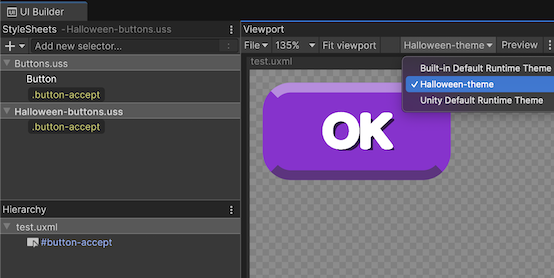
For runtime, reference your new theme in the Theme Style Sheet field of the Panel Settings Inspector.