Layouts
Table of Contents
Visual elementsA node of a visual tree that instantiates or derives from the C#
VisualElementclass. You can style the look, define the behaviour, and display it on screen as part of the UI. More info
See in Glossary
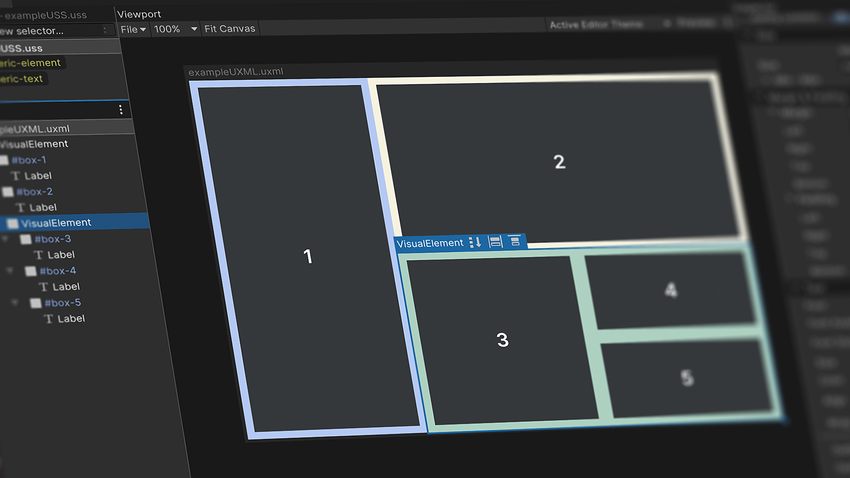
This section covers the essential steps to creating layouts in UI Builder.
UI Builder is a WYSIWYGWhat You See Is What You Get. A term used to describe a system where the user interface closely resembles the final output.
See in Glossary, designer-friendly tool to help create UXML and USS files. While some teams may prefer creating UI directly in code, UI Builder empowers artists with creative control, enabling significant workflow improvements. When you make changes in the UI Builder, it generates the code for you, and everything you create in UI Builder can be implemented as code directly in UXML and USS.
The efficient set up of responsive layouts is a major benefit of using UI Toolkit and UI Builder. Such layouts are a necessary feature for any game that is targeting multiple platforms with different screen resolutions and ratios.
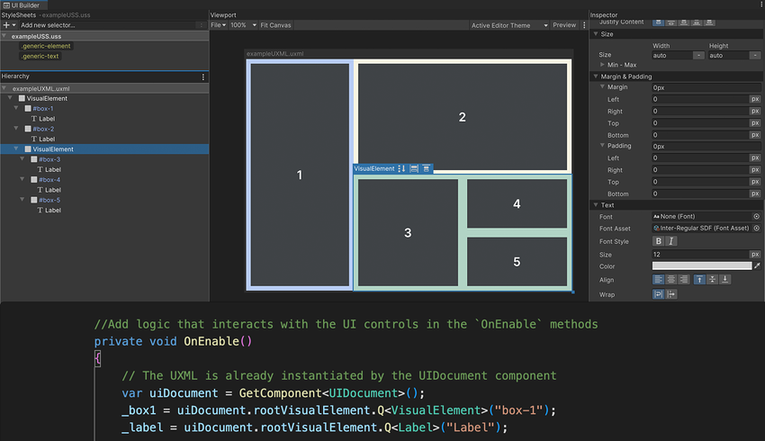
Below is a UXML file with its code displayed in the UXML Preview panel in UI Builder. In UI Builder, create the asset via File > New and then Save As.

In this example UXML code, you can see visual elements are represented as markup language that resembles HTML, such as starting with an open and ending bracket. For example, this is the syntax for a start button:
<engine:Button text="START" name="start-game__button" />
Core runtime components
UI Toolkit elements won’t appear in the SceneA Scene contains the environments and menus of your game. Think of each unique Scene file as a unique level. In each Scene, you place your environments, obstacles, and decorations, essentially designing and building your game in pieces. More info
See in Glossary view. You can see the interface as you make it in UI Builder, but the Game view provides a more accurate preview at the target resolution. To render the UI in Game view, a GameObjectThe fundamental object in Unity scenes, which can represent characters, props, scenery, cameras, waypoints, and more. A GameObject’s functionality is defined by the Components attached to it. More info
See in Glossary must have a UI Document component with a Panel Settings asset and a Visual TreeAn object graph, made of lightweight nodes, that holds all the elements in a window or panel. It defines every UI you build with the UI Toolkit.
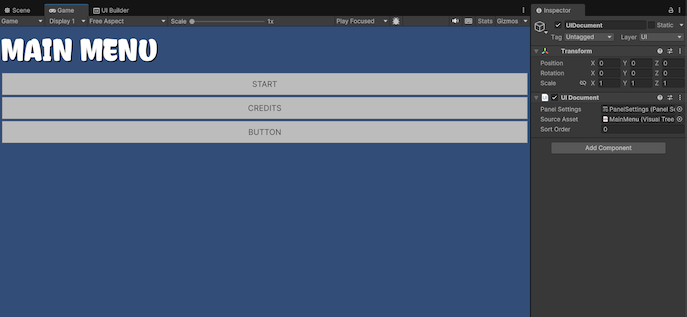
See in Glossary asset (UXML), as seen in this screenshot:

A UI Document Component defines what UXML will be displayed, and comes with a default Panel Settings asset. The Sort Order field determines how this document shows up in relation to other UI Documents using the same Panel Settings.
Add this component to a GameObject using the Add Component menu in the Inspector, or right-click in the Hierarchy and select UI Toolkit > UI Document, which will automatically assign the Panel Settings asset.
The Panel Settings asset defines how the UI Document component will be instantiated and visualized at runtime. It’s possible to have multiple Panel Settings assets to enable different styles for the UIs. If your game includes HUD or a minimap, for instance, these special UIs could each have their own Panel Settings.
Create the asset via Assets > Create > UI Toolkit > Panel Settings Asset. It will be added to your root project folder, which can then be applied to a UI Document component on a GameObject for a multi-step setup process. The example could use multiple UI documents for different game modes or menus. You can also find UIs for the runtime and for the Editor in the same Unity project.
Responsive layouts: Flexbox
UI Toolkit positions visual elements based on Yoga, an HTML/CSS layout engine that implements a subset of Flexbox.
If you’re unfamiliar with Yoga and Flexbox, this chapter will get you up to speed on the principles behind UI Toolkit’s layout engine.
Flexbox (or Flexible Box Layout) is a method for arranging items in rows or columns.
Flexbox architecture is great for developing complex, well-organized layouts. Consider a few of its advantages:
Responsive UI: Flexbox organizes everything into a network of boxes or containers. You can nest these elements as parents and children and arrange them spatially onscreen using simple rules. Children respond automatically to changes in their parent containers. A responsive layout adapts to different screen resolutions and sizes, allowing you to target multiple platforms more easily.
Organized complexity: Styles define simple rules that control the aesthetic values of a visual element. One style can be applied to hundreds of elements at once, with changes immediately reflected on the entire UI. This centers UI design around consistent reusable styles rather than working on the appearance of individual elements.
Decoupled logic and design: UI layouts and styles are decoupled from the code. This helps designers and developers work in parallel without breaking dependencies. Each user can then focus on what they do best.
Visual elements
In UI Toolkit, the fundamental building blocks of each interface are their visual elements. A visual element is the base class of every UI Toolkit element (buttons, images, text, etc.) Think of them as UI Toolkit equivalents of GameObjects.
A UI Hierarchy of one or more visual elements is called a Visual Tree.
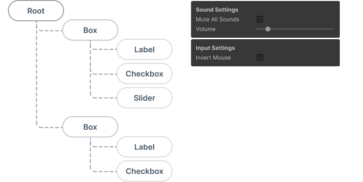
Combinations of multiple visual elements are stored in UXML files, which contains information related to the hierarchy, as well as its styling (if not using a StyleSheet or USS) and the layout of visual elements.
Before we dive deeper into UI Toolkit, you’ll need to understand the fundamentals of Flexbox Layout, which can be demonstrated with basic visual elements in the UI Builder.
Position visual elements
When mocking up a UI, approach each screen as a separate group of visual elements. Think about how to break the screens down into boxes that stack up horizontally or vertically and if they need child boxes to keep organizing the information.
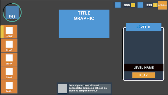
In the below example, one large visual element could be a container, the menu bar and its elements on the left. Separate child visual elements to represent each of the buttons.

UI Builder offers two position options for visual elements:
-
Relative positioning: This is the default setting for new visual elements. Child elements follow the Flexbox rules of the parent container. For example, if the parent element’s Direction is set to Row, child visual elements arrange themselves from left to right. Relative positioning resizes and moves elements dynamically based on:
The parent element’s size or style rules: If you modify a parent element’s settings via Padding or Align > Justify Content, its children adjust themselves according to those changes.
The child element’s own size and style rules: If the child visual element has its own minimum or maximum size settings, the layout engine tries to respect those as well.
UI Toolkit handles any conflicts between the parent and child element (so a child element with a minimum width that is wider than its container, for instance, results in an overflow).

Position modes available for any visual element. -
Absolute positioning: Here, the position of the visual element anchors to the parent container, similar to how uGUI (Unity UI) works with Canvases. Size rules or rules that affect the children elements still apply, but the element itself will overlay on top of the parent container ignoring flex settings like Grow, Shrink, or Margins.
Absolutely positioned elements can use the Left, Top, Right, and Bottom settings as anchors. For example, zero values for the Right and Bottom pin a Button to the bottom-right of the parent container.
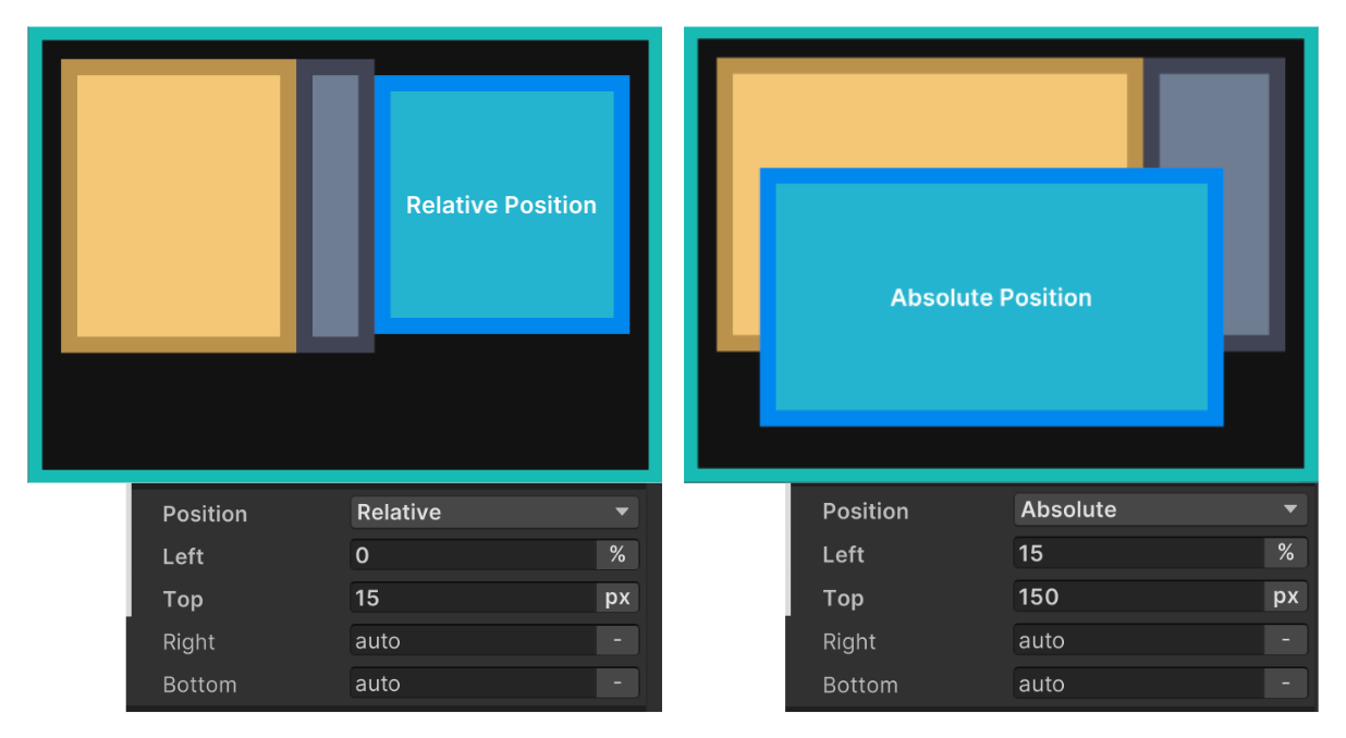
On the left, the blue visual element has a Relative position, with the parent element using Direction: Row as the Flex setting. On the right, the blue visual element uses Absolute position and ignores the parent element’s Flexbox rules.
You’ll probably want to use Relative positioning for elements that are permanently visible, have complex grouping, or contain a number of elements.
Absolute positioning can be useful for temporary UIs (like pop-up windows), decorative elements that don’t interfere with the layout composition, or elements that follow the position of other in-game elements (like a character’s health bar).
Size settings
Remember that visual elements are simply containers. In Unity 6, their default Grow setting is set to 1, which means they will take all the available space in the container. Otherwise they don’t take up any space unless they are filled with other child elements that already have a specific size, or you set them to a particular Width and Height.
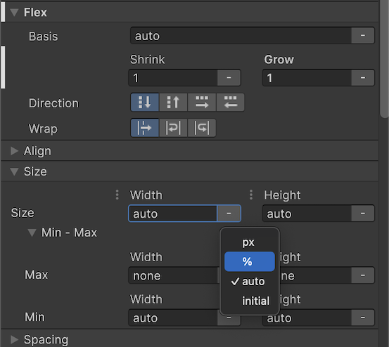
The Width and Height fields define the size of the element. The Max Width and Max Height limit how much it can expand. Likewise, the Min Width and Min Height limit how much it can contract. You can define the sizes in pixelThe smallest unit in a computer image. Pixel size depends on your screen resolution. Pixel lighting is calculated at every screen pixel. More info
See in Glossary units or percentages overriding the default auto. These impact how the Flex settings (below) can resize the elements based on available space.
Flex settings
The Flex settings can affect your element’s size when using Relative positioning. It’s recommended that you experiment with elements to understand their behavior firsthand.
Basis refers to the default Width and Height of the item before any Grow or Shrink ratio operation occurs:
- If Grow is set to 1, this element will take all the available vertical or horizontal space in the parent element. If it is set to 0.5 it will take half of all the available space.
- If Grow is set to 0, the element does not grow beyond its current Basis (or size).
- If Shrink is set to 1, the element will shrink as much as required to fit in the parent element’s available space.
- If Shrink is set to 0, the element will not shrink and will overflow if necessary.

The above example shows how Basis works with the Grow and Shrink options:
The green element with a Basis of 80% occupies 80 percent of the available space.
Setting the Grow to 1 allows the green element to expand to the entire space.
With a yellow element added, the elements overflow the space. The green element returns to occupying 80 percent of the space.
A Shrink setting of 1 makes the green element shrink to fit the yellow element.
Here, both elements have a Shrink value of 1. They shrink equally to fit in the available space.
As you can see, elements that have a fixed size expressed in pixels (the blue box in 3–5) don’t react to the Basis, Grow, or Shrink settings.
💡 Tip: Calculating visual element size
The layout engine combines the Size and Flexbox settings to determine how large each element appears when using Relative positioning. Calculating a visual element’s size entails the following steps:
The layout system computes the element size based on the Width and Height properties.
The layout engine checks if there is additional space available in the parent container, or if its children are already overflowing the available space.
If there is additional space available, the layout system looks for elements that have non-zero values in the Flex/Grow setting. It distributes the additional space according to that factor, expanding the child elements.
If the child elements overflow the available space, elements that have non-zero Flex/Shrink values will reduce in size accordingly.
Any other properties that affect the resulting size of an element (Min-Width, Flex-Basis, etc.) are then taken into consideration.
The layout engine applies the final, resolved size.
The Direction setting defines how child elements are arranged inside the parent. Child elements higher in the Hierarchy menu appear first. Elements at the end of the Hierarchy appear last.
The Wrap setting tells the layout system whether elements should try to fit into one column or row (No Wrap). Otherwise, they appear in the next row or column (Wrap or Wrap reverse).
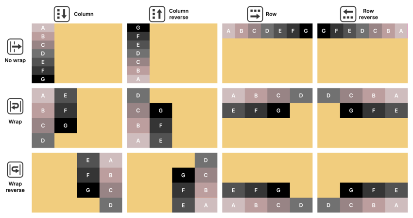
Align settings
The Align settings determine how child elements line up to their parent element. Set the Align > Align Items in the parent to line up child elements to the start, center, or end. These options affect the cross-axis (perpendicular to the row or column in the Flex > Direction).
The Stretch option also works along the cross-axis, but the Min or Max values from the size can limit the effect (this is the default). Meanwhile, the Auto option indicates that the layout engine can automatically choose one of the other options based on other parameters. It’s recommended that you select one of the options for more control over the layout, and mainly use the Auto option for special use cases.
Go to Align > Justify Content to define how the layout engine spaces child elements within the parent. These elements can line up, adjacent to one another, or spread out using the available space. The Flex > Grow and Flex > Shrink settings influence the resulting layout.
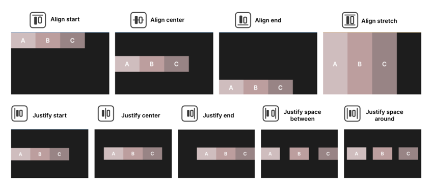
The Align Self option allows the container to align itself to the center, end, or start position of the flex layout.
Margin and Padding
Use the Margin and Padding settings to define empty spaces around your visual elements and their content. Unity uses a variation of the standard CSS box model, similar to the diagram below.
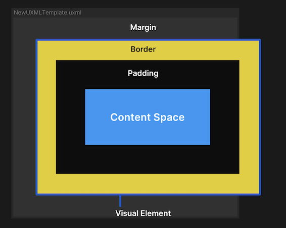
The Content Space holds your key visual elements (text, images, controls, etc.)
Padding defines an empty area around the Content Space, but inside the Border.
The Border defines a boundary between the Padding and the Margin. This can be colored and rounded. If given a thickness, the Border expands inward.
Margin is similar to Padding but defines an area outside the Border. For elements with Absolute position, the margin settings won’t have any effect but you can use the Position settings to add offset values.
Background and images
In UI Toolkit, any visual element can be used to display an onscreen image. Simply set the background property to show a texture or spriteA 2D graphic objects. If you are used to working in 3D, Sprites are essentially just standard textures but there are special techniques for combining and managing sprite textures for efficiency and convenience during development. More info
See in Glossary.
You can fill in a color or image to change the element’s appearance. This is helpful for wireframing. Bright colors with contrast can show how different elements look next to one another and respond to changes in their containers.
Variable or fixed measuring units
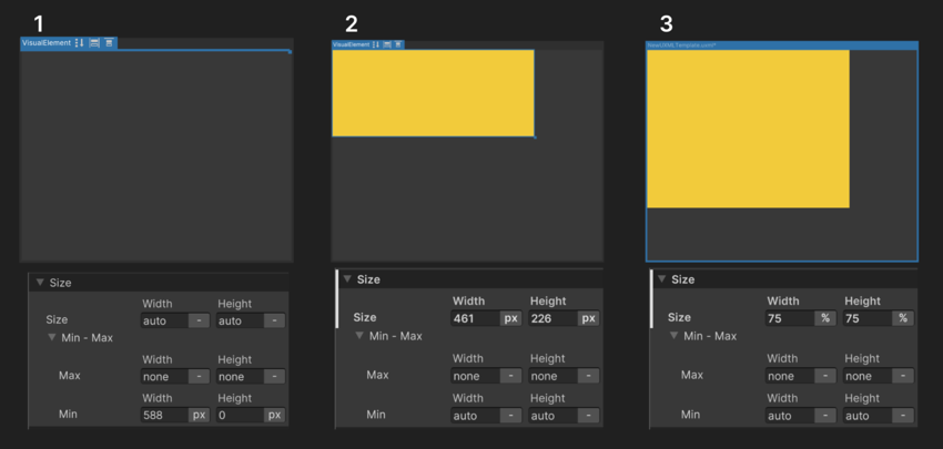
In UI Builder, you’ll encounter four parameters that define the distance and size of elements:
Auto: This is the default option for size and position. The layout system calculates the elements’ values based on both the parent and child elements’ information.
Percentage: The unit equals a percentage of an element’s container and changes dynamically with the parent’s Width and Height. Working with percentages can provide scalability when dealing with multiple format sizes.
Pixels: This option is useful when you want your element to have a fixed size, for example, when you want small elements to have a minimum size in pixels that will allow them to remain readable at all times.
Initial: This sets the property back to its default state (Unity’s own default styling rules), ignoring the current styling values.
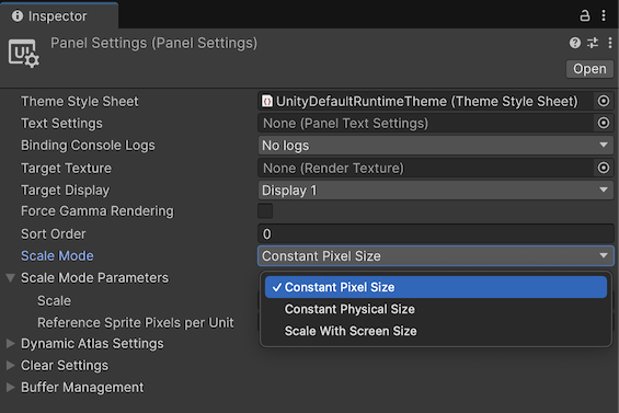
If you want to apply a scaling rule to the entire UI at the same time, you can do so in the Panel Settings under the Scale Mode parameters:
Constant Pixel Size: This scale mode keeps elements at a fixed pixel size, unaffected by screen size. A Scale Factor can be applied to multiply element sizes.
Constant Physical Size: This mode maintains elements at the same physical size across screens. The system scales the UI based on a Reference DPI, adjusting the size if the actual screen DPI differs.
Scale with Screen Size: This option resizes elements dynamically based on resolution. Screen Match Mode determines whether scaling prioritizes width, height, or a blend of both. The Reference Resolution sets the UI’s base size. When Screen Match Mode is set to Match Width or Height, the Match value controls whether the UI system scales the UI to match the screen width, the screen height, or a mix of the two.
Overridden properties in UI Builder
Modified properties will be highlighted in the InspectorA Unity window that displays information about the currently selected GameObject, asset or project settings, allowing you to inspect and edit the values. More info
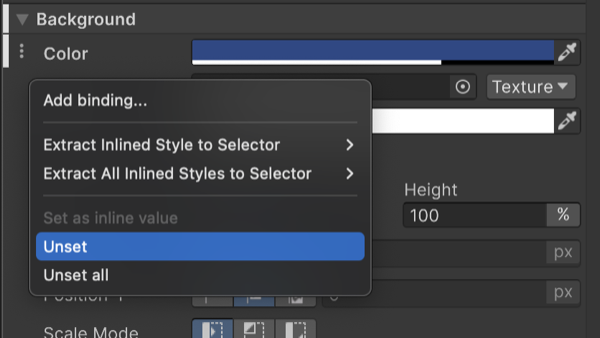
See in Glossary with a bold font and white line next to them as shown in the screenshot below. This indicates that they are overriding default values or values in the selector in the style sheet or USS of the selected UXML file. This behavior is also referred to as “inline styling”. If a value doesn’t need to be modified, it’s best to leave it in its default state to make changes easier to find and manage. To reset a property to its default value, you can use the option available in the dots (⋮) menu next to the property section.
UXML as templates
UXML files can be used similar to prefabsAn asset type that allows you to store a GameObject complete with components and properties. The prefab acts as a template from which you can create new object instances in the scene. More info
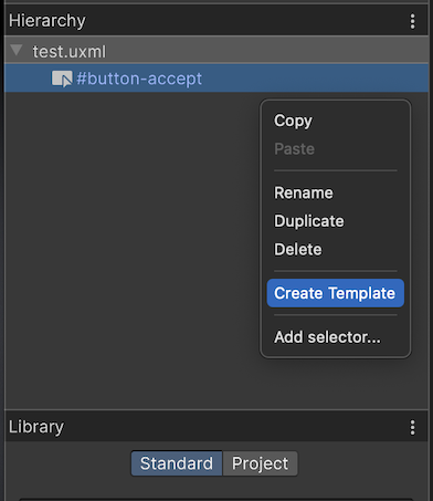
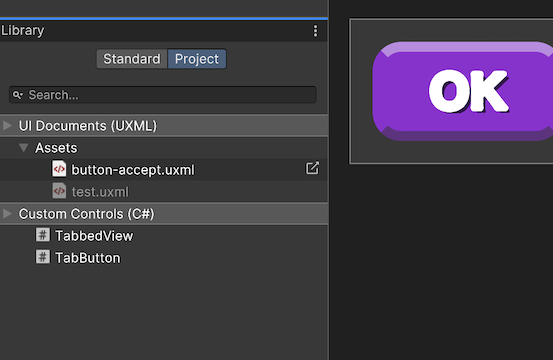
See in Glossary. For example, you could have a project with a UXML layout that contains an item icon and count number that you need to spawn many times inside an inventory. If you right click on any UXML you get the option to create a Template, which can later be added to any other visual element in the Hierarchy pane or instantiated from code. Once created you can find it in your Library and Project view.
Additional resources
Learn more about the Flexbox layout engine with the following resources. As Flexbox and Yoga are existing standards in web and app development, there will be a variety of resources available online.