Transition Options
Within a selectable component there are several transition options depending on what state the selectable is currently in. The different states are: normal, highlighted, pressed and disabled.

| Transition Options: | Function: |
|---|---|
| None | This option is for the button to have no state effects at all. |
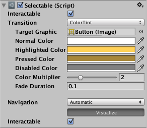
| Color Tint | Changes the colour of the button depending on what state it is in. It is possible to select the colour for each individual state. It is also possible to set the Fade Duration between the different states. The higher the number is, the slower the fade between colors will be. |
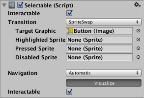
| Sprite Swap | Allows different spritesA 2D graphic objects. If you are used to working in 3D, Sprites are essentially just standard textures but there are special techniques for combining and managing sprite textures for efficiency and convenience during development. More info See in Glossary to display depending on what state the button is currently in, the sprites can be customised. |
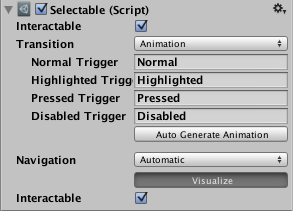
| Animation | Allows animations to occur depending on the state of the button, an animator componentA component on a model that animates that model using the Animation system. The component has a reference to an Animator Controller asset that controls the animation. More info See in Glossary must exist in order to use animation transitionAllows a state machine to switch or blend from one animation state to another. Transitions define how long a blend between states should take, and the conditions that activate them. Glossary must exist in order to use animation transitionAllows a state machine to switch or blend from one animation state to another. Transitions define how long a blend between states should take, and the conditions that activate them. More info See in Glossary. It’s important to make sure root motionMotion of character’s root node, whether it’s controlled by the animation itself or externally. Glossary. It’s important to make sure root motionMotion of character’s root node, whether it’s controlled by the animation itself or externally. More info See in Glossary is disabled. To create an animation controller click on generate animation (or create your own) and make sure that an animation controller has been added to the animator component of the button. |
Each Transition option (except None) provides additional options for controlling the transitions. We’ll go into details with those in each of the sections below.
Color Tint

| Property: | Function: |
|---|---|
| Target Graphic | The graphic used for the interaction component. |
| Normal Color | The normal color of the control |
| Highlighted Color | The color of the control when it is highlighted |
| Pressed Color | The color of the control when it is pressed |
| Disabled Color | The color of the control when it is disabled |
| Color Multiplier | This multiplies the tint color for each transition by its value. With this you can create colors greater than 1 to brighten the colors (or alpha channel) on graphic elements whose base color is less than white (or less then full alpha). |
| Fade Duration | The time taken, in seconds, to fade from one state to another |
Sprite Swap

| Property: | Function: |
|---|---|
| Target Graphic | The normal sprite to use |
| Highlighted Sprite | Sprite to use when the control is highlighted |
| Pressed Sprite | Sprite to use when the control is pressed |
| Disabled Sprite | Sprite to use when the control is disabled |
Animation

| Property: | Function: |
|---|---|
| Normal Trigger | The normal animation trigger to use |
| Highlighted Trigger | Trigger to use when the control is highlighted |
| Pressed Trigger | Trigger to use when the control is pressed |
| Disabled Trigger | Trigger to use when the control is disabled |
SelectableTransition