Контролы
IMGUI Control Types
There are a number of different IMGUI Controls that you can create. This section lists all of the available display and interactive Controls. There are other IMGUI functions that affect layout of Controls, which are described in the Layout section of the Guide.
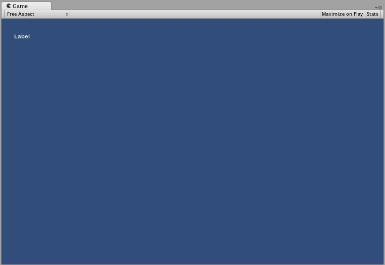
Label
The Label is non-interactive. It is for display only. It cannot be clicked or otherwise moved. It is best for displaying information only.
/* GUI.Label example */


// JavaScript
function OnGUI () {
    GUI.Label (Rect (25, 25, 100, 30), "Label");
}


// C#
using UnityEngine;
using System.Collections;

public class GUITest : MonoBehaviour {

    void OnGUI () {
        GUI.Label (new Rect (25, 25, 100, 30), "Label");
    }

}
Button
The Button is a typical interactive button. It will respond a single time when clicked, no matter how long the mouse remains depressed. The response occurs as soon as the mouse button is released.
Простейшее применение
In UnityGUI, Buttons will return true when they are clicked. To execute some code when a Button is clicked, you wrap the the GUI.Button function in an if statement. Inside the if statement is the code that will be executed when the Button is clicked.
/* GUI.Button example */


// JavaScript
function OnGUI () {
    if (GUI.Button (Rect (25, 25, 100, 30), "Button")) {
        // This code is executed when the Button is clicked
    }
}


// C#
using UnityEngine;
using System.Collections;

public class GUITest : MonoBehaviour {

    void OnGUI () {
        if (GUI.Button (new Rect (25, 25, 100, 30), "Button")) {
            // This code is executed when the Button is clicked
        }
    }

}

RepeatButton
RepeatButton is a variation of the regular Button. The difference is, RepeatButton will respond every frame that the mouse button remains depressed. This allows you to create click-and-hold functionality.
Простейшее применение
In UnityGUI, RepeatButtons will return true for every frame that they are clicked. To execute some code while the Button is being clicked, you wrap the the GUI.RepeatButton function in an if statement. Inside the if statement is the code that will be executed while the RepeatButton remains clicked.
/* GUI.RepeatButton example */


// JavaScript
function OnGUI () {
    if (GUI.RepeatButton (Rect (25, 25, 100, 30), "RepeatButton")) {
        // This code is executed every frame that the RepeatButton remains clicked
    }
}


// C#
using UnityEngine;
using System.Collections;

public class GUITest : MonoBehaviour {

    void OnGUI () {
        if (GUI.RepeatButton (new Rect (25, 25, 100, 30), "RepeatButton")) {
            // This code is executed every frame that the RepeatButton remains clicked
        }
    }

}

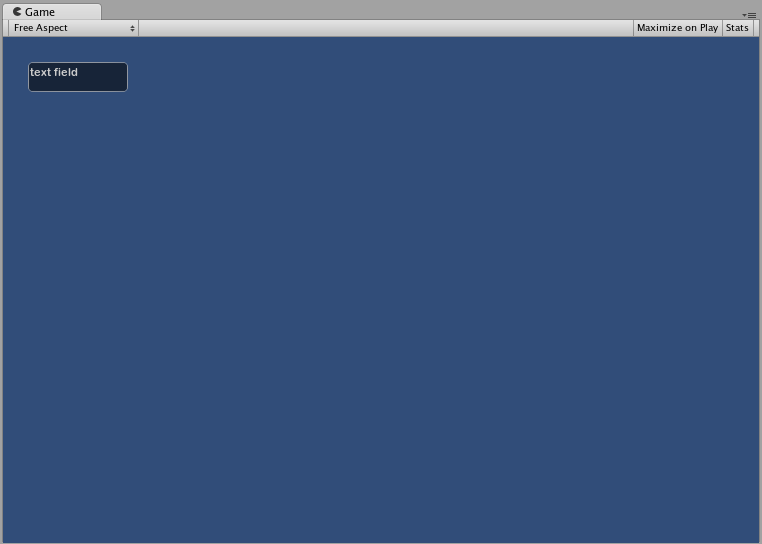
TextField
The TextField Control is an interactive, editable single-line field containing a text string.
Простейшее применение
TextField будет всегда отображать строку. Вы должны предоставить строку для отображения в TextField. Когда производится изменение текста, функция TextField вернет измененную строку.
/* GUI.TextField example */


// JavaScript
var textFieldString = "text field";

function OnGUI () {
    textFieldString = GUI.TextField (Rect (25, 25, 100, 30), textFieldString);
}


// C#
using UnityEngine;
using System.Collections;

public class GUITest : MonoBehaviour {

    private string textFieldString = "text field";

    void OnGUI () {
        textFieldString = GUI.TextField (new Rect (25, 25, 100, 30), textFieldString);
    }

}
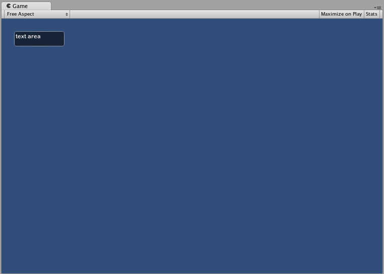
TextArea
The TextArea Control is an interactive, editable multi-line area containing a text string.
Простейшее применение
TextArea будет всегда отображать строку. Вы должны предоставить строку для отображения в TextArea. Когда производится изменение строки, функция TextArea вернет измененную строку.
/* GUI.TextArea example */


// JavaScript
var textAreaString = "text area";

function OnGUI () {
    textAreaString = GUI.TextArea (Rect (25, 25, 100, 30), textAreaString);
}


// C#
using UnityEngine;
using System.Collections;

public class GUITest : MonoBehaviour {

    private string textAreaString = "text area";

    void OnGUI () {
        textAreaString = GUI.TextArea (new Rect (25, 25, 100, 30), textAreaString);
    }

}
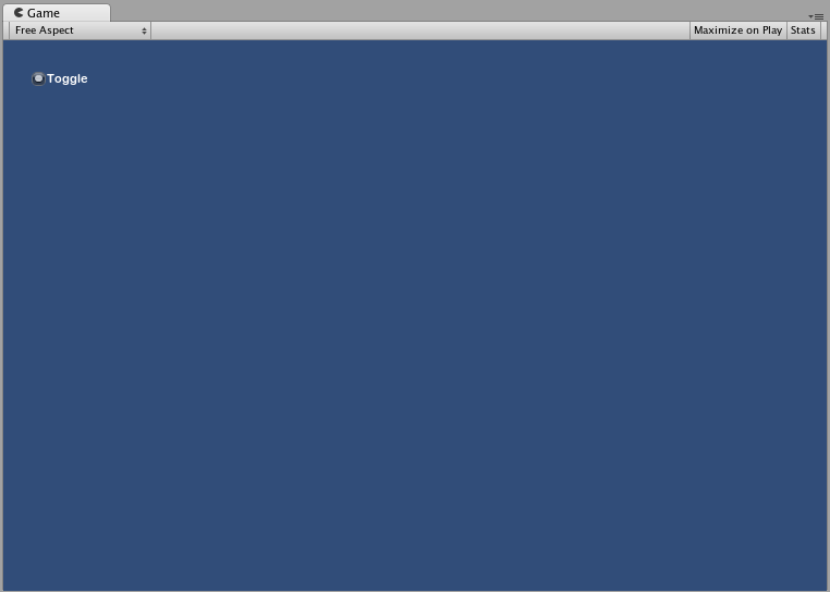
Toggle
The Toggle Control creates a checkbox with a persistent on/off state. The user can change the state by clicking on it.
Простейшее применение
Состояние вкл/выкл представлено в виде boolean значения (true/false). Вы должны предоставить boolean в качестве параметра, чтобы флажок отобразил текущее состояние. Функция Toggle вернёт новое значение boolean, если флажок был нажат. Чтобы “поймать” этот момент, вы должны присвоить boolean значение, возвращаемое Toggle функцией.
/* GUI.Toggle example */


// JavaScript
var toggleBool = true;

function OnGUI () {
    toggleBool = GUI.Toggle (Rect (25, 25, 100, 30), toggleBool, "Toggle");
}


// C#
using UnityEngine;
using System.Collections;

public class GUITest : MonoBehaviour {

    private bool toggleBool = true;

    void OnGUI () {
        toggleBool = GUI.Toggle (new Rect (25, 25, 100, 30), toggleBool, "Toggle");
    }

}
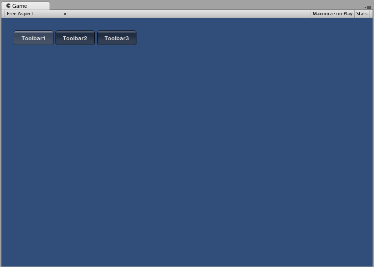
Toolbar
The Toolbar Control is essentially a row of Buttons. Only one of the Buttons on the Toolbar can be active at a time, and it will remain active until a different Button is clicked. This behavior emulates the behavior of a typical Toolbar. You can define an arbitrary number of Buttons on the Toolbar.
Простейшее применение
Активная кнопка в Toolbar определяется целым числом (integer). Вы должны предоставить integer в качестве аргумента функции. Чтобы сделать Toolbar интерактивным, вы должны присвоить integer переменной возвращаемое функцией значение. Число элементов в массиве с содержимым, который вы передадите, определит количество кнопок, отображаемых в Toolbar.
/* GUI.Toolbar example */


// JavaScript
var toolbarInt = 0;
var toolbarStrings : String[] = ["Toolbar1", "Toolbar2", "Toolbar3"];

function OnGUI () {
    toolbarInt = GUI.Toolbar (Rect (25, 25, 250, 30), toolbarInt, toolbarStrings);
}


// C#
using UnityEngine;
using System.Collections;

public class GUITest : MonoBehaviour {

    private int toolbarInt = 0;
    private string[] toolbarStrings = {"Toolbar1", "Toolbar2", "Toolbar3"};

    void OnGUI () {
        toolbarInt = GUI.Toolbar (new Rect (25, 25, 250, 30), toolbarInt, toolbarStrings);
    }

}
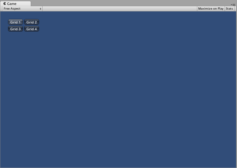
SelectionGrid
The SelectionGrid Control is a multi-row Toolbar. You can determine the number of columns and rows in the grid. Only one Button can be active at time.
Простейшее применение
Активная кнопка в SelectionGrid отслеживается через integer. Вы должны передать integer в качестве аргумента функции. Чтобы сделать SelectionGrid интерактивным, вы должны присвоить возвращаемое значение integer’у. Число элементов в массив с содержимым определяет количество кнопок, отображаемых в SelectionGrid. Вы также можете устанавливать количество столбцов через аргументы функции.
/* GUI.SelectionGrid example */


// JavaScript
var selectionGridInt : int = 0;
var selectionStrings : String[] = ["Grid 1", "Grid 2", "Grid 3", "Grid 4"];

function OnGUI () {
    selectionGridInt = GUI.SelectionGrid (Rect (25, 25, 100, 30), selectionGridInt, selectionStrings, 2);

}


// C#
using UnityEngine;
using System.Collections;

public class GUITest : MonoBehaviour {

    private int selectionGridInt = 0;
    private string[] selectionStrings = {"Grid 1", "Grid 2", "Grid 3", "Grid 4"};

    void OnGUI () {
        selectionGridInt = GUI.SelectionGrid (new Rect (25, 25, 300, 60), selectionGridInt, selectionStrings, 2);

    }

}
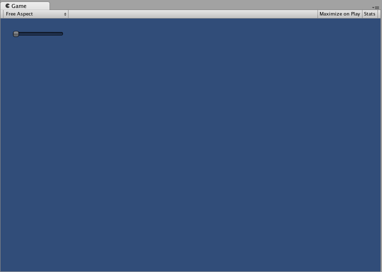
HorizontalSlider
The HorizontalSlider Control is a typical horizontal sliding knob that can be dragged to change a value between predetermined min and max values.
Простейшее применение
Положение ползунка хранится в виде float переменной. Для отображения положения ползунка вы должны передать этот float в качестве одного из аргументов функции. Существует два дополнительных значения, которые определяют минимум и максимум. Если вы хотите, чтобы слайдер можно было двигать, присваивайте возвращаемое значение из функции Slider переменной типа float.
/* Horizontal Slider example */


// JavaScript
var hSliderValue : float = 0.0;

function OnGUI () {
    hSliderValue = GUI.HorizontalSlider (Rect (25, 25, 100, 30), hSliderValue, 0.0, 10.0);
}


// C#
using UnityEngine;
using System.Collections;

public class GUITest : MonoBehaviour {

    private float hSliderValue = 0.0f;

    void OnGUI () {
        hSliderValue = GUI.HorizontalSlider (new Rect (25, 25, 100, 30), hSliderValue, 0.0f, 10.0f);
    }

}
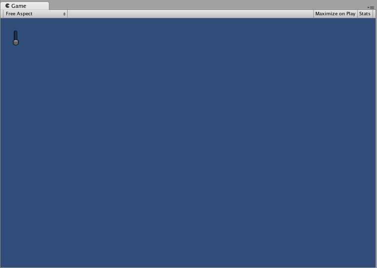
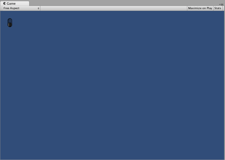
VerticalSlider
The VerticalSlider Control is a typical vertical sliding knob that can be dragged to change a value between predetermined min and max values.
Простейшее применение
Положение ползунка хранится в виде float переменной. Для отображения положения ползунка вы должны передать этот float в качестве одного из аргументов функции. Существует два дополнительных значения, которые определяют минимум и максимум. Если вы хотите, чтобы слайдер можно было двигать, присваивайте возвращаемое значение из функции Slider переменной типа float.
/* Vertical Slider example */


// JavaScript
var vSliderValue : float = 0.0;

function OnGUI () {
    vSliderValue = GUI.VerticalSlider (Rect (25, 25, 100, 30), vSliderValue, 10.0, 0.0);
}


// C#
using UnityEngine;
using System.Collections;

public class GUITest : MonoBehaviour {

    private float vSliderValue = 0.0f;

    void OnGUI () {
        vSliderValue = GUI.VerticalSlider (new Rect (25, 25, 100, 30), vSliderValue, 10.0f, 0.0f);
    }

}
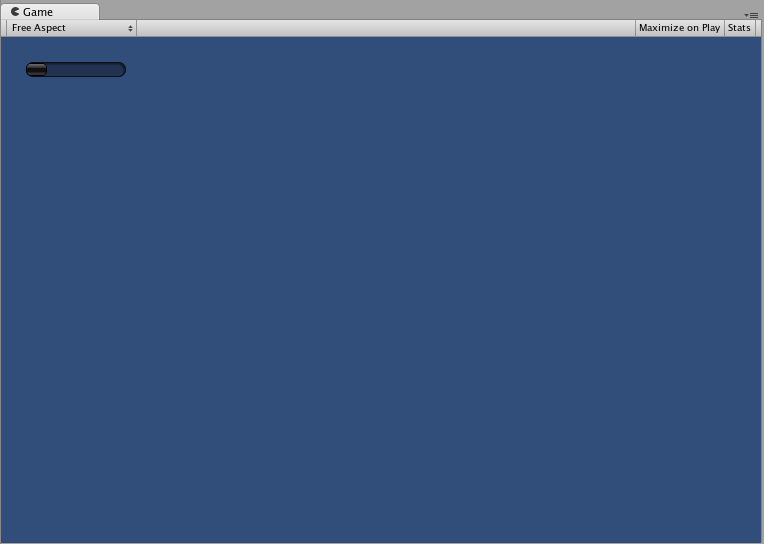
HorizontalScrollbar
The HorizontalScrollbar Control is similar to a Slider Control, but visually similar to Scrolling elements for web browsers or word processors. This control is used to navigate the ScrollView Control.
Простейшее применение
Horizontal Scrollbar’ы работают идентично Horizontal Slider’ам с одним исключением: существует дополнительный аргумент, который контролирует ширину самого ползунка скроллбара.
/* Horizontal Scrollbar example */


// JavaScript
var hScrollbarValue : float;

function OnGUI () {
    hScrollbarValue = GUI.HorizontalScrollbar (Rect (25, 25, 100, 30), hScrollbarValue, 1.0, 0.0, 10.0);
}


// C#
using UnityEngine;
using System.Collections;

public class GUITest : MonoBehaviour {

    private float hScrollbarValue;

    void OnGUI () {
        hScrollbarValue = GUI.HorizontalScrollbar (new Rect (25, 25, 100, 30), hScrollbarValue, 1.0f, 0.0f, 10.0f);
    }

}
VerticalScrollbar
The VerticalScrollbar Control is similar to a Slider Control, but visually similar to Scrolling elements for web browsers or word processors. This control is used to navigate the ScrollView Control.
Простейшее применение
Vertical Scrollbar’ы работают идентично Vertical Slider’ам с одним исключением: существует дополнительный аргумент, который контролирует высоту самого ползунка скроллбара.
/* Vertical Scrollbar example */


// JavaScript
var vScrollbarValue : float;

function OnGUI () {
    vScrollbarValue = GUI. VerticalScrollbar (Rect (25, 25, 100, 30), vScrollbarValue, 1.0, 10.0, 0.0);
}


// C#
using UnityEngine;
using System.Collections;

public class GUITest : MonoBehaviour {

    private float vScrollbarValue;

    void OnGUI () {
        vScrollbarValue = GUI. VerticalScrollbar (new Rect (25, 25, 100, 30), vScrollbarValue, 1.0f, 10.0f, 0.0f);
    }

}
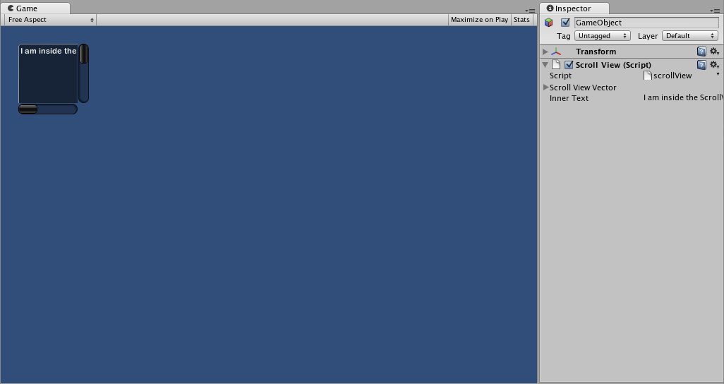
ScrollView
ScrollViews are Controls that display a viewable area of a much larger set of Controls.
Простейшее применение
ScrollViews require two Rects as arguments. The first Rect defines the location and size of the viewable ScrollView area on the screen. The second Rect defines the size of the space contained inside the viewable area. If the space inside the viewable area is larger than the viewable area, Scrollbars will appear as appropriate. You must also assign and provide a 2D Vector which stores the position of the viewable area that is displayed.
/* ScrollView example */


// JavaScript
var scrollViewVector : Vector2 = Vector2.zero;
var innerText : String = "I am inside the ScrollView";

function OnGUI () {
    // Begin the ScrollView
    scrollViewVector = GUI.BeginScrollView (Rect (25, 25, 100, 100), scrollViewVector, Rect (0, 0, 400, 400));

    // Put something inside the ScrollView
    innerText = GUI.TextArea (Rect (0, 0, 400, 400), innerText);

    // End the ScrollView
    GUI.EndScrollView();
}


// C#
using UnityEngine;
using System.Collections;

public class GUITest : MonoBehaviour {

    private Vector2 scrollViewVector = Vector2.zero;
    private string innerText = "I am inside the ScrollView";

    void OnGUI () {
        // Begin the ScrollView
        scrollViewVector = GUI.BeginScrollView (new Rect (25, 25, 100, 100), scrollViewVector, new Rect (0, 0, 400, 400));

        // Put something inside the ScrollView
        innerText = GUI.TextArea (new Rect (0, 0, 400, 400), innerText);

        // End the ScrollView
        GUI.EndScrollView();
    }

}
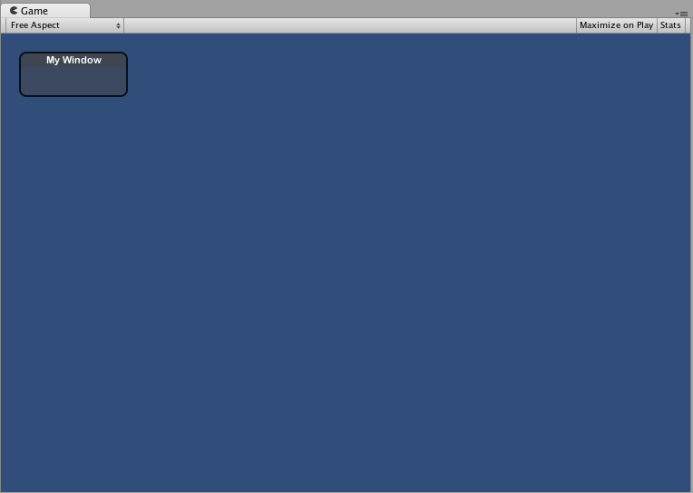
Window
Windows are drag-able containers of Controls. They can receive and lose focus when clicked. Because of this, they are implemented slightly differently from the other Controls. Each Window has an id number, and its contents are declared inside a separate function that is called when the Window has focus.
Простейшее применение
Windows are the only Control that require an additional function to work properly. You must provide an id number and a function name to be executed for the Window. Inside the Window function, you create your actual behaviors or contained Controls.
/* Window example */


// JavaScript
var windowRect : Rect = Rect (20, 20, 120, 50);

function OnGUI () {
    windowRect = GUI.Window (0, windowRect, WindowFunction, "My Window");
}

function WindowFunction (windowID : int) {
    // Draw any Controls inside the window here
}


// C#
using UnityEngine;
using System.Collections;

public class GUITest : MonoBehaviour {

    private Rect windowRect = new Rect (20, 20, 120, 50);

    void OnGUI () {
        windowRect = GUI.Window (0, windowRect, WindowFunction, "My Window");
    }

    void WindowFunction (int windowID) {
        // Draw any Controls inside the window here
    }

}
GUI.changed
To detect if the user did any action in the GUI (clicked a button, dragged a slider, etc), read the GUI.changed value from your script. This gets set to true when the user has done something, making it easy to validate the user input.
A common scenario would be for a Toolbar, where you want to change a specific value based on which Button in the Toolbar was clicked. You don’t want to assign the value in every call to OnGUI(), only when one of the Buttons has been clicked.
/* GUI.changed example */


// JavaScript
private var selectedToolbar : int = 0;
private var toolbarStrings = ["One", "Two"];

function OnGUI () {
    // Determine which button is active, whether it was clicked this frame or not
    selectedToolbar = GUI.Toolbar (Rect (50, 10, Screen.width - 100, 30), selectedToolbar, toolbarStrings);

    // If the user clicked a new Toolbar button this frame, we'll process their input
    if (GUI.changed)
    {
        print ("The toolbar was clicked");

        if (selectedToolbar == 0)
        {
            print ("First button was clicked");
        }
        else
        {
            print ("Second button was clicked");
        }
    }
}


// C#
using UnityEngine;
using System.Collections;

public class GUITest : MonoBehaviour {

    private int selectedToolbar = 0;
    private string[] toolbarStrings = {"One", "Two"};

    void OnGUI () {
        // Determine which button is active, whether it was clicked this frame or not
        selectedToolbar = GUI.Toolbar (new Rect (50, 10, Screen.width - 100, 30), selectedToolbar, toolbarStrings);

        // If the user clicked a new Toolbar button this frame, we'll process their input
        if (GUI.changed)
        {
            Debug.Log("The toolbar was clicked");

            if (0 == selectedToolbar)
            {
                Debug.Log("First button was clicked");
            }
            else
            {
                Debug.Log("Second button was clicked");
            }
        }
    }

}
GUI.changed will return true if any GUI Control placed before it was manipulated by the user.