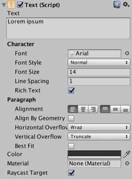
Text
The Text control displays a non-interactive piece of text to the user. This can be used to provide captions or labels for other GUI controls or to display instructions or other text.

Свойства

| Свойство: | Функция: |
|---|---|
| Text | The text displayed by the control. |
| Character | |
| Font __ | The Font used to display the text. | |Font Style__ | The style applied to the text. The options are Normal, Bold, Italic and Bold And Italic. |
| Font Size | The size of the displayed text. |
| Line Spacing | The vertical separation between lines of text. |
| Rich Text | Should markup elements in the text be interpreted as Rich Text styling? |
| Paragraph | |
| Alignment | The horizontal and vertical alignment of the text. |
| Align by Geometry | Use the extents of glyph geometry to perform horizontal alignment rather than glyph metrics. |
| Horizontal Overflow | The method used to handle the situation where the text is too wide to fit in the rectangle. The options are Wrap and Overflow. |
| Vertical Overflow | The method used to handle the situation where wrapped text is too tall to fit in the rectangle. The options are Truncate and Overflow. |
| Best Fit | Should Unity ignore the size properties and simply try to fit the text to the control’s rectangle? |
| Color | Цвет, используемый для отображение текста. |
| Material | The Material used to render the text. |
Детали
Some controls (such as Buttons and Toggles have textual descriptions built-in. For controls that have no implicit text (such as Sliders, you can indicate the purpose using a label created with a Text control. Text is also useful for lists of instructions, story text, conversations and legal disclaimers.
The Text control offers the usual parameters for font size, style, etc, and text alignment. When the Rich Text option is enabled, markup elements within the text will be treated as styling information, so you can have just a single word or short section in boldface or in a different color, say (see the page about Rich Text for details of the markup scheme).
Советы
- See the Effects page for how to apply a simple shadow or outline effect to the text.