Using App UI
Once you have installed App UI Unity Package, you can start using it in your Unity projects.
App UI Unity Package consists mainly of a set of UI Toolkit components. If you are not familiar with UI Toolkit, we recommend you to read the UI Toolkit documentation and the overall Unity Documentation before using App UI.
App UI UI-Toolkit Themes
Note
UI-Toolkit themes are files with the .tss extension which can be loaded in your PanelSettings component or selected in UI Builder via the theme dropdown in the viewport.
App UI comes with several UI-Toolkit themes that you can use in your projects. They are located in the PackageResources/Styles/Themes folder.
It is important to set a theme in your project.
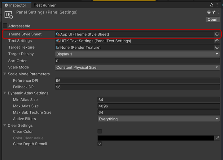
For more information about themes, see the Theming documentation page.
Default Theme
App UI.tss: This is the main theme that encapsulates every contexts via different USS selectors. We recommend to use this theme if you are building a runtime app that needs to be able to switch between different color schemes, scales, layout directions, etc.
Themes for UI Builder
Theses themes are designed to be used with the UI Builder, they are the combination styling related contexts (color scheme and scale).
App UI - Dark - Large.tssApp UI - Dark - Medium.tssApp UI - Dark - Small.tssApp UI - Light - Large.tssApp UI - Light - Medium.tssApp UI - Light - Small.tssApp UI - Editor Dark - Large.tssApp UI - Editor Dark - Medium.tssApp UI - Editor Dark - Small.tssApp UI - Editor Light - Large.tssApp UI - Editor Light - Medium.tssApp UI - Editor Light - Small.tss
Root Panel Element
App UI components are designed to be used inside a Panel component.
The Panel component is a VisualElement that provides an initial context to the UIDocument which will be propagated to its children. Having a context is vital for App UI components to be displayed correctly, as they provide information such as the current theme (color scheme), the language, layout direction, etc.
In addition to the context, the Panel component also provides a layering system to handle popups, notifications, and tooltips (they will appear in the same UIDocument as overlays).
To know more about Context management, see the Context documentation page.
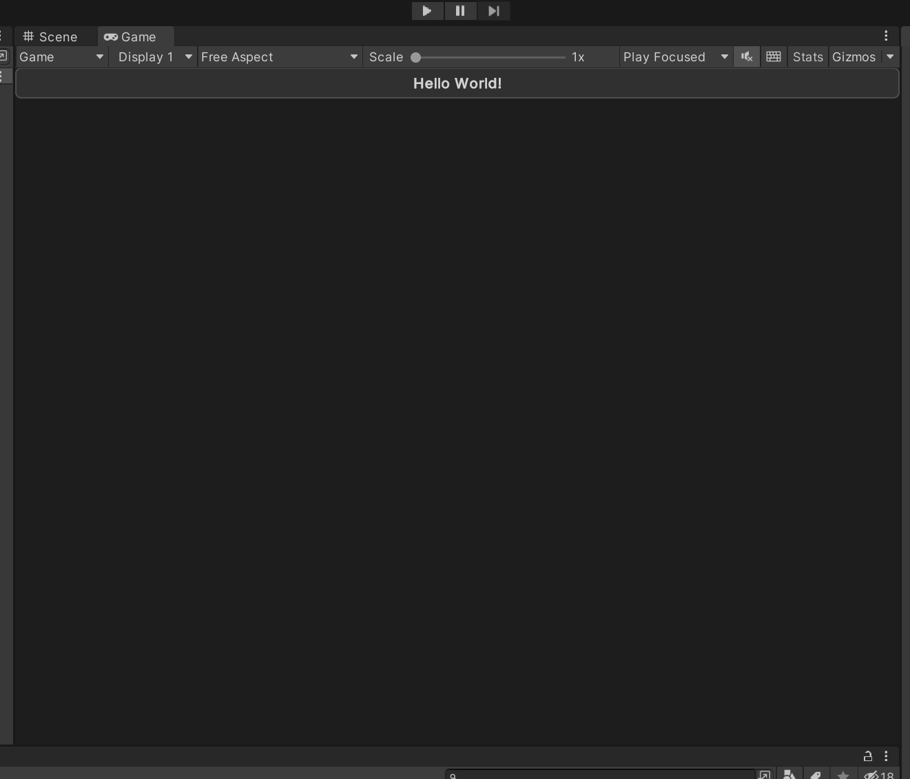
Here is how to use the Panel component in a UI Document:
<UXML xmlns="UnityEngine.UIElements" xmlns:appui="Unity.AppUI.UI">
    <appui:Panel>
        <!-- Your UI elements -->
    </appui:Panel>
</UXML>
App UI Components
App UI components are defined as VisualElement in UI Toolkit.
You can find them in the Unity.AppUI.UI namespace.
If you are working directly by editing UXML files, we recommend to define the appui namespace inside.
<UXML xmlns="UnityEngine.UIElements" xmlns:appui="Unity.AppUI.UI">
    [...]
</UXML>
You can also update the UXML Schema definition to get autocompletion in your IDE by selecting Assets > Update UXML Schema in the Editor.
Here is an example of usage inside a UI Document:
<UXML xmlns="UnityEngine.UIElements" xmlns:appui="Unity.AppUI.UI">
    <appui:Panel>
        <appui:Button title="Hello World!" />
    </appui:Panel>
</UXML>
Using App UI with UI Builder
UI Builder is Unity's visual authoring tool for UI Toolkit. App UI components are fully compatible with UI Builder, allowing you to create interfaces visually while leveraging all the design system components.
Setting Up UI Builder for App UI
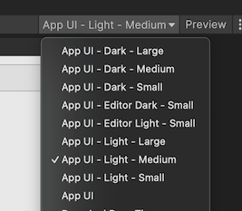
1. Configure the Theme
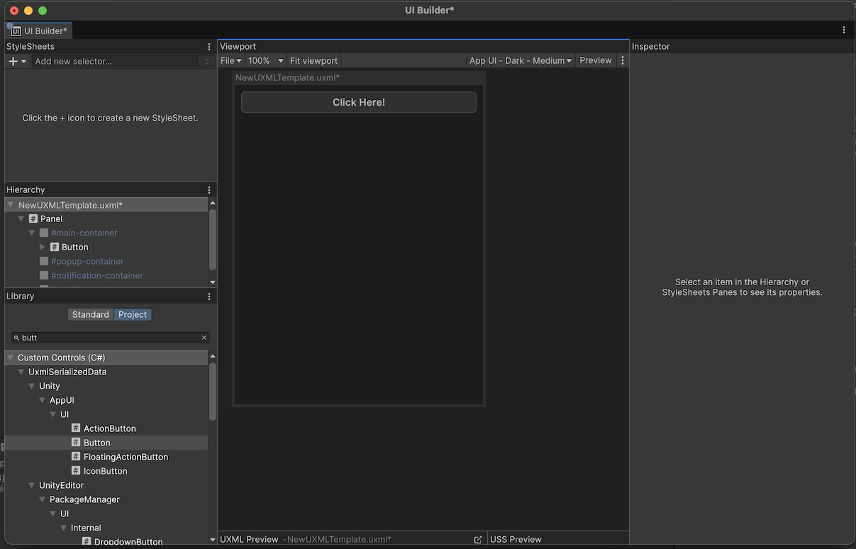
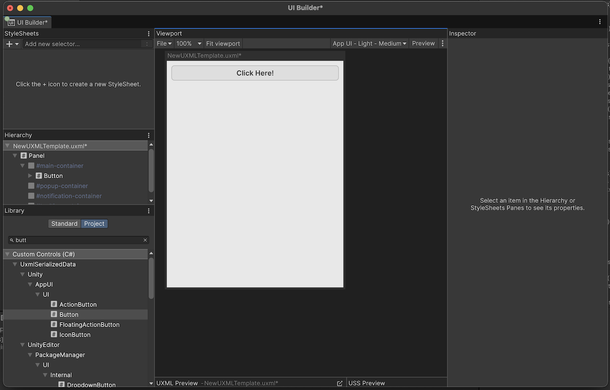
Before building your interface, you need to select an appropriate App UI theme in UI Builder:
- Open UI Builder (Window > UI Toolkit > UI Builder)
- In the viewport area, click on the Theme dropdown
- Select one of the App UI themes based on your target appearance:
- For runtime applications: Use the specific context themes (e.g.,
App UI - Dark - Medium) - For editor tools: Use the editor themes (e.g.,
App UI - Editor Dark - Small)
- For runtime applications: Use the specific context themes (e.g.,
2. Start with a Panel Root
Always begin your UI hierarchy with an App UI Panel component:
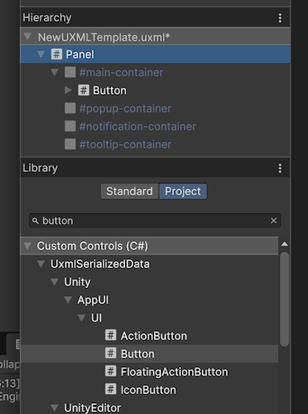
- In the Library section, choose Project tab.
- Search for Panel element from App UI library.
- Add the element into your Hierarchy by dragging and dropping it.
This Panel will serve as your root container and provide the necessary context for all App UI components

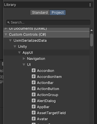
3. Access App UI Components
App UI components are available in the Library panel under the Project tab:
- Open the Library panel (if not visible, enable it via Window > UI Builder)
- Choose the Project tab.
- Expand the Custom Controls (C#) section to see all available components.
Building Interfaces with App UI Components
Adding Components
To add App UI components to your interface:
- Drag components from the Library panel into the Hierarchy
- Drop them inside your Panel or other container elements
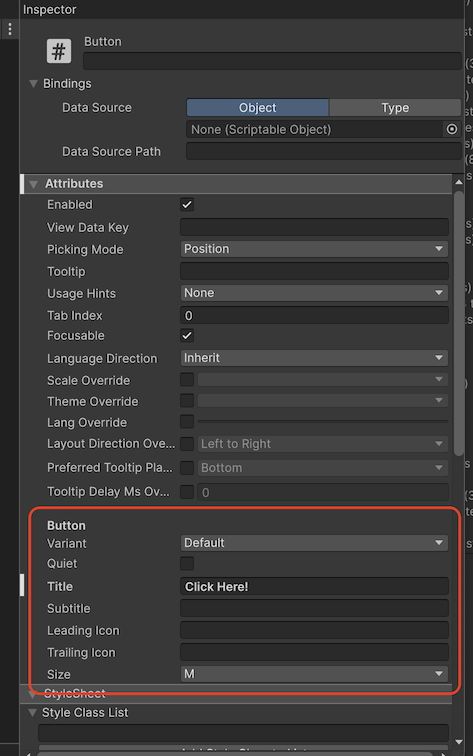
- Use the Inspector to configure component properties
Component Properties
App UI components expose their properties in the Inspector panel:
- Common Properties: All components inherit standard VisualElement properties
- App UI Properties: Component-specific properties like
title,variant,size, etc. - Styling: USS classes and inline styles can be applied as usual
Best Practices for UI Builder
Preview Different Themes
Use the theme dropdown in UI Builder to preview your interface with different App UI themes:
- Test both light and dark variants
- Verify your layout works across different scale sizes
- Ensure proper contrast and readability
Utilize the Visual Documentation
App UI includes visual documentation that can help you understand component behavior:
- Access component examples in the Package Documentation
- Reference the visual documentation in the
Docs/folder - Use the samples as starting points for your designs
Troubleshooting UI Builder Issues
Components Not Displaying Correctly
If App UI components don't appear as expected:
- Check Theme: Ensure you've selected an App UI theme in the viewport
- Verify Panel: Make sure your components are inside an App UI Panel
- Update Schema: Run Assets > Update UXML Schema to ensure proper autocompletion
Missing Components in Library
If App UI components don't appear in the Library panel:
- Ensure the App UI package is properly installed
- Restart Unity and UI Builder
- Check that the package is in the correct version
Styling Issues
If custom styling isn't working as expected:
- Verify USS specificity rules
- Check that your styles don't conflict with App UI's base styles
- Use the Inspector's computed styles to debug style application