Custom Icons
Every icon provided by App UI is available as a PNG file. They are all referenced inside USS files, which are used to load the icons.
Adding Custom Icons
To add a custom icon, you need to add a PNG file to your project and reference it in a USS file.
The naming convention used for the USS class name is appui-icon--<name>--<variant in lowercase>.
The variant by default is Regular, but you can use the following variants:
RegularBoldLightDuoToneThinFill
Here's an example of how to add a custom icon named home with the Regular variant:
.appui-icon--home--regular {
    --unity-image: url("path/to/home.png");
}
Important
Your USS class name must start with appui-icon-- followed by the name of your icon
in order to work with the Icon UI component.
Then you can use the Icon UI component to display the icon:
<appui:Icon name="home" variant="Regular" />
High DPI icons
To support high DPI icons, you need to add the high DPI icon with a @2x suffix to the name next to the original icon (in the same folder).
For example, if you have a home.png icon, you need to add a home@2x.png icon to the same folder.
Then when referring to the icon in your USS file, you need to use the resource() function instead of url(),
because the resource() function will track assets that are part of Resources folder. So implicitly the high DPI icon will part of your Runtime build.
Example:
.appui-icon--home--regular {
    --unity-image: resource("MyIcons/home"); /* This will load the high DPI icon on devices with a pixel ratio of 2.0 */
    /* Note that "MyIcons" is a folder contained inside a Resources folder */
}
For more information about this feature, please refer to UI-Toolkit documentation.
Icon Browser
The Icon Browser is an Editor tool that allows you to generate the USS classes for your custom icons.
To open the Icon Browser, go to Window > App UI > Icon Browser.
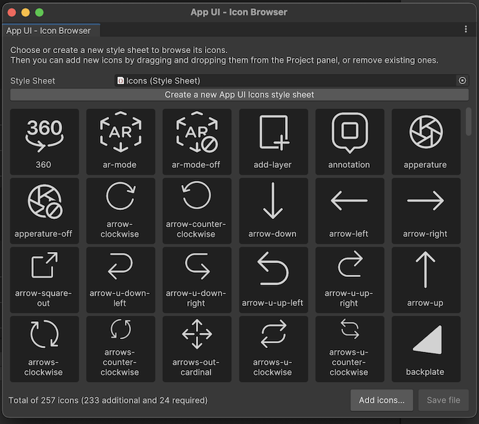
To use this tool you need to work on an existing USS file asset that includes only icons.
If you don't have one, you can create a new one by right-clicking in the Project window
and selecting Create > App UI > Icon Stylesheet.
You can also directly click on Create a new App UI Icons style sheet
button in the Icon Browser window.
Make sure the stylesheet (USS) asset is set in the Icon Browser window.
To include new Icons in this stylesheet, you can:
- Drag and drop texture assets from the Project window to the Icon Browser window.
- Click on the
Add Icons...button in the Icon Browser window and select the texture asset.
Note
When adding already existing texture assets as Icons via the Icon Browser,
the tool expects that the name of the folder containing the texture asset is
the name of the icon's variant.
For example, if you have a texture asset named home.png in a folder named Regular,
the tool will generate the USS class appui-icon--home--regular.
Note
App UI provides a set of icons that you can use in your project.
You can find them in the Packages/com.unity.dt.app-ui/PackageResources/Icons folder.