Inputs
Inputs components are used to get input from the user through UI controls. App UI provides a wide range of Input components that can be easily integrated into your Unity projects.
Input Label
The InputLabel element is used to display a name next to an input control. The InputLabel element can be used with any input control and will decorate it with a label, required indicator and helper text.
// This code creates a Name field with a label.
// The field is valid if it contains at least 1 character.
var myField = new TextField();
var label = new InputLabel("Name");
label.inputAlignment = Align.Stretch;
label.labelOverflow = TextOverflow.Ellipsis;
label.indicatorType = IndicatorType.Asterisk;
label.required = true;
label.helpVariant = HelpTextVariant.Destructive;
myField.validateValue = val => !string.IsNullOrEmpty(val);
myField.RegisterValueChangedCallback(evt =>
{
    label.helpMessage = myField.invalid ? "Name is required" : null;
});
Boolean Inputs
Boolean inputs are used to get a boolean value from the user, typically through a checkbox or a toggle.

In App UI, you can use the Checkbox element to create a checkbox, and the Toggle element to create a toggle.
Selection Inputs
Selection inputs are used to get a value from a list of pre-defined values.
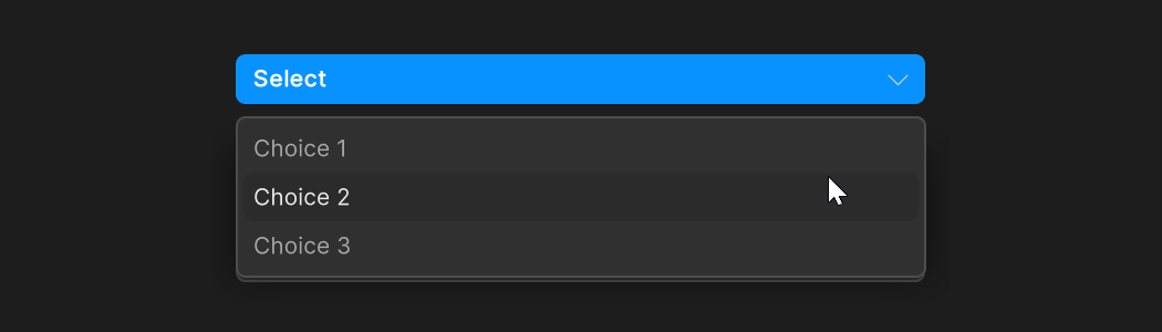
In App UI, you can use the Dropdown element to create a dropdown list, and the RadioGroup element to create a radio button group.
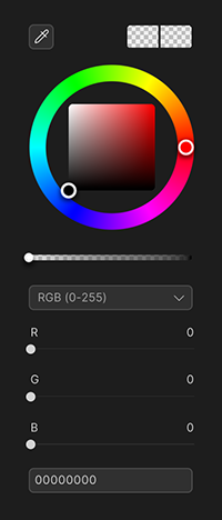
Color Inputs
Color inputs are used for selecting colors.
Text Inputs
Text inputs are used for entering text values.

In App UI, you can use the TextField element to create a text field, and the TextArea element to create a text area.
Numeric Inputs
Although there are multiple data structure that implies numerical values. Also, the precision of the value can vary from one data structure to another. We aim to provide different version of our component in order to fit the needs of the user.
Sliders
Slider inputs are used for selecting a value from a range of values.
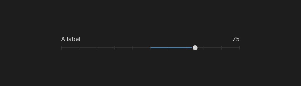
In App UI, you can use the SliderFloat element to create a slider. You can also use the SliderInt element to create a slider with integer values. For touch devices, you can use the TouchSliderFloat element to create a slider. You can also use the TouchSliderInt element to create a slider with integer values.
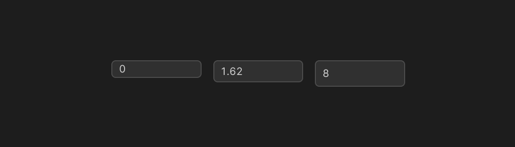
Numerical Fields
Numeric inputs are used for entering numerical values.
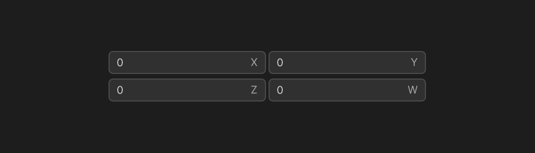
Vectors
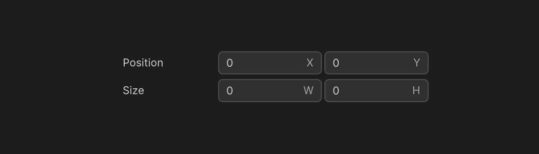
Rects and Bounds

Expression Evaluation
