Storybook
THe Storybook sample demonstrate how to display and test UI components in the same way as the React Storybook library.
Getting Started
Installation
To use the UI Kit sample, you will need to have this package installed in your project.
To install the package, follow the instructions in the Installation and Setup section of the documentation.
Inside the Unity Package Manager window, select the App UI package, then go to Samples and select Storybook. Click Install to install the sample.
Usage
The Storybook sample contains only C# classes and scripts. It doesn't contain any scenes.
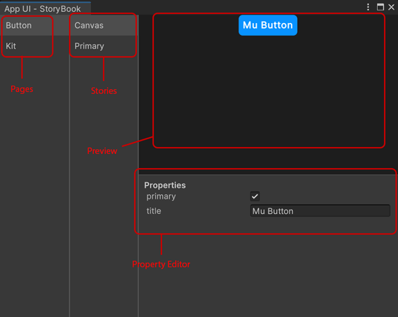
Our Storybook window is able to collect all the stories from the project and display them in a list.
To open the Storybook window, go to Window > App UI > Storybook.

On the left side of the window, you will see a list of all the pages that contain stories. Click on a page to see the list of stories in that page on the second column.
The Canvas story is a special story that displays the UI Component with a property editor. It can be used to edit the properties of the UI Component and see the changes in real time.
Others stories are made directly by code by giving a specific context.
Creating Stories
First, you need to create a Storybook Page which will contains all the stories of a specific UI Component.
To create a Storybook Page, create a new C# class that inherits from StoryBookPage.
Here is an example of a Storybook Page for the Button UI Component.
public class ButtonStoryBookPage : StoryBookPage
{
    public override string displayName => "Button";

    public override Type componentType => typeof(ButtonComponent);

    public ButtonPage()
    {
        // Add stories here using m_Stories.Add()
    }
}

public class ButtonComponent : StoryBookComponent
{
    public override Type uiElementType => typeof(Button);

    public ButtonComponent()
    {
        m_Properties.Add(new StoryBookBooleanProperty(
            nameof(Button.primary),
            (btn) => ((Button)btn).primary,
            (btn, val) => ((Button)btn).primary = val));

        m_Properties.Add(new StoryBookStringProperty(
            nameof(Button.title),
            (btn) => ((Button)btn).title,
            (btn, val) => ((Button)btn).title = val));
    }
}
The displayName property is used to display the name of the page in the Storybook window.
The componentType property is used to display the properties of the UI Component in the Storybook property editor.
You must implement the componentType property by creating a new class that inherits from StoryBookComponent.
Note
If you don't provide a valid componentType property, the Storybook property editor
and the Canvas story will not be displayed.
To add a story, use the m_Stories.Add() method.
public ButtonPage()
{
    m_Stories.Add(new StoryBookStory("Primary", () => new Button { primary = true, title = "Primary Style Button" }));
    m_Stories.Add(new StoryBookStory("Secondary", () => new Button { title = "Secondary Style Button" }));
}