Using App UI
Once you have installed App UI Unity Package, you can start using it in your Unity projects.
App UI Panel - The root context for all App UI components
In order for App UI components to be displayed correctly, they must be fed with an ApplicationContext object.
This object is defines some properties that can affect the component's look and feel, such as the current theme, the current language, and the current screen size.
This ApplicationContext object is provided by a ContextProvider component.
To know more about Context management, see the Context documentation page.
The application will also need to have a special layering system to display UI elements on top of the app's content, such as a dialog box or a popup menu.
The Panel component is a special ContextProvider
that provides a default ApplicationContext object,
based on the current system information, and a layering system to handle popups, notifications, and tooltips.
It is highly recommended to use the Panel component as the root component of your application.
Here is an example of usage inside your UI Document:
<UXML xmlns="UnityEngine.UIElements" xmlns:appui="UnityEngine.Dt.App.UI">
    <appui:Panel>
        <!-- Your UI elements -->
    </appui:Panel>
</UXML>
App UI Components
App UI components are defined as VisualElement in UI Toolkit.
You can find them in the UnityEngine.Dt.App.UI namespace.
If you are working directly by editing UXML files, we recommend to define the appui namespace inside.
You can also update the UXML Schema definition to get autocompletion in your IDE by selecting Assets > Update UXML Schema in the Editor.
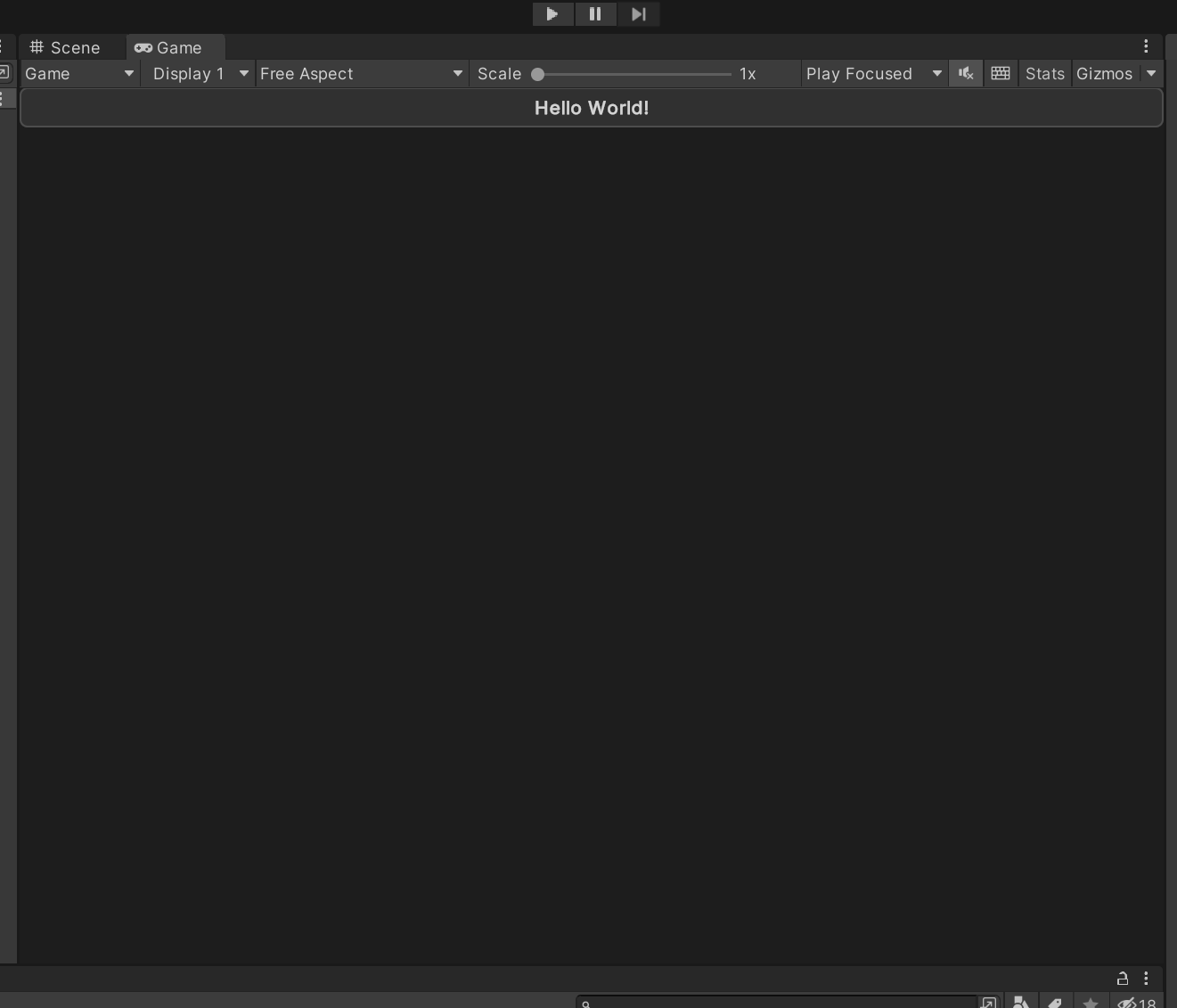
Here is an example of usage inside your UI Document:
<UXML xmlns="UnityEngine.UIElements" xmlns:appui="UnityEngine.Dt.App.UI">
    <appui:Panel>
        <appui:Button title="Hello World!" />
    </appui:Panel>
</UXML>
