Layouts
App UI provides a variety of layout components to help you create the UI of your Unity project.
Layout Components
App UI Panel
The App UI Panel component is the root component of the App UI system. Your application should have only one App UI Panel component, and it should be the root of your UI document.
The App UI Panel component provides a default ApplicationContext object,
based on the current system information, and a layering system to handle popups, notifications, and tooltips.
Containers
Containers are layout components that contain several similar child elements. They are used to group elements together and to apply a layout to them.
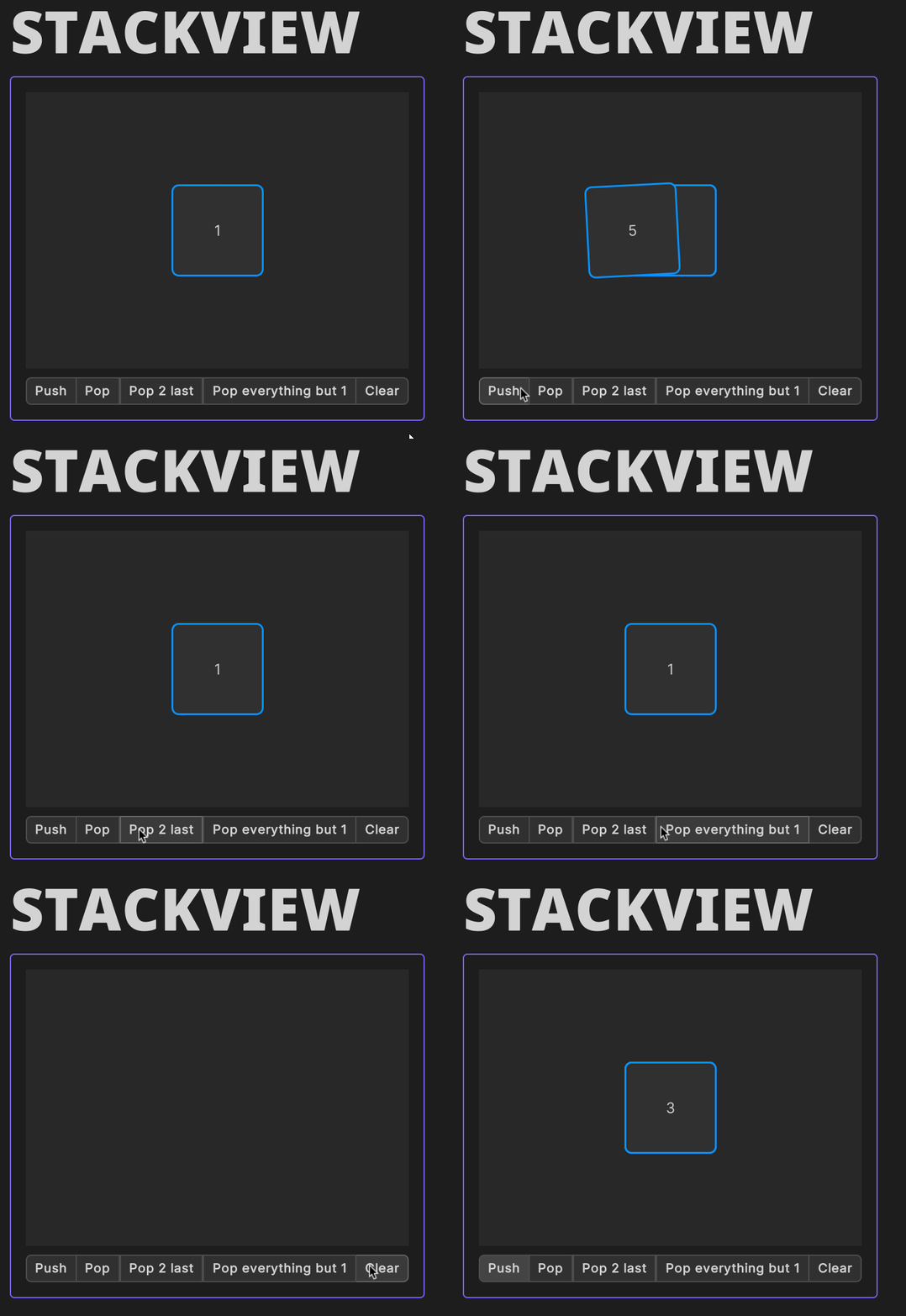
StackView
The StackView component is a container that arranges its children one over the other, in a Z-axis stack. You can push and pop elements from the stack at runtime, and you can also animate the transition between the elements.

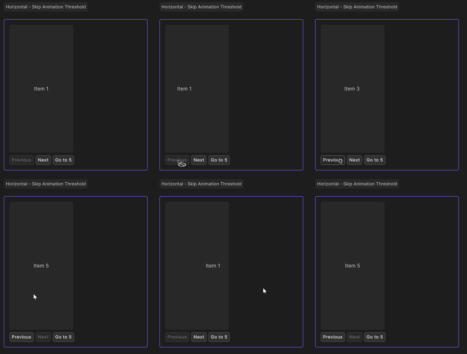
SwipeView
The SwipeView component is a container that arranges its children in a horizontal or vertical stack, and allows the user to swipe between them. This view can display more than one child at a time, and it can also be used to create a carousel effect by using the wrap mode.


PageView
The PageView component is a the composition of a SwipeView and a PageIndicator components. It allows the user to swipe between pages, and to see the current page index.
Dialogs
Dialogs are layout components that are used to display a message to the user.
Dialog
The Dialog component is a layout component composed of a heading, a body, and a footer.
Alert
The AlertDialog component is similar to the Dialog component, but its styling will depend on its AlertSemantic property.
Others Views
SplitView
The SplitView component is a layout component that allows the user to resize its children.
VisualElement & ScrollView
The VisualElement and ScrollView components are layout components that are part of the UI Toolkit system. When you didn't find a layout component that fits your needs, you can use these components to create your own layout.